Bind an Enum to a ComboBox Control in UWP with Community Toolkit

Last month, I blogged about how we can create our own value converter to bind an enum to a ComboBox control in an UWP application. After reading the article, Riza Marhaban recommended to look into the Windows Community Toolkit which can do the same job in an easier manner.

About Windows Community Toolkit

The toolkit was first released in August 2016 with the name “UWP Community Toolkit” as an open-source project with a collection of helper functions, custom controls, and app services. The main goal of the project is to simplify the common developer tasks in UWP app development.

Two years after its first release, the UWP Community Toolkit was renamed to the Windows Community Toolkit with more helper functions and controls available. The new name is reflective of the increased focus and more inclusive of all Windows developers.

In March 2021, the 7th version of the toolkit was released with a whole new .NET Standard MVVM library, the Microsoft.Toolkit.Mvvm.

Today, in this article, we will look into how the helper function in the toolkit is able to help us in the task of binding an enum to a ComboBox control.

PROJECT GITHUB REPOSITORY

The complete source code of this project can be found at https://github.com/goh-chunlin/gcl-boilerplate.csharp/tree/master/universal-windows-platform/WTS.CommunityToolkit.EnumCombo.

EnumValuesExtension

There is an extension in the toolkit that can exactly help us in doing just that. The extension is called the EnumValuesExtension.

EnumValuesExtension returns a collection of values of a specific enum type. Hence, we can use it to easily bind a collection of all possible values from a given enum type to a ComboBox control or some other UI controls.

Model and ViewModel

We will use the same enum, MyColors, the one we use in our previous blog post.

public enum MyColors
{
    Red,
    Green,
    Blue,
    Orange,
    Pink,
    Black
}

We will still have the same ViewModel for our MainPage.xaml which will contains the ComboBox control.

public class MainViewModel : ViewModelBase
{
    private MyColors _selectedColor = MyColors.Black;

    public MyColors SelectedColor
    {
        get => _selectedColor;
        set
        {
            if (_selectedColor != value)
            {
                SetProperty(ref _selectedColor, value);
            }
        }
    }
}

View

Now in the MainPage.xaml which contains the ComboBox control, without using our own custom value converter, we can directly bind the enum above to our front-end view with the help of EnumValuesExtension, as shown below.

<Page
    x:Class="WTS.CommunityToolkit.EnumCombo.Views.MainPage"
    xmlns:enums="using:WTS.CommunityToolkit.EnumCombo.Core.Enums"
    xmlns:toolkitui="using:Microsoft.Toolkit.Uwp.UI"
    ...>
    ...
    <ComboBox
        ItemsSource="{toolkitui:EnumValues Type=enums:MyColors}"
        SelectedItem="{Binding SelectedColor, Mode=TwoWay}" />
    ...

</Page>

Conclusion

That’s all for the quickstart steps to bind an enum to a ComboBox control in an UWP app with the help of the Windows Community Toolkit.

If you’d like to further customise the values shown in the ComboBox, you could also use a value converter. I have made the source code available on GitHub. The code will have more features where the colour of text in a TextBlock will be based on the colour we pick from the ComboBox, as shown below.

Demo of the ComboBox on UWP.

References

How to Bind an Enum to a ComboBox Control in UWP?

One of the ways to develop a desktop application for Windows 10/11 is UWP (Universal Windows Platform). UWP app has two fundamental sections, i.e. front-end and back-end. The front-end is developed using XAML (Extensible Markup Language) and back-end can be coded in C# (or even JavaScript back in the old time).

In order to decoupling front-end and back-end codes, there is a UI architectural design pattern, the MVVM (Model-View-ViewModel), introduced. With MVVM, we define our UI declaratively in XAML and use data binding markup to link it to other layers containing data and commands.

In order to implement MVVM in our UWP app, we can use Prism, which is an implementation of a collection of design patterns that are helpful in writing well-structured and maintainable XAML applications, including MVVM.

Even though Prism maintainers had decided to drop support for non-Xamarin.Forms UWP project back in 2019, Uno team announced that, in 2020, they stepped up to the plate and committed to providing ongoing support to the library.

In this article, we will figure out how we can setup data binding of an enum to a ComboBox control in UWP with Prism.

PROJECT GITHUB REPOSITORY

The complete source code of this project can be found at https://github.com/goh-chunlin/gcl-boilerplate.csharp/tree/master/universal-windows-platform/WTS.Prism.EnumCombo.

Model: The Enum

Let’s say we have an enum, MyColors, whose values are six different colours, as shown below.

public enum MyColors
{
    [Description("Red")] Red,
    [Description("Green")] Green,
    [Description("Blue")] Blue,
    [Description("Orange")] Orange,
    [Description("Pink")] Pink,
    [Description("Black")] Black
}

The enum has an attribute known as Description which can be retrieved with the extension method GetDescription().

public static class EnumExtension
{
    public static string GetDescription(this Enum value)
    {
        FieldInfo fi = value.GetType().GetField(value.ToString());
        var attributes = (DescriptionAttribute[])fi.GetCustomAttributes(typeof(DescriptionAttribute), false);
        if (attributes.Length > 0) return attributes[0].Description;
        else return value.ToString();
    }
}

ViewModel

Next we will define the ViewModel of our MainPage.xaml which will contains the ComboBox control. We will bind the variable SelectorColor whose type is the enum to the ComboBox control, as shown below.

public class MainViewModel : ViewModelBase
{
    private MyColors _selectedColor = MyColors.Black;

    public MyColors SelectedColor
    {
        get => _selectedColor;
        set
        {
            if (_selectedColor != value)
            {
                SetProperty(ref _selectedColor, value);
            }
        }
    }
}

The method SetProperty will set the property and notifies listeners only when necessary. The SetProperty method checks whether the backing field is different from the value being set. If different, the backing field is updated and the PropertyChanged event is raised.

Value Conversion

The data binding will be simple when the source and target properties are of the same type, or when one type can be converted to the other type through an implicit conversion, for example binding a string variable to the Text field of a TextBlock control. However, to bind enum to the dropdown value and text fields of a ComboBox, we will need the help of a value conversion.

The value conversion can be done by a converter class, which implements the IValueConverter interface. It will act like middlemen and translate a value between the source and the destination.

Here, we will implement a converter, MyColorValueConverter, that takes an enum value and then return a string value to be used in ComboBox fields, as well as the other way around.

public class MyColorValueConverter : IValueConverter
{
    public object Convert(object value, Type targetType, object parameter, string language)
    {
        if (value is MyColors color) return color.GetDescription();

        return null;
    }

    public object ConvertBack(object value, Type targetType, object parameter, string language)
    {
        if (value is string s) return Enum.Parse(typeof(MyColors), s);
        
        return null;
    }

    ...

}

After this, in order to provide all available values in the enum as ItemsSource of the ComboBox control, we will need to have a Strings property in the MyColorValueConverter.

public string[] Strings => GetStrings();

public static string[] GetStrings()
{
    List<string> list = new List<string>();

    foreach (MyColors color in Enum.GetValues(typeof(MyColors)))
    {
        list.Add(color.GetDescription());
    }


    return list.ToArray();
}

View: The Front-end

Now in the MainPage.xaml which contains the ComboBox control, we first need to instantiate the value converter in the resource dictionary of the page.

<Page
    x:Class="WTS.Prism.EnumCombo.Views.MainPage"
    xmlns:local="using:WTS.Prism.EnumCombo.Helpers"
    ...>
    <Page.Resources>
        <local:MyColorValueConverter x:Key="MyColorValueConverter" />
    </Page.Resources>
    ...
</Page>

We then can have our ComboBox control defined as follows.

<ComboBox 
    ItemsSource="{Binding Source={StaticResource MyColorValueConverter}, Path=Strings}"
    SelectedItem="{Binding SelectedColor, Converter={StaticResource MyColorValueConverter}, Mode=TwoWay}"/>

Conclusion

That’s all for the quickstart steps to bind an enum to a ComboBox control in an UWP app.

I have made the source code available on GitHub. The code will have more features where the colour of text in a TextBlock will be based on the colour we pick from the ComboBox, as shown below.

Demo of the ComboBox on UWP.

References

[KOSD] Fixed 0x800B0100 WACK Issue in VS2019 16.10.2 Onwards

I have been using Visual Studio 2019 to develop desktop and mobile applications using Xamarin. I could successfully deploy my Xamarin UWP app to Microsoft Store until I upgraded my Visual Studio 2019 to 16.10.2.

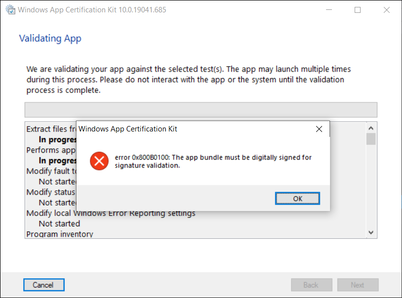
Normally, before we can publish our UWP app to Microsoft Store, we need to launch WACK (Windows App Certification Kit) to validate our app package. However, in VS2019 16.10.2 (and onwards), there will be an error occurs, as shown in the screenshot below, and the validation cannot be completed.

Error 0x800B0100 in Windows App Certification Kit (WACK).

MSBuild Project Build Output

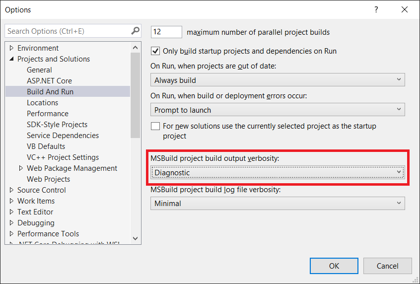
Since my code is the same, so the first thing that I suspect is that the new updates in Visual Studio 2019 are causing this issue. Hence, I changed the verbosity of the project build output to Diagnostic, as shown below. This will help us understand better about what’s happening during the build.

Setting MSBuild project build output verbosity.

By comparing the current build output with the one using the previous version of Visual Studio 2019, I realised that there is something new in the current build ouput. The parameter GenerateTemporaryStoreCertificate is set to false while BuildAppxUploadPackageForUap is true, as shown below.

1>Target "_RemoveDisposableSigningCertificate: (TargetId:293)" in file "C:\Program Files (x86)\Microsoft Visual Studio\2019\Preview\MSBuild\Microsoft\VisualStudio\v16.0\AppxPackage\Microsoft.AppXPackage.Targets" from project "...UWP.csproj" (target "_GenerateAppxPackage" depends on it):
1>Task "RemoveDisposableSigningCertificate" skipped, due to false condition; ('$(GenerateTemporaryStoreCertificate)' == 'true' and '$(BuildAppxUploadPackageForUap)' == 'true') was evaluated as ('false' == 'true' and 'true' == 'true').
1>Done building target "_RemoveDisposableSigningCertificate" in project "...UWP.csproj".: (TargetId:293)

Online Discussions

Meanwhile, there are only two discussion threads online about this issue.

On 22nd of June 2021, Nick Stevens first reported a problem that he encountered in publishing app to Microsoft Store after upgrading his Visual Studio 2019 to 16.10.2. However, his problem is about package family name and publisher name being marked as invalid.

Few days later, on 1st of July 2021, another developer Tautvydas Zilys also reported a similar issue as Nick Stevens’. Interestingly, the same Microsoft engineer, James Parsons, replied to them with the similar answer, i.e. adding the following property in their project file to set GenerateTemporaryStoreCertificate to true.

<GenerateTemporaryStoreCertificate>true</GenerateTemporaryStoreCertificate>

As explained by James, the GenerateTemporaryStoreCertificate will mimic the old behavior of Visual Studio where it will generate a certificate for us that has the publisher name that Microsoft Partner Center expects.

Fixed

Thankfully, after adding this line in the UWP csproject of my Xamarin project as shown below, the WACK works again without the error showing.

<?xml version="1.0" encoding="utf-8"?>
<Project ToolsVersion="14.0" ...>
    ...
    <PropertyGroup>
        ...
        <GenerateTemporaryStoreCertificate>True</GenerateTemporaryStoreCertificate>
        ...
    </PropertyGroup>
</Project>

That’s all to fix the issue. I hope this article, which is also the 3rd in the world discussing about this Visual Studio 2019 problem, is helpful to other Xamarin UWP developers who are running into the same problem.

References

KOSD, or Kopi-O Siew Dai, is a type of Singapore coffee that I enjoy. It is basically a cup of coffee with a little bit of sugar. This series is meant to blog about technical knowledge that I gained while having a small cup of Kopi-O Siew Dai.

Build Cross-Platform App with Embedded Images on Xamarin.Forms

As we all know, a picture is worth 1,000 words. More and more, we see developers utilising images as the core of their app. Images play an important role in application navigation, usability, and branding. Hence, sharing images across all platforms, i.e. iOS, Android, and Windows 10, is often a task we need to work on. Today, I will share about how we do just that with Embedded Images.

Distributing images across different platforms with Embedded Images is recommended when identical images are used on each platform, and is particularly suited to creating components, as the image is bundled with the code. In this post, I will demo how we can do that in a new Xamarin.Forms blank project.

PROJECT GITHUB REPOSITORY

The complete source code of this project can be found at https://github.com/goh-chunlin/gcl-boilterplate.csharp/tree/master/xamarin-forms/CPEI.

Setup Images Folder

Let’s say we would like to show some images in the first screen of our app for each of the platforms. We will first have a folder called Images to store all those images. Then, we need to proceed to set the Build Action of the images to be “Embedded resource”.

Right-click the selected images and then select “Properties” to modify their Build Action.

The project name is called CPEI which stands for Cross-Platform Embedded Images. I use shortform here so that the Android project will not complain about our path to the files being too long.

ACCESS Embedded ImageS on XAML

Now, let’s say if we can to show only one of the images in the first screen of our app, we can do so by editing the XAML code of MainPage.xaml. However, we need to have the following extension first to convert the image file name which is in string to ResourceImageSource, then only the image can be natively loaded by XAML.

[ContentProperty(nameof(Source))]
public class ImageResourceExtension : IMarkupExtension
{
    public string Source { get; set; }

    public object ProvideValue(IServiceProvider serviceProvider)
    {
        if (Source == null) return null;

        Assembly assembly = typeof(ImageResourceExtension).Assembly;
        var imageSource = ImageSource.FromResource(Source, assembly);

        return imageSource;
    }
}

Here we use the overload of ImageSource.FromResource that specifies the source assembly in which to search for the image so that it can work on the Release mode of UWP on Windows 10.

Now we can use this extension in the XAML, as shown below, in MainPage.xaml.

<?xml version="1.0" encoding="utf-8" ?>
<ContentPage xmlns="http://xamarin.com/schemas/2014/forms"
             xmlns:x="http://schemas.microsoft.com/winfx/2009/xaml"
             xmlns:embeddedImage="clr-namespace:CPEI.Extensions;assembly=CPEI"
             x:Class="CPEI.MainPage">

    <ScrollView>
        ...

        <Image x:Name="MainImage" Source="{embeddedImage:ImageResource CPEI}" 
            WidthRequest="600" HeightRequest="400" HorizontalOptions="CenterAndExpand" />

        ...
    </ScrollView>

</ContentPage>

The highlighted sections are the parts newly added. At this point of time, we’re still not sure the name of the image. So our app now should not show any image at that part. To find out the actual image names, we can add a debugging code (which we should remove in production) in the ImageResourceExtension class as follows.

[ContentProperty(nameof(Source))]
public class ImageResourceExtension : IMarkupExtension
{
    ...

    public object ProvideValue(IServiceProvider serviceProvider)
    {
        ...

        foreach (var res in assembly.GetManifestResourceNames())
        {
            System.Diagnostics.Debug.WriteLine("found resource: " + res);
        }

        ...
    }
}

When we debug our app, the following should be shown in the Output window.

found resource: CPEI.Images.Genshin-Impact-Pic01.png
found resource: CPEI.Images.Genshin-Impact-Pic02.png
found resource: CPEI.Images.Genshin-Impact-Pic03.png
found resource: CPEI.Images.Genshin-Impact-Pic04.png
found resource: CPEI.Images.Genshin-Impact-Pic05.png
found resource: CPEI.Images.Genshin-Impact-Pic06.png

So now we know the name for each of the images. We simply update the Source in the XAML code above to correctly show the image, for example

<Image x:Name="MainImage" Source="{embeddedImage:ImageResource CPEI.Images.Genshin-Impact-Pic02.png}" WidthRequest="600" HeightRequest="400" HorizontalOptions="CenterAndExpand" /> 
Yay, the selected image is now displayed on our UWP app.

Access Embedded Images from Code Behind

Instead of XAML, we can access the embedded images from code behind too. For example, if we want to change the image above randomly through a click of button, we can have the following code in the click event of the button.

private void Button_Clicked(object sender, EventArgs e)
{
    Random rnd = new Random();
    int imageIndex = rnd.Next(1, 7);

    MainImage.Source = ImageSource.FromResource(
        $"CPEI.Images.Genshin-Impact-Pic{imageIndex:00}.png", 
        typeof(MainPage).Assembly);
}
Yay, we now can choose embedded images to be displayed in frontend from code behind.

Android and iOS

Since embedded images are shipped with those images embedded in the assembly as a resource, the images can be also displayed on Android, as demonstrated below.

Debugging our Xamarin.Forms app on Android emulator.

In order to test our app on the iOS platform, it’s easier if we choose to build our iOS app project on a Mac machine directly. Visual Studio for Mac offers the support for debugging Xamarin.iOS applications both in the iOS simulator and on iOS devices.

This is my first time building Xamarin.iOS app on my MacBook Air, so I need to download Xcode 12.5 from the Apple Developer Downloads page first. I don’t download it from the App Store because that will take a longer time and the installation may fail. Interestingly, there is a tip on how to install Xcode with xip in a faster manner but I’d still waited for like one hour to have it installed on my machine.

After getting both XCode 12.5 and VS 2019 for Mac installed, I proceed to checkout the Xamarin.iOS app from the source control and update the Deployment Target accordingly in order to have our app running on the simulators, as shown in the following screenshot.

Running our Xamarin.iOS app on iPhone 12 simulator.

As demonstrated below, our app can be run on iPad as well with all the embedded images loaded successfully.

This shows our Xamarin.iOS app running on iPad Air (4th Generation) simulator.

References

The code of this project described in this article can be found in my GitHub repository: https://github.com/goh-chunlin/gcl-boilterplate.csharp/tree/master/xamarin-forms/CPEI.