Revisit Avalonia UI App Development

Back in April 2018, I had the priviledge of sharing about Avalonia UI app development with the Singapore .NET Developers Community. At the time, Avalonia was still in its early stages, exclusively tailored for the creation of cross-platform desktop applications. Fast forward to the present, five years since my initial adventure to Avalonia, there is a remarkable transformation in this technology landscape.

In July 2023, Avalonia v11 was announced. It is a big release with mobile development support for iOS and Android, and WebAssembly support to allow running directly in the browser.

In this artlcle, I will share about my new development experience with Avalonia UI.

About Avalonia UI

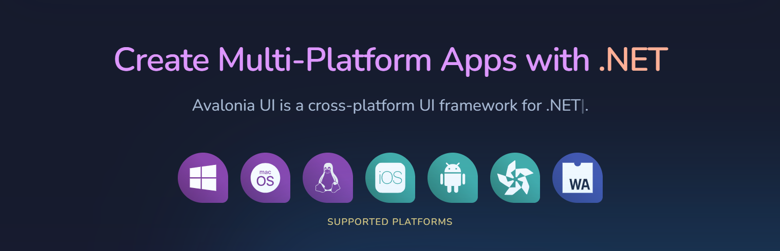
Avalonia UI, one of the .NET Foundations projects, is an open-source, cross-platform UI framework designed for building native desktop apps. It has been described as the spiritual successor to WPF (Windows Presentation Foundation), enabling our existing WPF apps to run on macOS and Linux without expensive and risky rewrites.

Platforms supported by Avalonia. (Reference)

Like WPF and Xamarin.Forms, Avalonia UI also uses XAML for the UI. XAML is a declarative markup language that simplifies UI design and separates the UI layout from the application’s logic. Same as WPF, Avalonia also encourages the Model-View-ViewModel (MVVM) design pattern for building apps.

Hence, for WPF developers, they will find the transition to Avalonia relatively smooth because they can apply their knowledge of XAML and WPF design patterns to create UI layouts in Avalonia easily. With Avalonia, they can reuse a significant portion of their existing WPF code when developing cross-platform apps. This reusability can save time and effort in the development process.

Semi.Avalonia Theme

Theming is still a challenge especially when it comes to develop line-of-business apps with Avalonia UI. According to the community, there are a few professional themes available, such as

Currently, I have only tried out Semi.Avalonia.

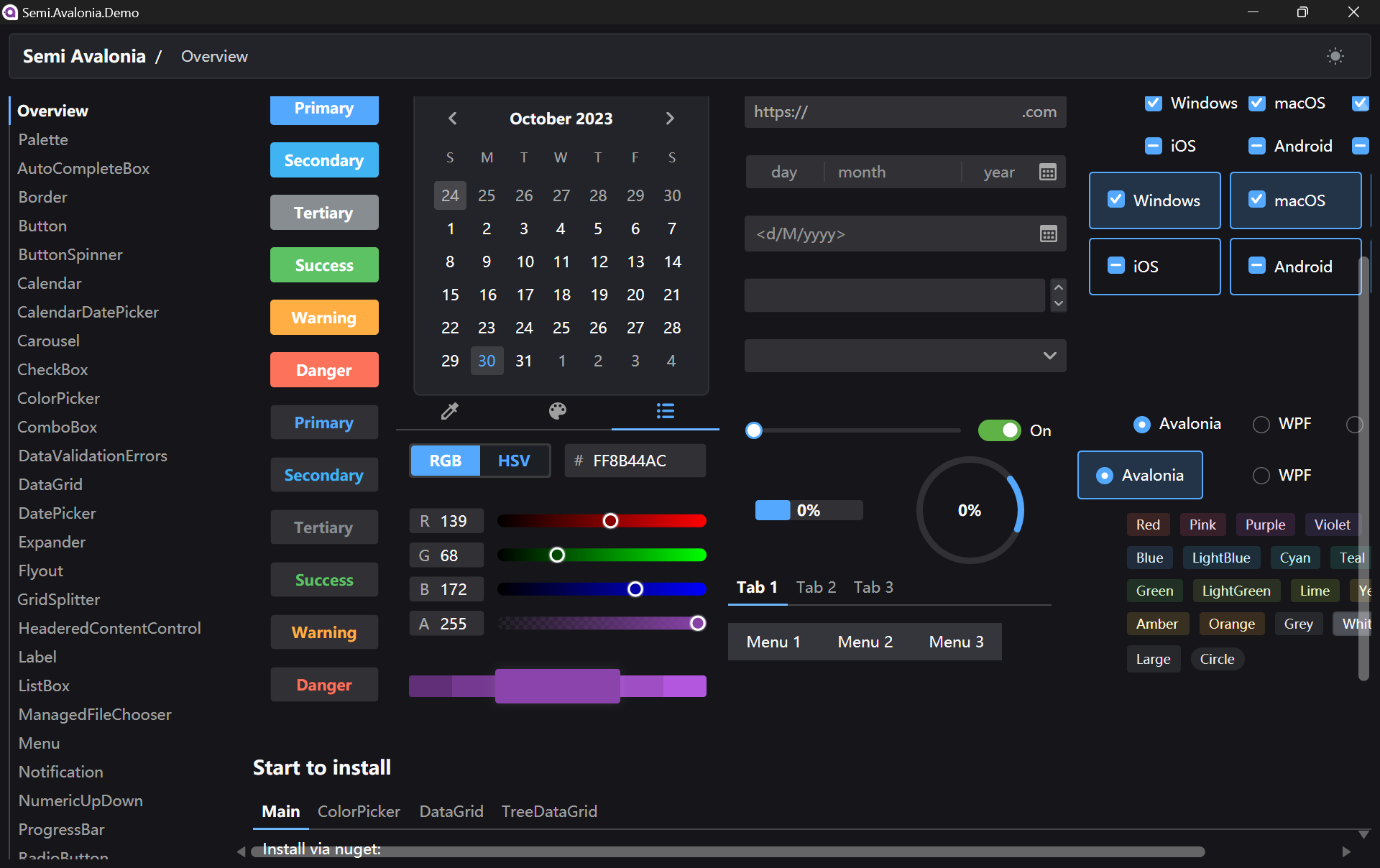
Semi.Avalonia is a theme inspired by Semi Design, a design system designed and currently maintained by Douyin. The reason why I chose Semi.Avalonia is because there is a demo app which demonstrating all of the general controls and styles available to develop Avalonia apps.

There is a demo executable available for us to play around with Semi Avalonia Themes.

XAML Previewer for Avalonia

In September 2023, .NET Foundation announced on the social network, X, that Avalonia UI offered a live XAML previewer for Avalonia in Visual Studio Code through an extension as well.

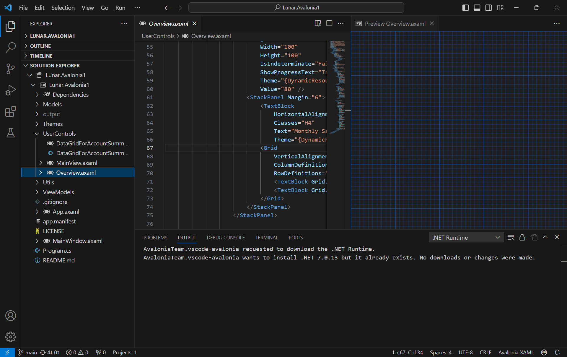
The Avalonia XAML Previewer offers real-time visualisation of XAML code. With this capability, developers can deftly craft and refine user interfaces, swiftly pinpoint potential issues, and witness the immediate effects of their alterations.

Unlike Visual Studio, VS Code will reuse the single preview window. Hence, the previewer will refresh everytime when we switch between multiple XAML files.

Besides, the Avalonia for Visual Studio Code Extension also contains support for Avalonia XAML autocomplete.

The Avalonia XAML Previewer somehow is not working perfectly on my Surface Go.

C# DevKit

In addition, there is also a new VS Code extension that needs our attention.

In October 2023, Microsoft announced the general availability of C# Dev Kit, a VS Code extension that brings an improved editor-first C# development experience to Linux, macOS, and Windows.

When we install this extension, three other extensions, i.e. the C# extension, the IntelliCode for C# Dev Kit, and the .NET Runtime Install Tool will automatically be installed together.

With C# Dev Kit, we can now manage our projects with the Solution Explorer that we have been very familiar with on the Visual Studio.

Besides the normal file explorer, we now can have the Solution Explorer in VS Code too.

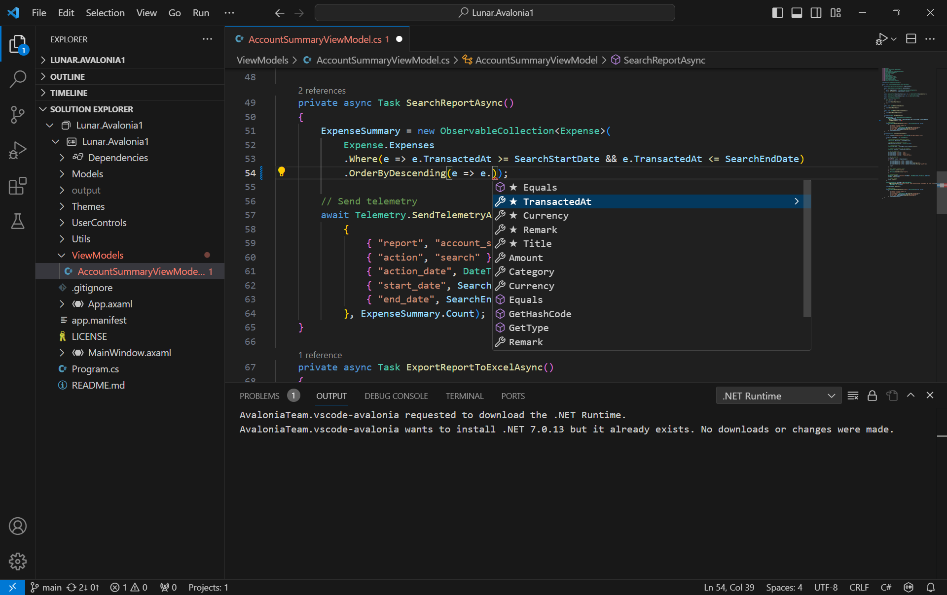
Since the IntelliCode for C# Dev Kit extension is installed together, on top of the basic IntelliSense code-completion found in the existing C# extension, we can also get powerful IntelliCode features such as whole-line completions and starred suggestions based on our personal codebase.

AI-assisted IntelliCode predicts the most likely correct method to use in VSCode.

Grafana Dashboard

Next, I would like to talk about the observability of an app.

I attended Grafana workshop during the GrafanaLive event in Singapore in September 2023.

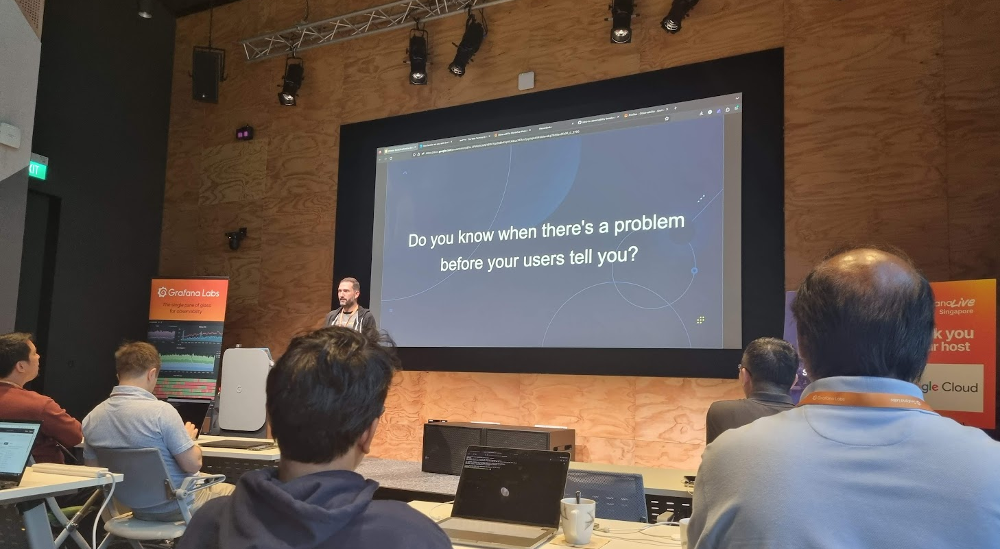
Observability plays a crucial role in system and app management, allowing us to gain insights into the inner workings of the system, understand its functions, and leverage the data it produces effectively.

In the realm of observability, our first concern is to assess how well the system can gauge its internal status merely by examining its external output. This aspect of observability is crucial for proactive issue detection and troubleshooting, as it allows us to gain a deeper insight into performance and potential problems of the system without relying on manual methods.

Effective observability not only aids in diagnosing problems but also in understanding the system behavior in various scenarios, contributing to better decision-making and system optimisation.

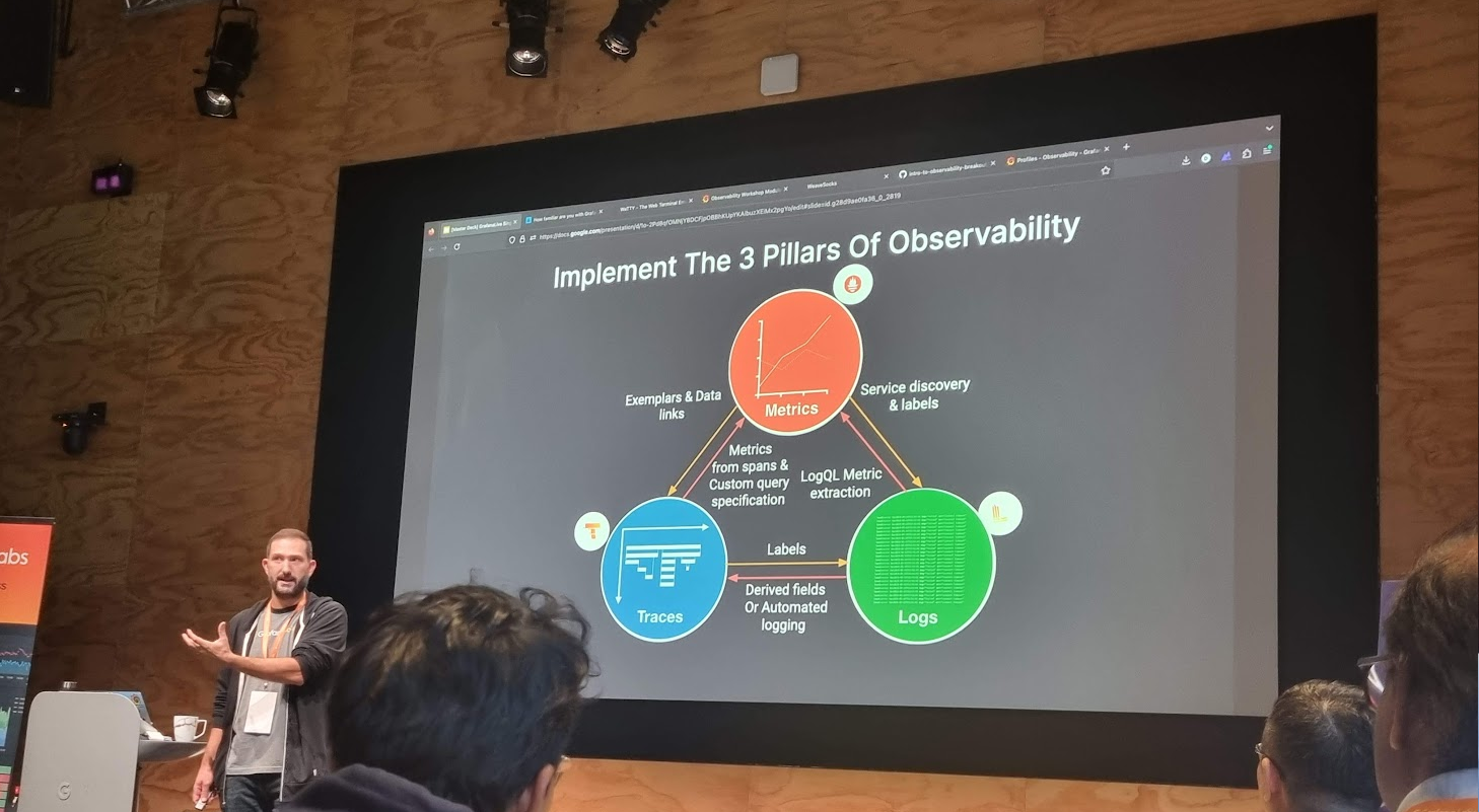
Grafana engineer shared about the 3 pillars of observability.

There are three fundamental components of observability, i.e. monitoring, logging, and tracing. Monitoring enhances the understanding of system actions by collecting, storing, searching, and analysing monitoring metrics from the system.

Prometheus and Grafana are two widely used open-source monitoring tools that, when used together, provide a powerful solution for monitoring and observability. Often, Prometheus collects metrics from various systems and services. Grafana then connects to Prometheus as a data source to fetch these metrics. Finally, we design customised dashboards in Grafana, incorporating the collected metrics.

A simple dashboard collecting metrics from the Avalonia app though HTTP metrics.

We can get started quickly with Grafana Cloud, a hosted version of Grafana, without the need to set up and manage infrastructure components.

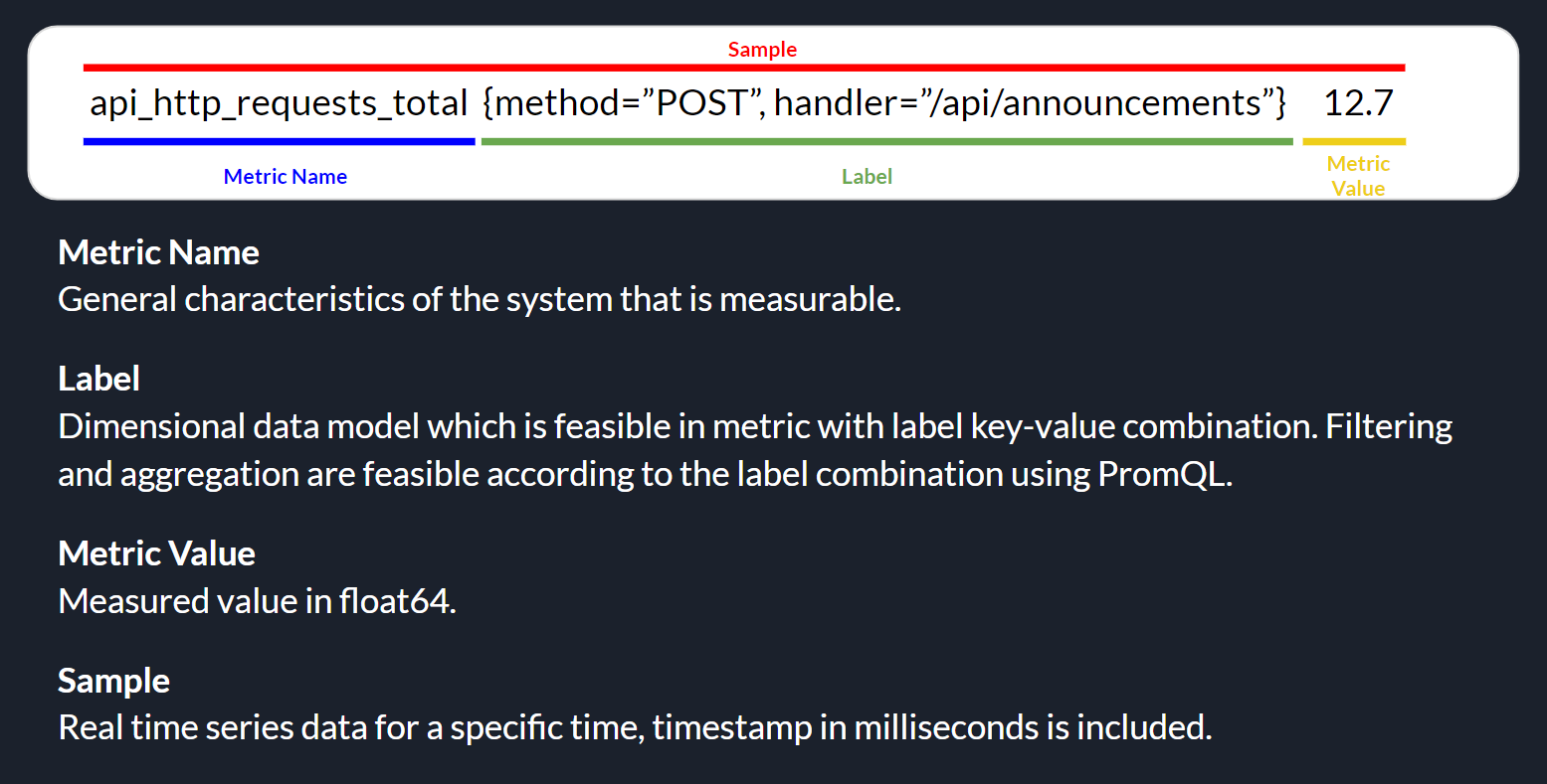
On Grafana Cloud, using the “HTTP Metrics”, we are able to easily send metrics directly from our app over HTTP for storage in the Grafana Cloud using Prometheus. Prometheus uses a specific data model for organising and querying metrics, which includes the components as highlighted in the following image.

Prometheus metrics basic structure.

Thus, in our Avalonia project, we can easily send metrics to Grafana Cloud with the codes below, where apiUrl, userId, and apiKey are given by the Grafana Cloud.

HttpClient httpClient = new();
httpClient.DefaultRequestHeaders.Add("Authorization", "Bearer " + userId + ":" + apiKey);

string metricLabelsText = metricLabels.Select(kv => $"{kv.Key}={kv.Value}").Aggregate((a, b) => $"{a},{b}");

string metricText = $"{metricName},{metricLabelsText} metric={metricValue}";

HttpContent content = new StringContent(metricText, Encoding.UTF8, "text/plain");

await httpClient.PostAsync(apiUrl, content);

Wrap-Up

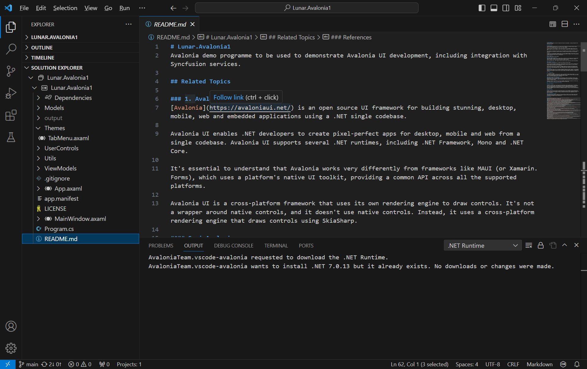
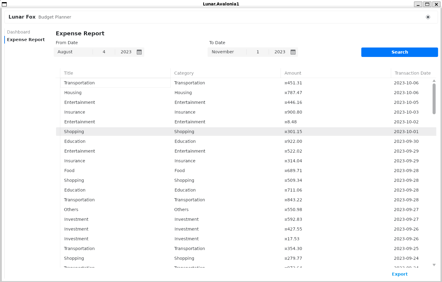
The complete source code of this project can be found at https://github.com/goh-chunlin/Lunar.Avalonia1. In the Readme file, I have also included both the presentation slide and recording for my presentation in the Singapore .NET Developers Community meetup in October 2023.

My Avalonia app can run on WSLg without any major issues.

WinUI 3 Learning Notes

In November 2021, WinUI 3 was released in Windows App SDK 1.0 Stable.

Two months after that, I decided to give it a try by creating a toy app called “WinUI Desktop” with WinUI 3 to experience the development journey.

The Tweets page of our toy app.

The app has three main pages.

  • Tweets (TwitterPage.xaml): Users can search the tweets by tags.
  • Web Browser (WebViewPage.xaml): Users can view the image of a selected tweet in a larger view here.
  • Canvas (CanvasPage.xaml): Draw random circles and rectangles on a canvas using Win2D library.

In this article, I’ll share about things I have learned while building the toy app above.

PROJECT GITHUB REPOSITORY

The complete source code of this project can be found at https://github.com/goh-chunlin/Lunar.WinUI3Playground.

About WinUI

WinUI 3 is a native UI layer which contains modern controls and styles from Fluent Design for building Windows apps. WinUI 3 is the next generation of the WinUI framework, and is now available for production apps.

Unlike WinUI 2.x, which is a control library that sits on top of UWP, WinUI 3 works with any app supported by the Windows App SDK. We can use WinUI 3 as the entire UI layer for building our desktop app. Another more subtle difference is that WinUI 3 targets .NET 5, whilst UWP still uses .NET Native.

According to Microsoft, WinUI 3 is currently supported for use by full WinUI 3 apps only. We will be able to use WinUI 3 in WPF and WinForms only in a future release via XAML Islands.

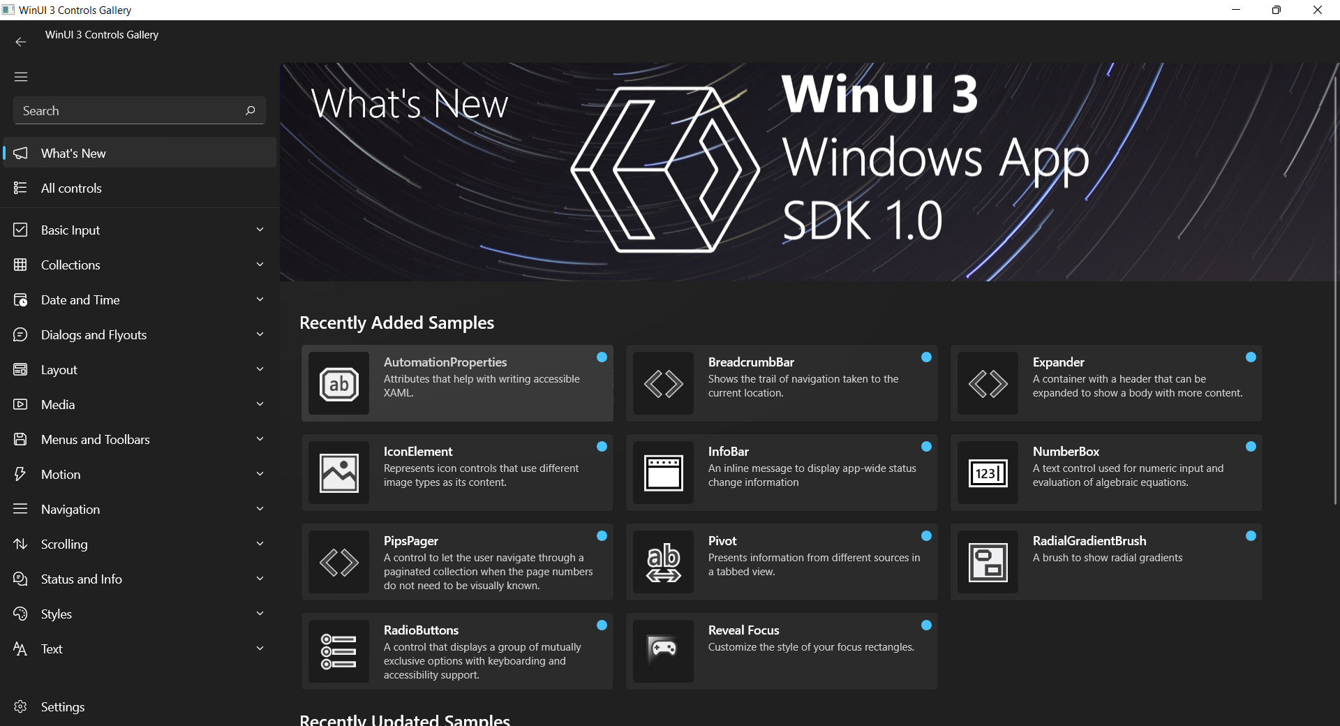
WinUI 3 controls and styles are demonstrated in a free app known as WinUI 3 Controls Gallery on Microsoft Store.

Why WinUI 3?

I’d like to share with you some of the benefits of developing with WinUI 3 that I found online.

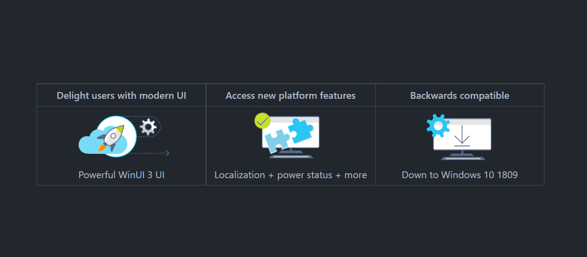
  • Modern GUI Design: Our apps will be up-to-date with latest visual elements and controls with the latest Fluent Design without requiring an updated Windows SDK;
  • Backward Compatible: WinUI 3 provides backward compatibility with a wide range of Windows 10 versions;
  • UX Stack Decoupling: In WinUI 3, UX stack and control library completely decoupled from the OS and the Windows 10 SDK. Hence, unlike UWP, WinUI 3 allows us to use the latest UI controls without updating Windows;
  • Open-Source: WinUI is an open-source project hosted on Github;
  • Latest .NET Support: We can use .NET 5 or later for developing WinUI 3 app but currently there is no official support for .NET 5 UWP yet.

Introduction of Windows App SDK (Project Reunion)

WinUI 3 now comes as a feature in the current releases of the Windows App SDK.

Highlights of Windows App SDK. (Image Source: Microsoft GitHub)

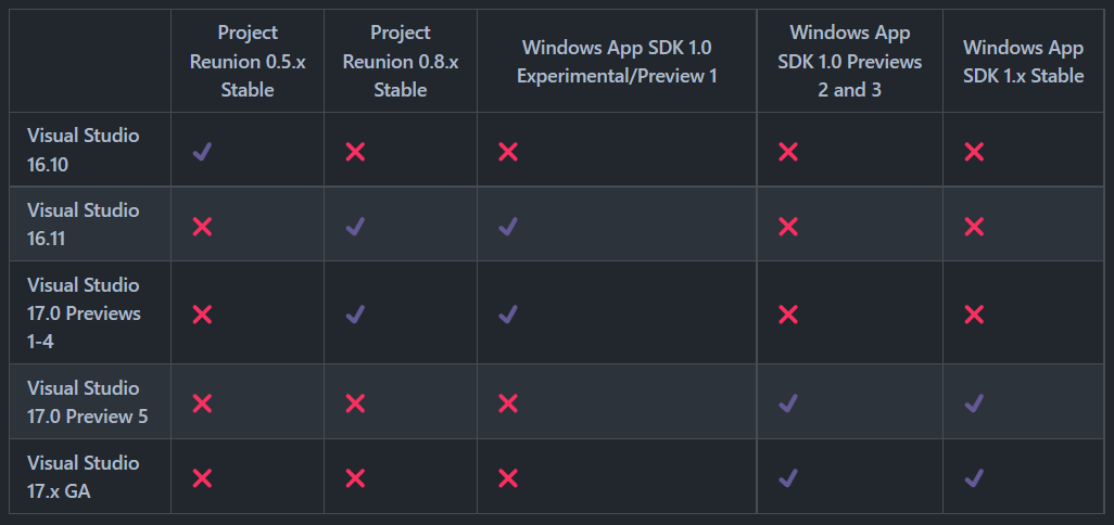
The Windows App SDK is a set of unified developer components and tools that can be used in a consistent way by any desktop app on Windows 11 and backwards compatible all the way until Windows 10, version 1809.

The Windows App SDK provides a broad set of Windows APIs—with implementations that are decoupled from the OS, and released to developers via NuGet packages.

We need to take note that the Windows App SDK is not meant to replace the Windows SDK which will continue to work as is.

Finally, since Windows App SDK is backward compatible, we don’t need to write version adaptive code, as long as our users are at least on Windows 10 (version 1809).

Hot Reload

In May 2021, Microsoft announced the availability of the .NET Hot Reload experience.

Due to compat-breaking changes between prerelease versions of the Windows App SDK, Hot Reload in WinUI 3 does not have backwards/forwards compatibility. Hence, in the future, Visual Studio 17.0 GA (aka VS 2022) and beyond will support Windows App SDK 1.0 GA and beyond, up until Windows App SDK 2.0.

Hot Reload, Live Visual Tree, and Live Property explorer support. (Image Source: Microsoft GitHub)

High Performance Data Binding with {x:Bind}

Data binding is a way for the UI to display data, and optionally to stay in sync with that data. Data binding allows us to separate the concern of data from the concern of UI.

Currently, there are two ways of doing data binding, i.e. {Binding} and {x:Bind} markup extensions. The binding objects created by both are mostly functionally equivalent. For {x:Bind}, there will be no reflection needed because code is generated along with XAML files that contain controls and DataTemplates, in .g.cs and .g.i.cs files. Hence, {x:Bind} will have great performance, provide compile-time validation of our binding expressions, and support debugging by set breakpoints in the .g.cs code files.

Since {x:Bind} is new for Windows 10, {x:Bind} is currently only supported in the both UWP and WinUI but not in WPF even though all of them using XAML for frontend.

Microsoft.Toolkit.Mvvm

In order to decoupling front-end and back-end codes, there is a UI architectural design pattern, the MVVM (Model-View-ViewModel), introduced by Microsoft in 2005 in order to support the development of XAML apps in WPF, UWP, and now WinUI.

In Nov 2020, Michael A. Hawker from Microsoft and Sergio Pedri from .NET Foundation announced the MVVM Toolkit is officially available in Windows Community Toolkit. MVVM Toolkit is a modern, fast, and modular MVVM library.

The view models in our WinUI app require the property change notification support. Hence, we will make our view models inherit from the ObservableObject base class.

ObservableObject provides a base implementation for INotifyPropertyChanged and exposes the PropertyChanged event. In addition, it provides a series of SetProperty methods that can be used to easily set property values and to automatically raise the appropriate events. The following code snippet shows how we implement that in the view model for a page called TwitterPage in the app.

public class TwitterPageViewModel : ObservableObject
{
    private string _searchingQuery;

    ...

    public string SearchingQuery
    {
        get => _searchingQuery;
        private set => SetProperty(ref _searchingQuery, value);
    }

    ...
}

The provided SetProperty method checks the current value of the property, and updates it if different, and then also raises the relevant events automatically.

Then we can do data binding accordingly in the XAML of the TwitterPage.

<TextBlock Margin="15" FontSize="48" Foreground="White"
           Text="{Binding SearchingQuery}" />

In the MVVM Toolkit, in order to bind commands between the view model and a GUI element, we need to use RelayCommand or AsyncRelayCommand which supports asynchronous operations. Both of them are ICommand implementations that can expose a method or delegate to the view.

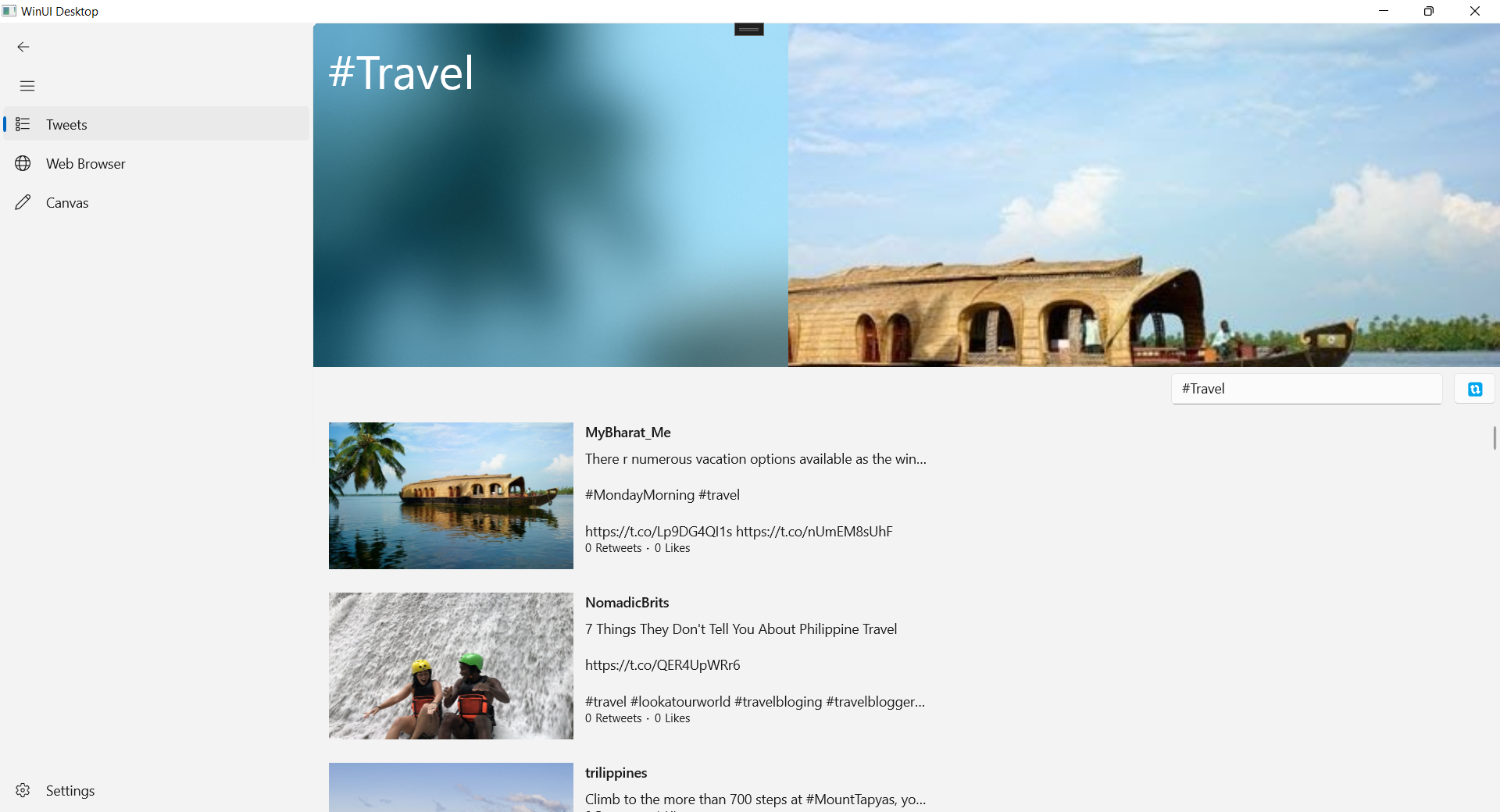
For example, if we would like to have a button that can refresh the tweets in the TwitterPage when the button is clicked, we will do the following in the view model of the page.

public class TwitterPageViewModel : ObservableObject
{
    ...

    public TwitterPageViewModel()
    {
        ...

        RefreshTweetsCommand = new AsyncRelayCommand(RefreshTweetsAsync);
    }

    public ICommand RefreshTweetsCommand { get; }

    private async Task RefreshTweetsAsync() => await FetchTweetsAsync(_searchingQuery);

}

Then we can bind the command to a button on the TwitterPage as shown below.

<Button ...
    Command="{Binding RefreshTweetsCommand}" />

AppConfig in WinUI 3

Since we need to make API calls to Twitter, we have to provide relevant API keys and secrets. Instead of hardcoding the keys in the project, it’s better to keep them in another file appsettings.json which is also ignored in Git.

{
  "TwitterConfig": {
    "ConsumerApiKey": "...",
    "ConsumerApiSecret": "...",
    "AccessToken": "...",
    "AccessTokenSecret": "..."
  }
}

In order to use the JSON-based configuration in our WinUI app, we will need to install the following two NuGet packages first.

  • Microsoft.Extensions.Configuration;
  • Microsoft.Extensions.Configuration.Json.

To contain all the configuration logic in one place, we create an AppConfig class with the configuration pipeline as shown below.

public class AppConfig
{
    private readonly IConfigurationRoot _configurationRoot;

    public AppConfig()
    {
        var builder = new ConfigurationBuilder()
            .SetBasePath(Package.Current.InstalledLocation.Path)
            .AddJsonFile("appsettings.json", optional: false);

        _configurationRoot = builder.Build();
    }

    ...
}

Then within the same AppConfig class, we can retrieve the Twitter API keys as shown below.

public TwitterConfig TwitterConfiguration 
{
    get 
    {
        var config = _configurationRoot.GetSection(nameof(TwitterConfig)).GetChildren();

        var twitterConfig = new TwitterConfig 
        {
            ConsumerApiKey = config.First(c => c.Key == "ConsumerApiKey").Value,
            ConsumerApiSecret = config.First(c => c.Key == "ConsumerApiSecret").Value,
            AccessToken = config.First(c => c.Key == "AccessToken").Value,
            AccessTokenSecret = config.First(c => c.Key == "AccessTokenSecret").Value
        };

        return twitterConfig;
    }
}

Finally, since we will be retrieving tweets in the view model of the TwitterPage, we will use the AppConfig class as follows in the view model.

public class TwitterPageViewModel : ObservableObject
{
    private AppConfig _appConfig = new();

    ...

    public TwitterPageViewModel()
    {
        _twitterClient = new TwitterClient(
            _appConfig.TwitterConfiguration.ConsumerApiKey,
            _appConfig.TwitterConfiguration.ConsumerApiSecret,
            _appConfig.TwitterConfiguration.AccessToken,
            _appConfig.TwitterConfiguration.AccessTokenSecret);

        ...
    
    }
    ...
}

Chromium-based WebView Control

In November 2020, Microsoft announced that WebView2 was generally available for use in production Windows Forms, WPF, and WinUI apps. WebView2 is a new embedded web control built on top of Microsoft Edge (Chromium). This means that we now have access to the latest web tech in our desktop app as well. 

Viewing Twitter image on WebView2 control. (Image Used: @CuppyDraws)

In WinUI 3 (as well as UWP and WPF), we can use the NavigationView control for top-level navigation in our app.

<NavigationView x:Name="MainNavigationView"
    AlwaysShowHeader="False"
    Background="{ThemeResource ApplicationPageBackgroundThemeBrush}"
    ...>
    <NavigationView.MenuItems>
        <NavigationViewItem Content="Tweets" Tag="Twitter" ... />
        ...
    </NavigationView.MenuItems>
    <Frame x:Name="ContentFrame" />
</NavigationView>

The NavigationView doesn’t perform any navigation tasks automatically. When we tap on a navigation item, an ItemInvoked event will be raised. Hence, we can make use of the ItemInvoked event and set a convention such that the Tag of the navigation will tell the app which page it should be navigated to once it’s tapped, as demonstrated in the code below.

public sealed partial class MainWindow : Window
{
    ...

    public void SetCurrentNavigationViewItem(NavigationViewItem item, object parameter)
    {
        if (item == null || item.Tag == null) return;

        ContentFrame.Navigate(
            Type.GetType($"Lunar.WinUI3Playground.Pages.{item.Tag}Page"), parameter);

        MainNavigationView.Header = item.Content;
        MainNavigationView.SelectedItem = item;
    }

    void MainNavigationView_ItemInvoked(NavigationView sender, NavigationViewItemInvokedEventArgs args)
    {
        SetCurrentNavigationViewItem(
            (NavigationViewItem)sender.SelectedItem, null);
    }

    ...
}

NavigationView has a built-in back button; but there is also no backwards navigation implemented automatically. Hence, we need to handle that manually.

<NavigationView
    x:Name="MainNavigationView"
    ...
    BackRequested="MainNavigationView_BackRequested"
    IsBackEnabled="{x:Bind ContentFrame.CanGoBack, Mode=OneWay}">

We need to handle the BackRequested event which is raised when the back button on the NavigationView is tapped.

void MainNavigationView_BackRequested(NavigationView sender, NavigationViewBackRequestedEventArgs args)
{
    if (ContentFrame.CanGoBack)
    {
        ContentFrame.GoBack();
    }
}

We also bind the IsBackEnabled property to the CanGoBack property of our navigation frame, i.e. ContentFrame so that the back button is only enabled when we are allowed to navigate backwards.

Dark Mode and Light Mode

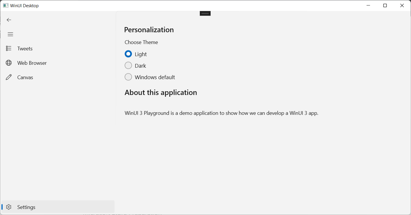
We can control the application UI theme to be either light or dark theme via a settings page.

By default, the NavigationView will have a Settings button because its IsSettingsVisible is true by default. Since the default tag of the Settings button is “Settings”, we can simply link it up to our settings page by creating a SettingsPage. We can use the SettingsPagePage.xaml from the Windows Template Studio as the reference of our SettingsPage.

Settings page copied from the Windows Template Studio.

We first need to create a static class ThemeSelectorService. In this service, we will save and load the app theme in a setting called “AppBackgroundRequestedTheme” in the ApplicationData.LocalSettings.

Then we will also set the app theme in the service as follows.

public static void SetRequestedTheme()
{
    ((FrameworkElement)((MainWindow)(Application.Current as App).MainWindow).Content).RequestedTheme = Theme;
}

Finally, we will initialise the service when the app is launched normally, as demonstrated below.

protected override void OnLaunched(Microsoft.UI.Xaml.LaunchActivatedEventArgs args)
{
    ThemeSelectorService.Initialize();
}

Win2D in WinUI 3

Win2D is a Windows Runtime API for immediate mode 2D graphics rendering with GPU acceleration. It utilizes the power of Direct2D, and integrates seamlessly with XAML. Previously, Win2D is available for UWP only. Now the team is moving Win2D onto WinUI 3. However, we can already make use of the Win2D library now in WinUI 3 with Microsoft.Graphics.Win2D.

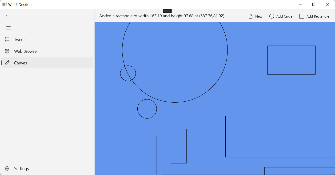
Drawing circles and rectangles on the Win2D CanvasControl.

In this app, instead of directly drawing to the CanvasControl, we draw to the Command List Drawing Session (CLDS) where command list is an intermediate object that stores the results of rendering for later use.

void CanvasControl_Draw(CanvasControl sender, CanvasDrawEventArgs args)
{
    ...

    CanvasCommandList cl = new CanvasCommandList(sender);
    using (CanvasDrawingSession clds = cl.CreateDrawingSession())
    {
        ...
        clds.DrawCircle(...);
        ...
        clds.DrawRectangle(...);
        ...
    }

    args.DrawingSession.DrawImage(cl);
}

Deploy WINUI 3 App to Microsoft Store

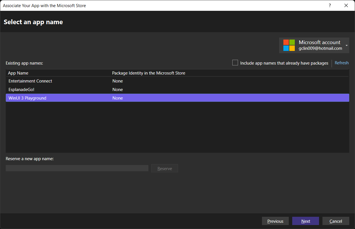
After we have successfully reserved an app name on Microsoft Store, we can then associate our app with it in Visual Studio, as shown below. The following popup is shown after we right-click on WinUI 3 project in the Solution Explorer and choose “Package and Publish” then “Associate App with the Store…”.

Selecting an app name reserved on Microsoft Store.

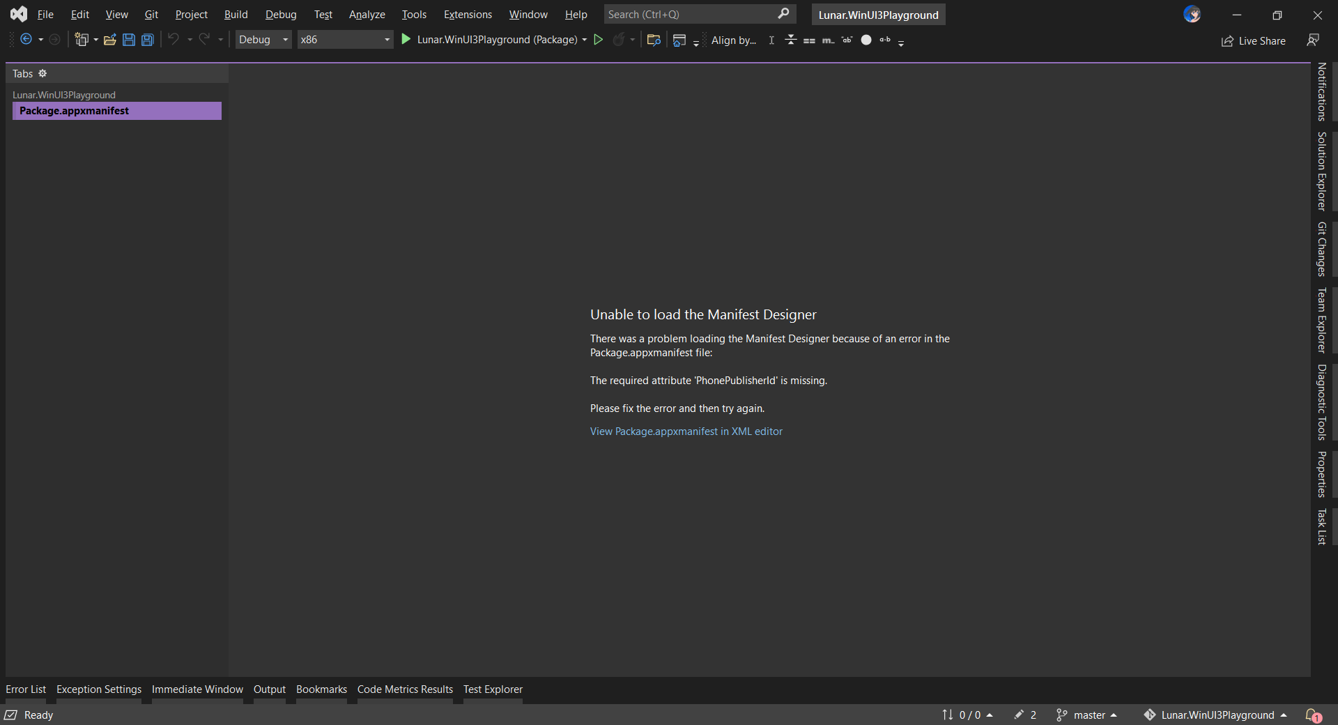
We will then be alerted when we try to build our WinUI 3 project again because our Package.appxmanifest file has an error, as shown below.

The error says the required attribute “PhonePublisherId” is missing.

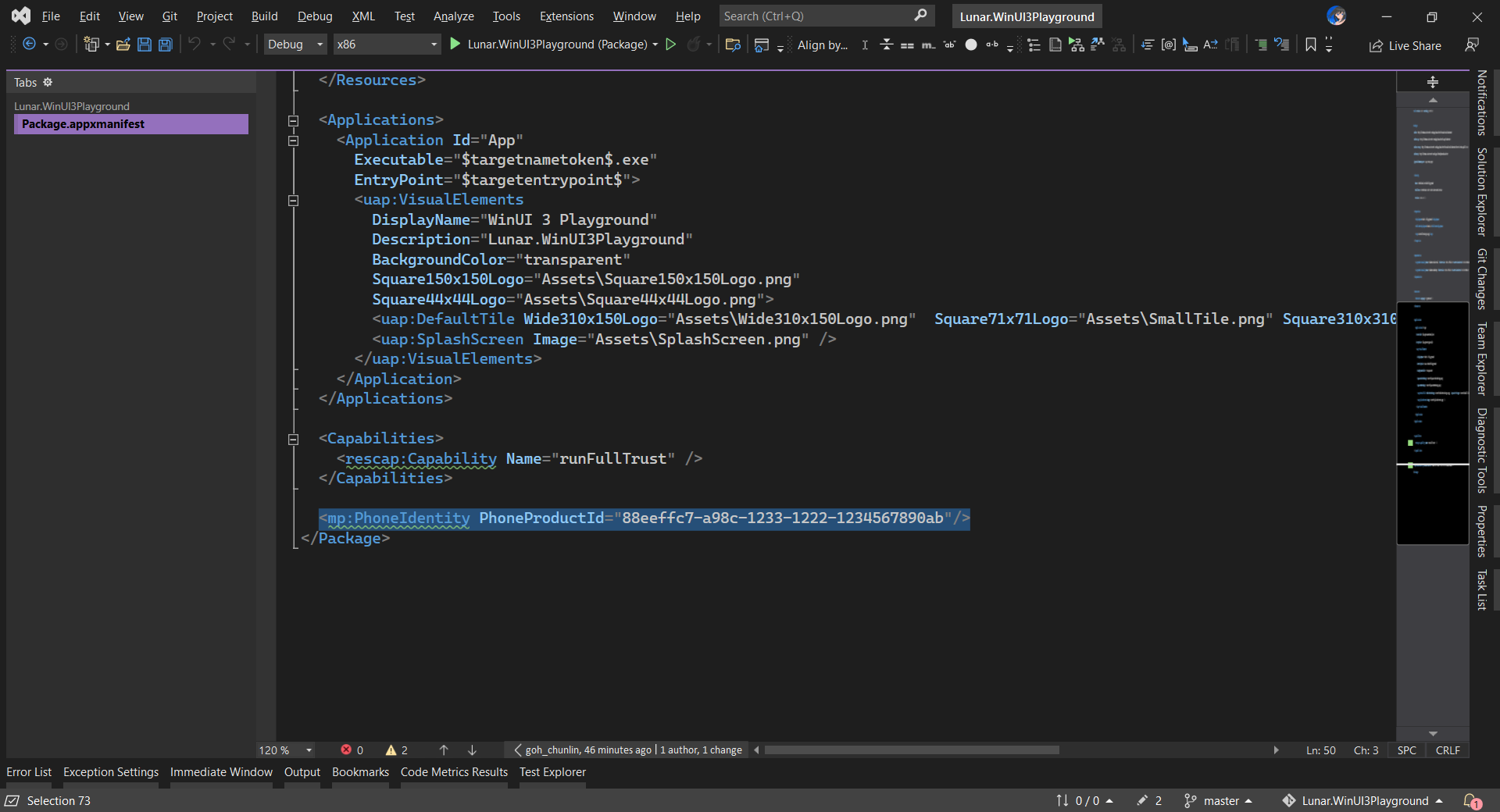
If we’re to open the file in XML editor, we will notice that PhoneIdentity is being added without us knowing, as highlighted in the following screenshot. This line should not be needed because our WinUI 3 app is not going to be made available on Windows Phone (in fact, there is no more Windows Phone).

We need to delete the PhoneIdentity to proceed.

Hence, the error will be gone after we delete the PhoneIdentity line. Now, we can continue to package and publish our app to the Microsoft Store, as shown below.

Uploading the msix of our WinUI 3 app to the Microsoft Store.

Finally, we also need to take note that currently in Windows App SDK version 1.0, only MSIX packaged apps that are full trust or have the packageManagement restricted capability have the permission to use the deployment API to install the main and singleton package dependencies.

References