MS Campfire: Talks, Codes and Buffet

Me: “There is an interesting event organized by Microsoft. Could I take one-day leave to join it?”

Boss: “Oh? Why do you need to take leave? You can just join it since it’s a good opportunity to learn exciting stuff, right?”

Thanks to my boss, I was allowed to take part in MS Campfire even though that day is a working day. Thus, I was glad to have my boss to support me in learning more. Of course, I had to write a report regarding what I had learnt from the talks since my boss hoped that other software engineers could benefit from that also.

MS Campfire was a 2-day event where many great speakers from Singapore and oversears were invited to give interesting talks on exciting topics:

  1. Mobile App Design
  2. Gamification
  3. Key HTML5 Must-Know Features
  4. The Importance of Prototype
  5. Windows 8 Development and the Metro Design Language
  6. The Kinect Effect

I enjoyed the presentation given by Rob Miles, lecturer from University of Hull. His presentation was about Kinect and a bit of Microsoft Robotics Developer Studio. His Kinect app demos were all very cute, especially the Bug Splat Game. All his slides and codes used in his talk could be found in his blog: http://www.robmiles.com/journal/2012/4/13/campfire-fun-and-games.html.

WinRT introduced during the Win8 talk was also very interesting. It’s exciting to see now developers can build Metro style app with JavaScript (together with HTML and CSS) also! In the talk, Hammad Rajjoub and Bruce Wang from Microsoft also showed us how to easily add Search Contract and Share Contract easily to the app that we built. So, now by entering keywords in the search box, the users are able to search for the content published by our apps also. It’s quite cute, isn’t it?

Yup, overall, it was a nice learning experience. =)

MS Campfire: Buffet
Oh, nice buffet (this is the only photo found in the Spiffy #MSCampfire album that has me inside). Photo Credits: Spiffy

OneSimpleTablePaging: Doing Client-Side Table Pagination Easily

Motivation

Few days ago I was finding a solution for client-side HTML table pagination then I reached this page where I found a rather simple JS table pagination done by Ryan Zielke: http://neoalchemy.org/tablePagination.html

I like his solution very much because it does not require a lot of random CSS and JS files. In order to have the table pagination working in my web page, I just need to include one JS file and four images for the buttons. That’s all.

Few days after that, I started to think if there are ways to simplify his code and also to avoid using any image file. I would like to see if it’s possible that the table pagination can be done with just very simple and easy to understand JS code.

Mission Start!

After spending one day in Alumni Service Centre, NUS, I finally finished the first version of the project. I name it OneSimpleTablePaging: http://one-simple-table-paging.googlecode.com.

It now becomes my another open-source personal project after Google Docs Notifier and OneSync.

In my version, user can only customize the number of rows per page and the position of the pagination bar. This is to keep the code simple. So, if the user is okay with the default settings, after include the jQuery libraries and the OneSimpleTablePaging JS file to his/her web pages, he/she can actually just apply the method oneSimpleTablePagination() with empty array as parameter to existing tables to get the table pagination, for example

$(‘#main-table’).oneSimpleTablePagination({});

Yup, so now everything is so easy and straightforward. =)

Mission Clear

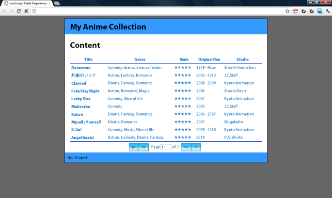
The following screenshot shows the look-and-feel of the table pagination handled by OneSimpleTablePaging.

OneSimpleTablePaging In Action

By the way, the table showed in the screenshot is a collection of my (favourite) watched anime. =P

Yup, now you can visit the project homepage of OneSimpleTablePaging hosted on Google Project Hosting to download the source code and then play with it. =)

Edit (22 Oct 2014)

OneSimpleTablePaging is now on GitHub!
OneSimpleTablePaging is now on GitHub: https://github.com/goh-chunlin/one-simple-table-paging!

Introducing Viewport to Mobile Website

Yesterday I downloaded Windows Phone Emulator from Microsoft Download Center (http://www.microsoft.com/download/en/details.aspx?id=13890). It came along with Visual Studio 2010 Express, Expression and XNA Game Studio 4. I basically just wanted to see how my mobile website will look on WP7.

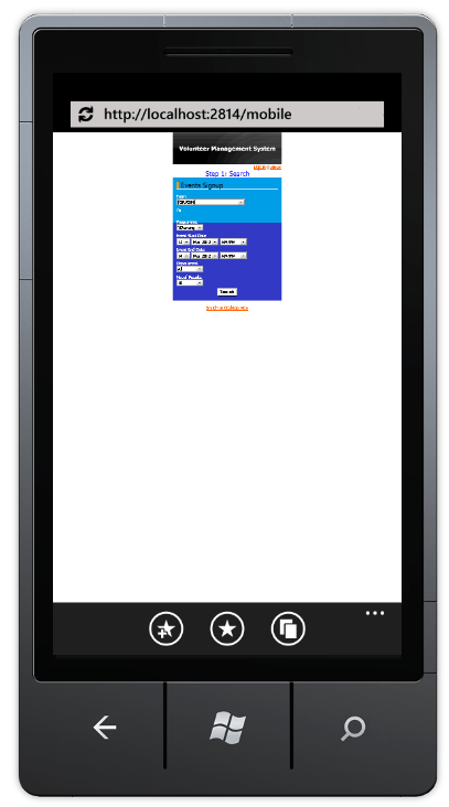
Then I realized the display of the web page had some problems, as shown in the following screenshot.

Phone Website - Without Viewport Meta Tag
Ano... Can't see.

It seems like the phone is showing the website as like on desktop.

Viewport

The screen size of mobile is always an important thing to take care of when I’m developing the mobile version of my website. Phone normally has screen width of about 400px. My Motorola Quench XT3 has the screen size of 320px x 480px (Reference: http://www.gsmarena.com/motorola_xt502_greco-3354.php). Hence, I need to find a way to tell the phone browser to show only the part with text.

So, how about setting the width of the body/div of the web pages? It just won’t work. Actually the screenshot shown above was done by setting the width of the div to be 320px and then positioning it at the center of the page. This method won’t work on most of the phones, except maybe my Android phone. In my Android phone browser, the website auto scale to fit the actual screen width. However, it’s not the case in my friend’s Android phone.

There are two types of viewport: Visual Viewport and Layout Viewport. There are a few very good online articles and discussion about these two viewports. For example, interesting and detailed explanation of the two can be found here: Browser compatibility — viewports and A tale of two viewports — part two. There is a thread discussing this on Stack Overflow: http://stackoverflow.com/questions/6333927/difference-between-visual-viewport-and-layout-viewport.

Solution

Soon, I found that by adding the viewport meta tag as shown below, the problem seems to be solved.

<meta name=”viewport” content=”width=device-width, minimum-scale=1.0, maximum-scale=1.0″ />

It allows developers to tell the phone browser how the web page should be shown.

The code above says the width of the viewport to be the width of the device. Setting the maximum-scale to be 1.0 is to prevent users to expand the window size beyond the initial size. Munimum-scale is also playing the similar role. However, these two are currently not supported in the initial release IE Mobile for WP7 (Reference: The IE Mobile Viewport on Windows Phone 7). So, to keep user from scaling the viewport, I have to set user-scalable to be false in the viewport meta tag. Anyway, for details explanation on the viewport tag setting, please refer to The IE Mobile Viewport on Windows Phone 7 (for IE Mobile on WP7) and Configuring the Viewport (for Mobile Safari on iOS). Meanwhile, Firefox also started to support viewport meta tag with the same properties as Mobile Safari two years ago: Using the viewport meta tag to control layout on mobile browsers.

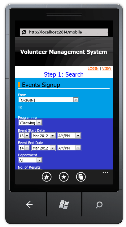
Yup, after adding in the viewport meta tag, the web pages look fine on the emulator.

Phone Website - With Viewport Meta Tag
Yup, the mobile website looks good now. =)

Flipping Table: Showing Very Wide Table on Phone

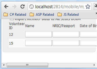
Most of the mobile phones have vertical screen, so building a mobile website where user needs to scroll horizontally frequently is a No. Thus, it is not a good idea to have HTML tables which are very wide, especially those have text-boxes and many other fields for user to fill in as shown below.

Before Flipping Table
Have to scroll horizontally to fill up information in a wide table

After the first version of the mobile website is done, I now focus on making the columns of the wide tables to be shown vertically, like the one shown below.

Columns now become rows

It is done using CSS. I like the solution very much because unlike some other solutions which require changes done to the ASPX, this solution with CSS will not affect the C# code behind.

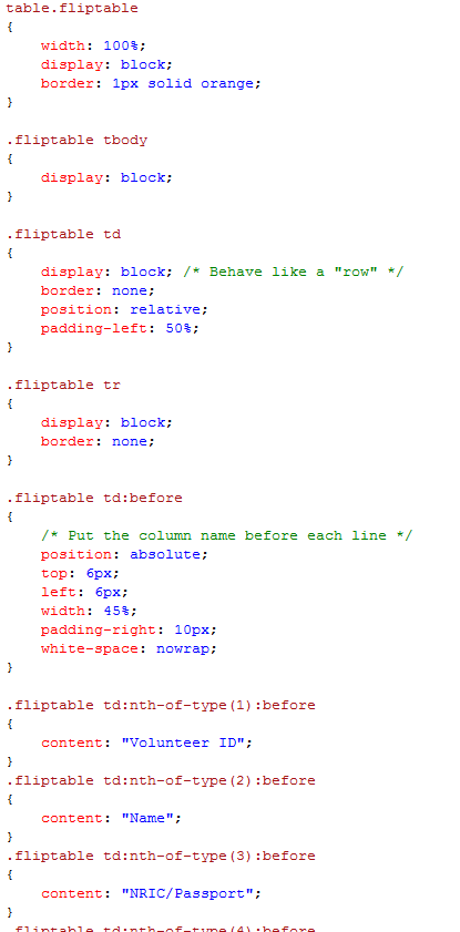
The CSS part is quite straight-forward. The idea is just to make each cell of every row to show line by line in the row. After that, the name of the columns will be placed in front of each line:

Fliptable CSS
The rest of the CSS is just adding header text to each row

There is an advanced solution posted online where the table can actually decide the layout itself based on the screen size: http://css-tricks.com/responsive-data-table-roundup/. That advanced version allows the user to get different look-and-feel on different devices. However, I somehow could not get it to work on my ASP website. Thus, I modified it to a simpler version as shown above.

Oh yeah, the CSS above does not work in Internet Explorer. According to a discussion on Stack Overflow, adding “float: left” to .fliptable td seems to solve the problem (at least in IE9).