This article will be written in English first and then followed by Chinese. 这篇文章将会先以英文书写,而后再以华文书写。
Owning a landed residential house in Johore state means that one should pay at least two taxes, i.e. the Cukai Tanah (Quit Rent, aka Land Tax) and Cukai Harta (Tax Assessment, aka Property Tax).
Cukai Tanah is the land tax imposed on private properties by Johore state government. The land taax is administered by the Pejabat Tanah dan Galian (Land and Mines Office).
While Cukai Tanah is paid by the house owner to the Johore state authority, Cukai Harta is paid to the local authority, for example Majlis Bandaraya Johor Bahru (Johor Bahru City Council).
Cukai Tanah is paid annually while the Cukai Harta needs to be paid every six months. So it is normal for one to not always remember the payment steps. Hence, I decide to write this article for not only myself, but also other Johore residents as a reference when we need to pay the taxes.
Web portal of JohorPay. There are mobile apps of it as well.
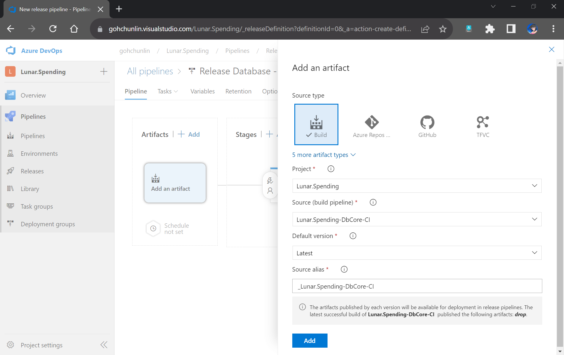
To make payment for the Cukai Tanah, we first need to register an account by clicking on “Daftar Baru” (New Registration) on JohorPay, i.e. https://johorpay.johor.gov.my/.
If you are a Malaysian paying for your own house in Johor, you need to choose “Individu – Warganegara” (Individual – Citizen) in the next web page.
Choosing user type.
Once we have ourselves registered on the platform with our Malaysian IC, we will receive TAC (Transaction Authorisation Code), which is used for account verification, through either SMS or email. According to the website, it is recommended to choose to receive TAC via SMS because there will normally a delay of a few minutes to receive TAC via email.
We can specify where the TAC should be sent to. SMS service is available only for Malaysia and Singapore numbers.
After we have our account verified, we can now login using our IC number and password.
We will first be presented with a list of government agencies. To make payment for the Cukai Tanah, we need to choose the Pentadbiran Tanah Johor, as shown in the screenshot below.
Choose Pentadbiran Tanah Johor in order to make payment for Cukai Tanah.
After that, we will be able to search (cari) of our bills by keying in our Malaysian IC number (kad pengenalan). We then can add unpaid bills (bil) to the cart (tambah ke troli) before we proceed to make our payment.
We can search for bills with our Malaysian IC number.
Once the payment is completed successfully, we can view our transaction history in the Transaction Record (Rekod Transaksi) page. To retrieve the official receipt of our payment, we simply need to click on the Print Receipt (Cetak Resit Pukai) button.
Once our payment is successful (berjaya), we can proceed to print the official receipt.
Since the receipts will be kept in JohorPay only until the end of the year, it is recommended to download the receipt right after our payment.
The official Cukai Tanah receipt.
That’s all the things we need to do in order to pay Cukai Tanah in Johore.
Cukai Harta (Tax Assessment / Property Tax)
As a residence in Johor Bahru, the capital city of Johore, every six months, I will receive notice from the Majlis Bandaraya Johor Bahru to inform me to make payment for Cukai Harta.
eKhidmat is still not using HTTPS for their web portal.
If we do not yet have an account on eKhidmat, we simply need to register one by clicking on the Daftar Akaun (Register Account) button. After that we have to verify our new account by clicking on the given link sent to our email address.
Please do not forget your password on eKhidmat because their password retrieval function is unstable. One may not receive the Password Reset emails no matter how long one has waited.
Once we have logged in, we have to choose a government agency (pilih agensi) based on where our house is located at. For example, if you are a resident in the Johor Bahru, then please choose Majlis Bandaraya Johor Bahru.
Choose the city council, municipal council, or district council based on which city your house is located at.
Next, we can proceed to pay (bayar) for the bill of Cukai Harta.
Choose Bayar > Cukai Harta to proceed to make payment.
In the next page, we need to enter both the No Akaun (Account Number) and No. Bil (Bill Number) to retrieve the corresponding bill.
We can search for unpaid bill with our account number and bill number.
These two numbers are available on the tax assessment bill, which is yellow/orange in colour.
Where to find the Account Number and Bill Number of our Cukai Harta. (Image Source: Portal Rasmi MBJB)
Once the payment is done, we will receive a receipt from the payment gateway to our email. The official receipt will be delayed and sent from a few minutes to a few days later.
Official receipt from the city council MBJB.
That’s how we normally pay Cukai Harta online as Johor Bahru residents. It’s easy and straightforward, right?
I was recently asked about how to unit test stored procedures before deploying to servers. Unfortunately, there are not much discussions about unit testing stored procedures, especially with tools like SSDT and Azure DevOps. Hence, I decide to write this walkthrough to share my approach to this issue.
According to The Art of Unit Testing, a unit test is an automated piece of code that invokes the unit of work being tested, and then checks some assumptions about a single end result of that unit.
Without unit testing, one has no choice but to rely on system and integration tests which are normally performed in the later stage of the SDLC. Some teams may even resort to the troublesome way, i.e. manually testing the end product they’re developing to invoke their codes.
Unit testing of stored procedures is also very crucial. If the bugs in stored procedures are not caught in the early stage of development, it is very challenging to rollback the data changes that have been made to the database.
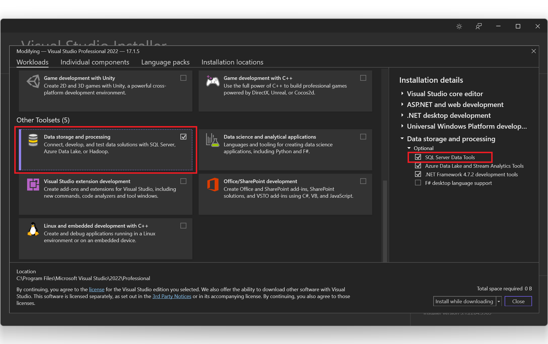
With SSDT, we can work directly with a connected database instance on/off-premise. We can use SSDT Transact-SQL design capabilities to build, debug, maintain, and refactor databases. In this article, we will be using SSDT to create unit tests that verify the behavior of several stored procedures.
Create a New Database Project
In this article, we will assume that we have an existing database hosted on Azure SQL server.
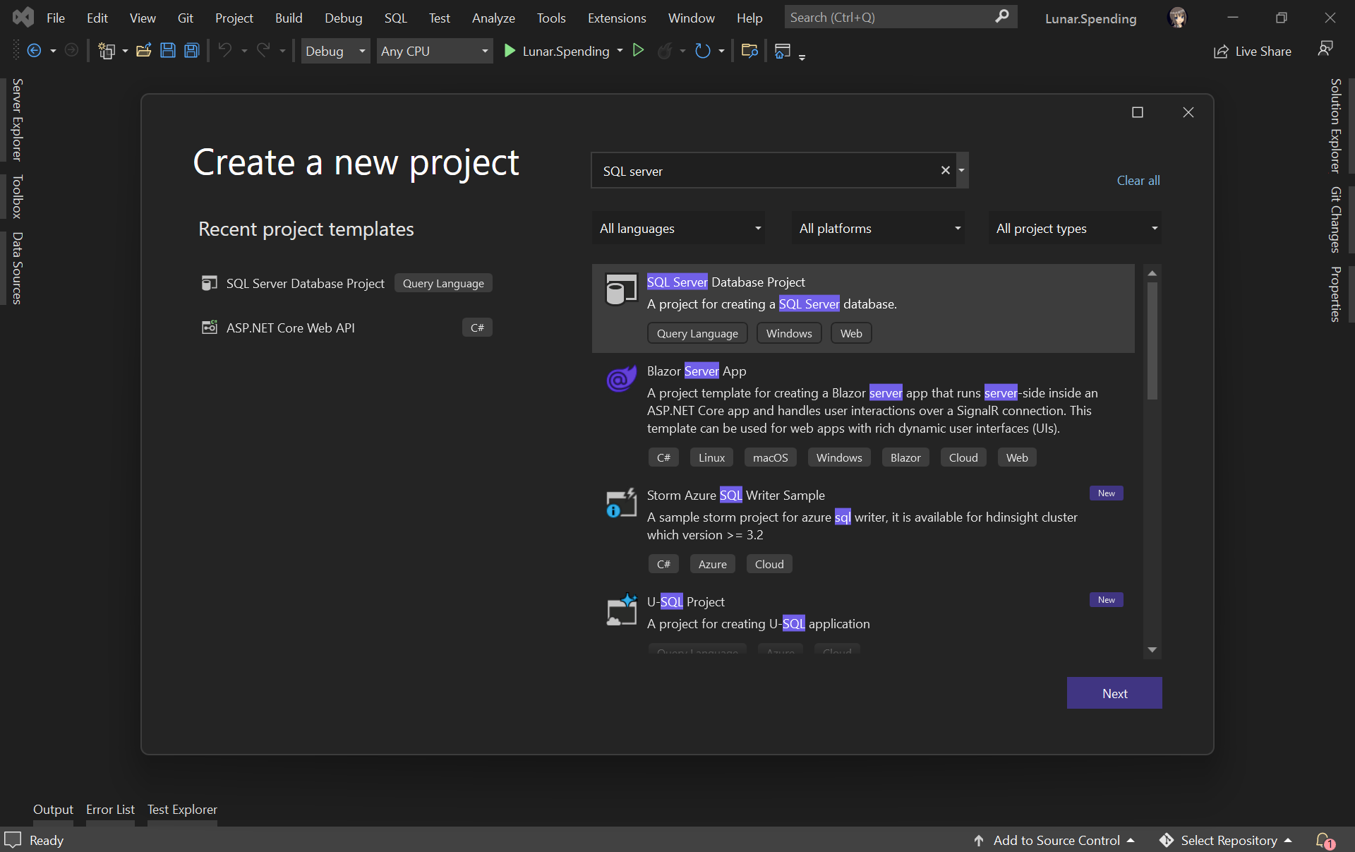
Firstly, as shown in the screenshot below, we need to create a new database project in order to import database schema and stored procedures from the database on Azure.
Creating a new SQL Server Database project on VS 2022.
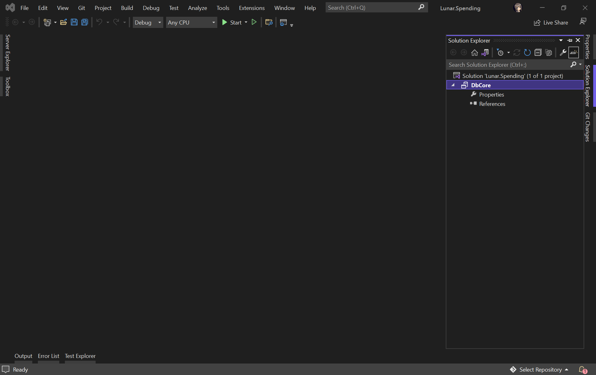
Let’s name our project DbCore. We will then see a simple DbCore project shown in our Solution Explorer, as demonstrated in the screenshot below.
The database project is successfully created.
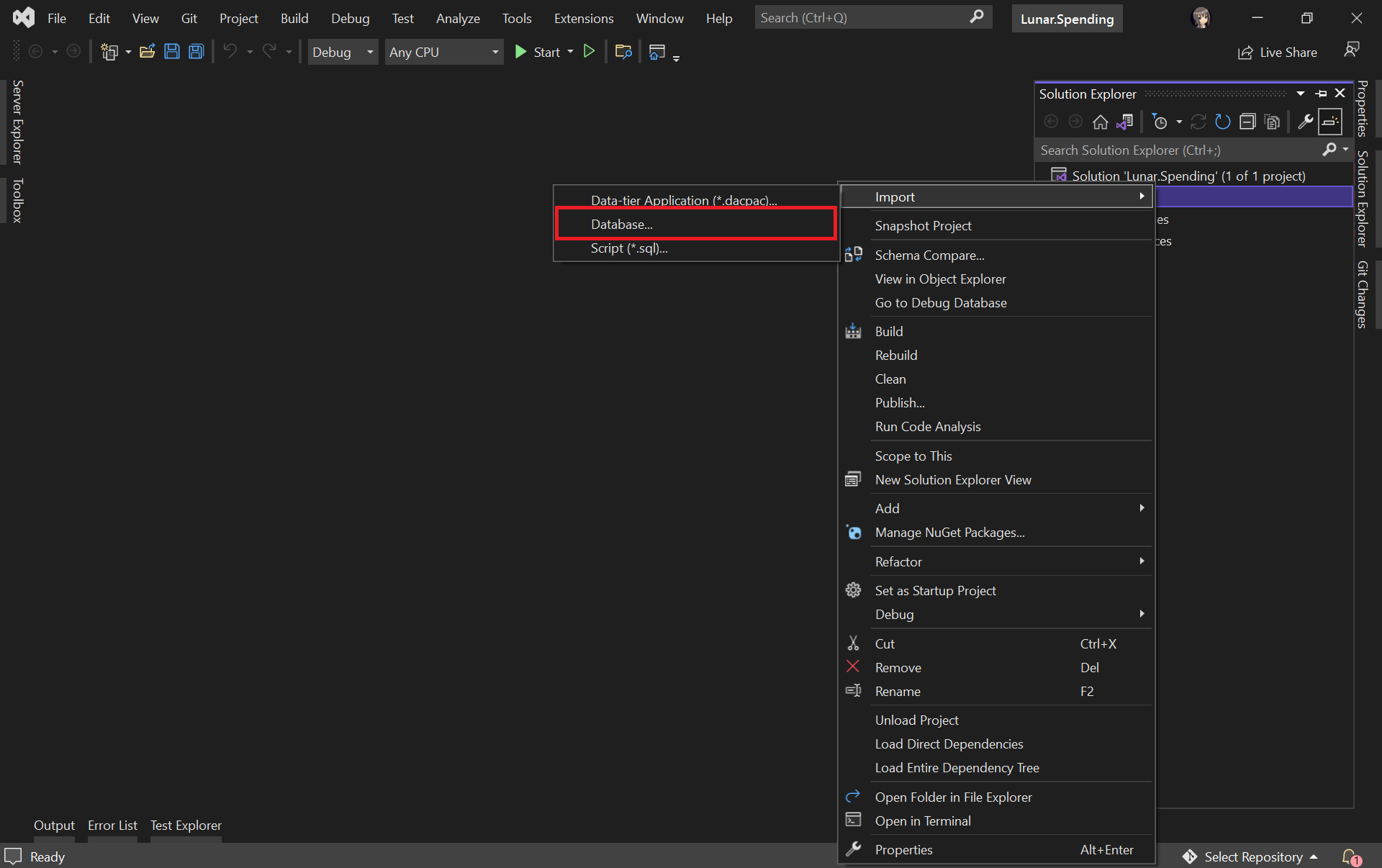
Next, we will import our Azure database into the database project by right-clicking on it in the Solution Explorer.
Select the “Database…” option to import from existing Azure database.
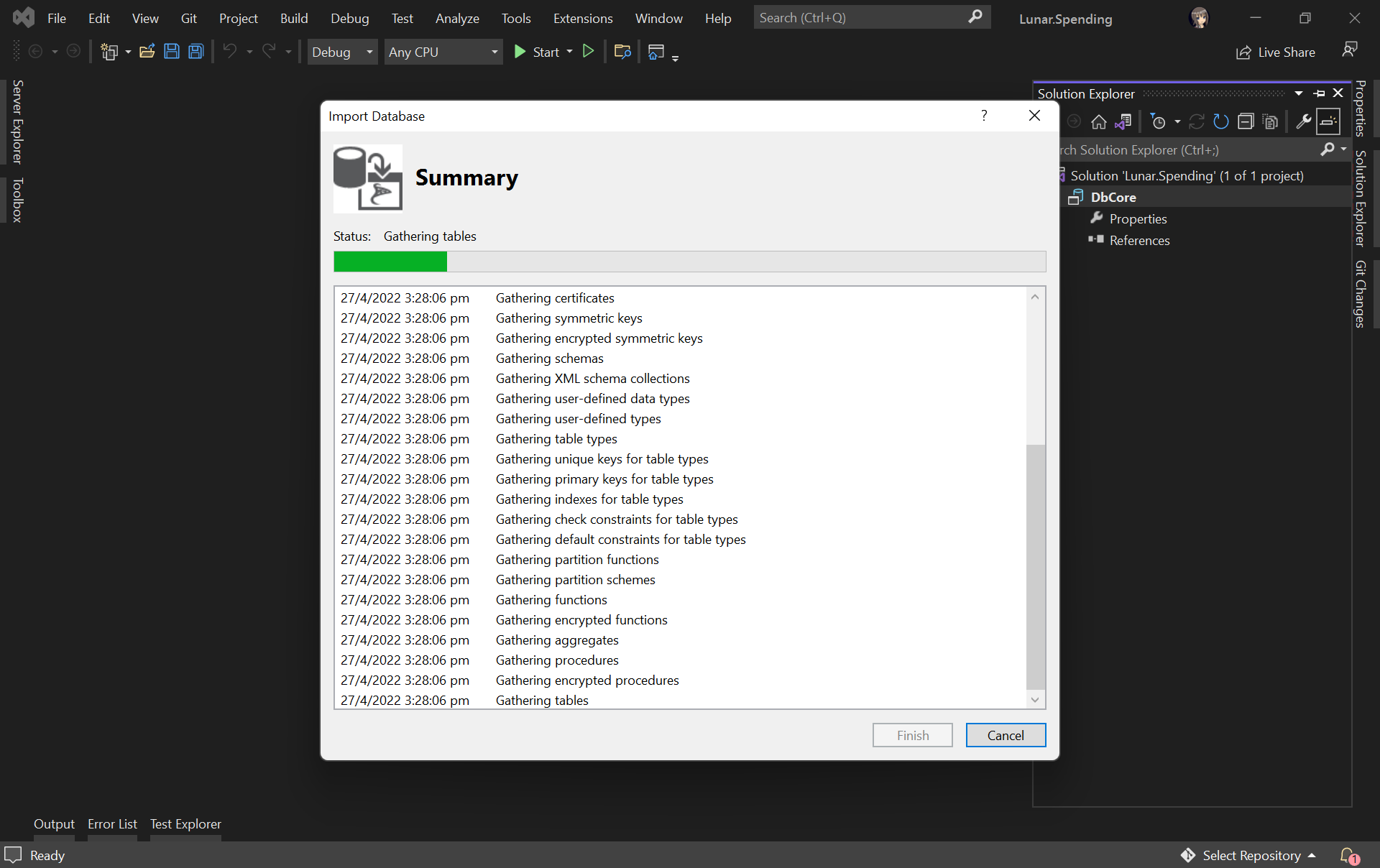
The widget will then import the data from the Azure database based on the given connection string, as shown below.
Importing database to our database project.
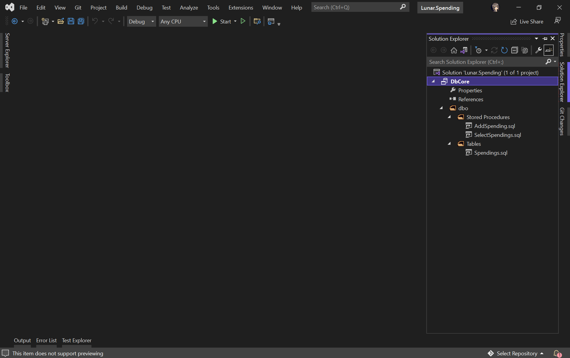
Once the import is done, we shall see our tables and stored procedures listed under the dbo directory in Solution Explorer, as shown below.
Table and stored procedures are successfully imported!
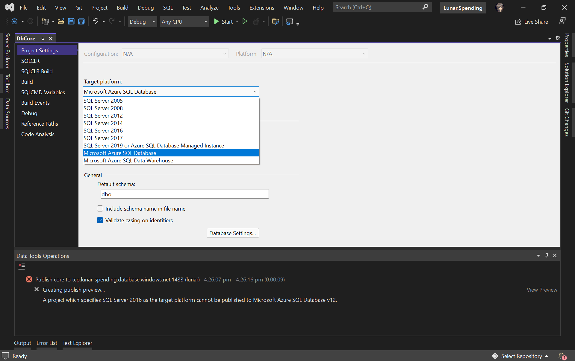
Before we continue, we need to edit the Target Platform of our database project accordingly, as shown in the following screenshot, otherwise we will not be able to publish the database later.
Changing the target platform to avoid the publish error.
Create Unit Test for Stored Procedure
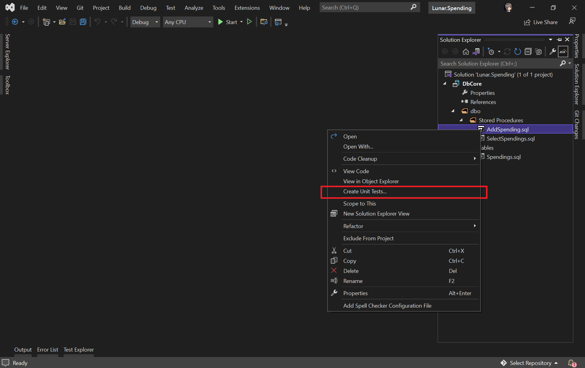
Let’s say we would like to unit test the AddSpending stored procedure. What we need to do is simply right-clicking the AddSpending stored procedure and then click on the “Create Unit Tests…” option, as demonstrated below.
Adding unit test for a selected stored procedure.
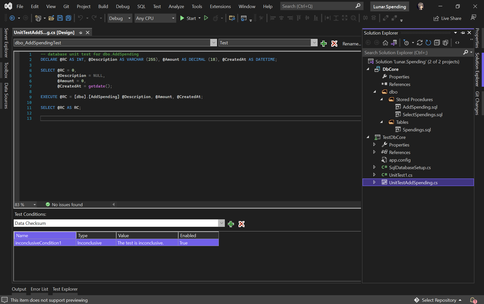
We will then be asked for the connection string of the database that the unit test project will be connecting to. Once the project has been successfully created, we will be given a template unit test as follows.
A boilerplate code of stored procedure unit test.
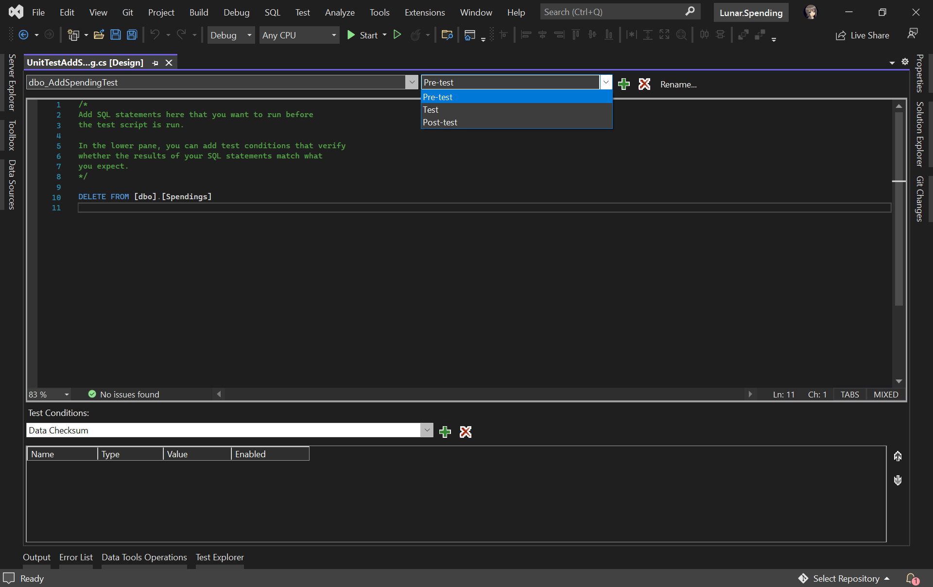
We can include pre and post test SQL statements which will be run before and after the test script is executed, respectively.
For example, we would like to have a clean Spendings table before the unit test runs, we can have the following SQL script to delete all rows in the table.
Pre-test script will be run before the test script.
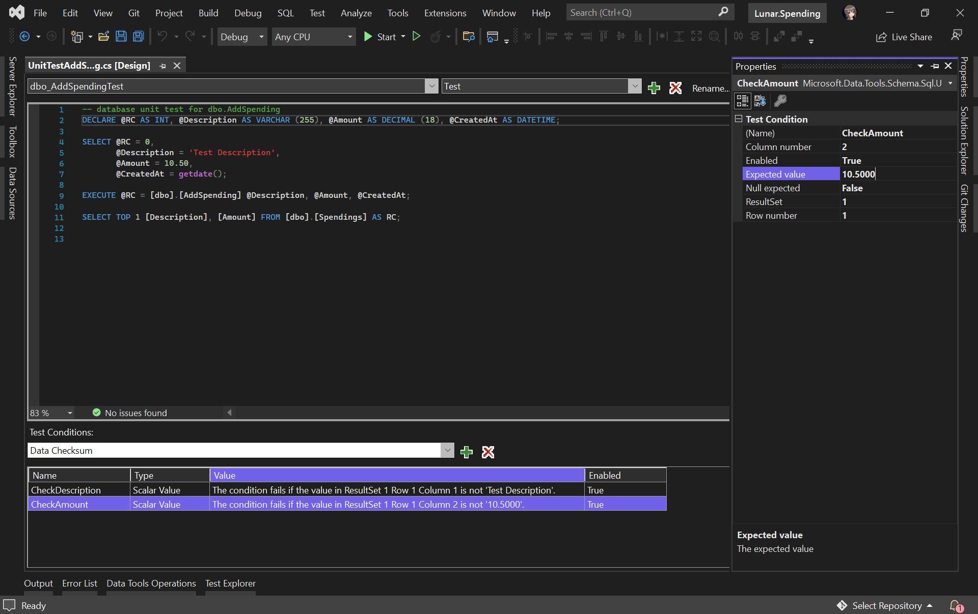
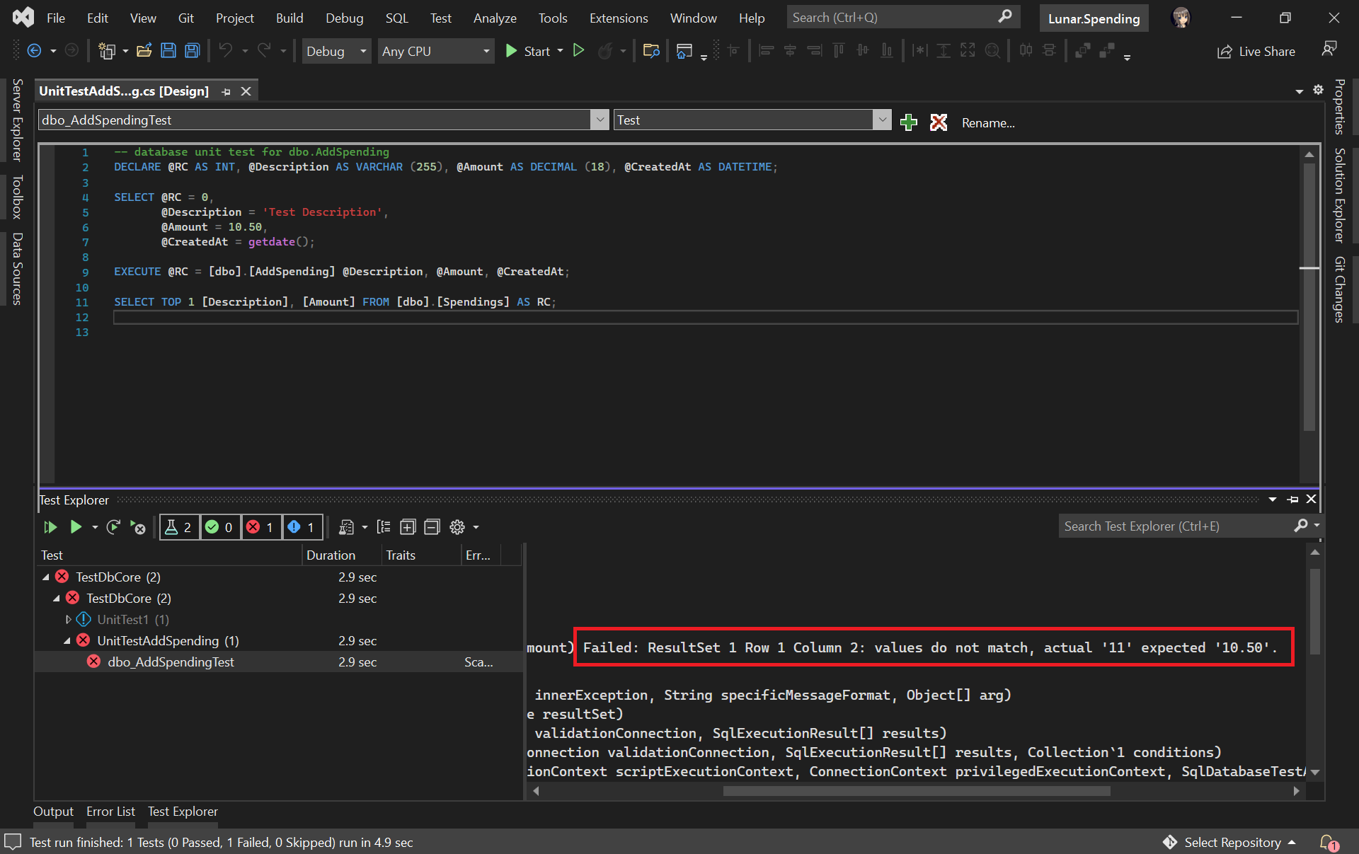
In our test script, we will test to see if the description and amount can be stored correctly in the database. Hence, we need to specify two Test Conditions to verify the two columns, as shown in the following screenshot.
RC means Return Code. It can later be used in a test case assertion.
Now, we can run our very first unit test with the Test Explorer to see if our stored procedure has any issue or not.
The test case fails. We shall check why the number is rounded up.
It turns out that this bug is caused by wrong data type used for the Amount column. Now we can proceed to fix it.
The test passed after we fixed the issue in our table schema and stored procedure.
Getting Ready for Publishing Database
As we discussed earlier, unit testing is not only about writing a piece of code to test our unit of work, but also making it to be automatically testable.
Hence, our next move is to automate the build, test, and release of our database.
Firstly, we shall make sure the source code of our projects is on GitHub (or any source control supported in Azure DevOps).
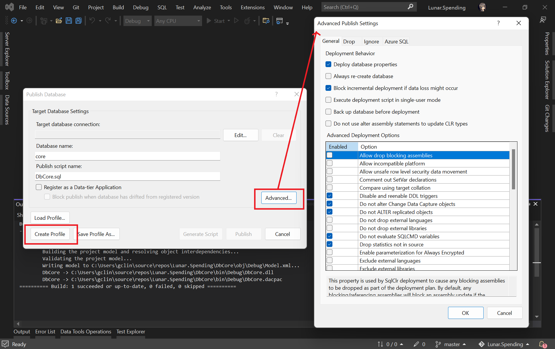
Secondly, we need to create the Publish Profile of our database. To do so, we simply right click on database project and choose the “Publish…” option. There will be a window popped out, as shown below.
Configuring the Publish Profile of our database.
As shown in the screenshot above, there are many settings that can be configured, including Azure SQL related settings. After configuring them accordingly, please click on the “Create Profile” button. Once it is grayed out, it means that the profile has been generated successfully. We can then proceed to close the popped-out window.
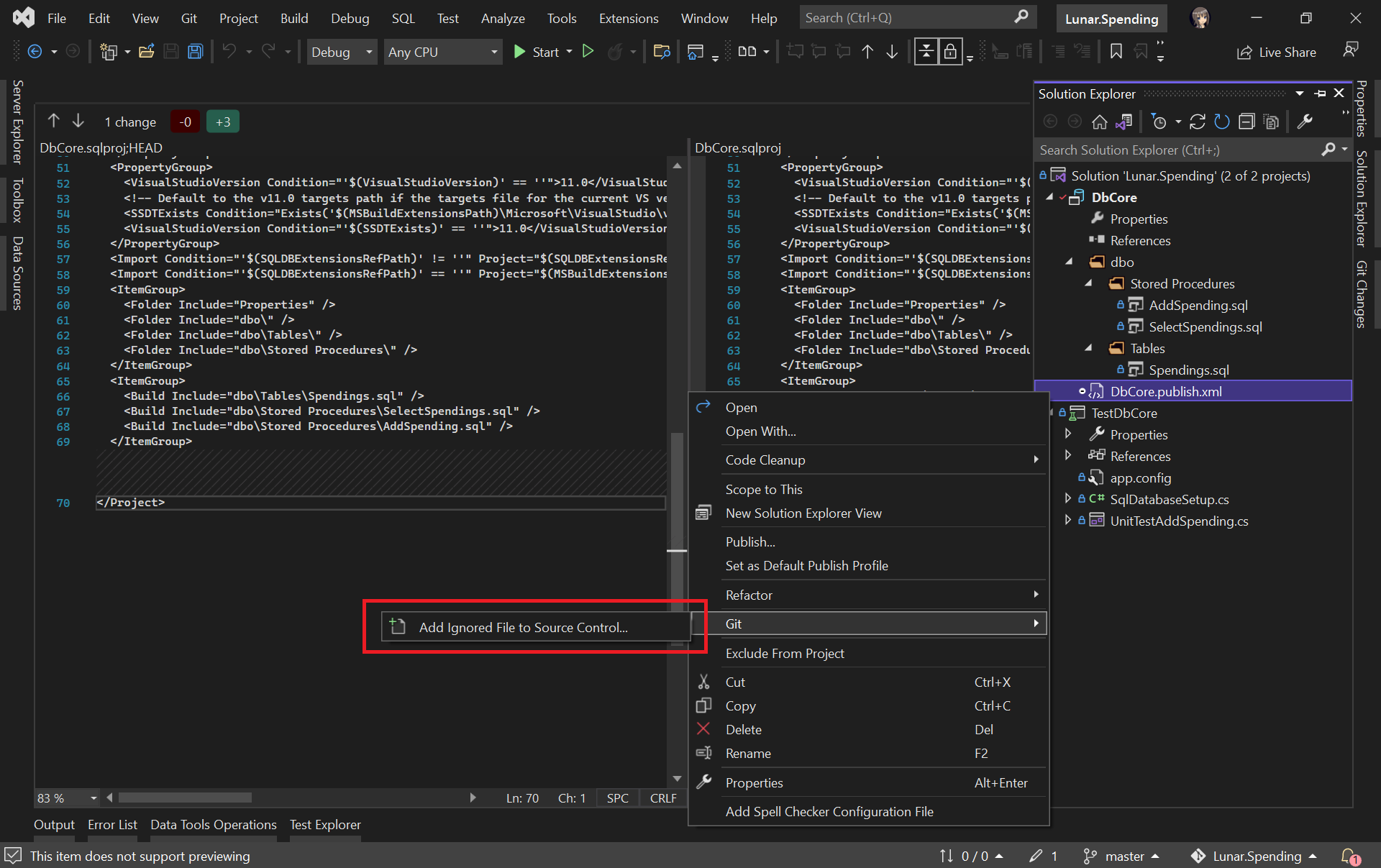
Please make sure the generated Database Profile file is included in the source control. Kindly add it to Git if it is not, as shown in the screenshot below. This is because this file is needed in our Azure DevOps build pipeline later.
Please make sure our Database Profile is included in source control.
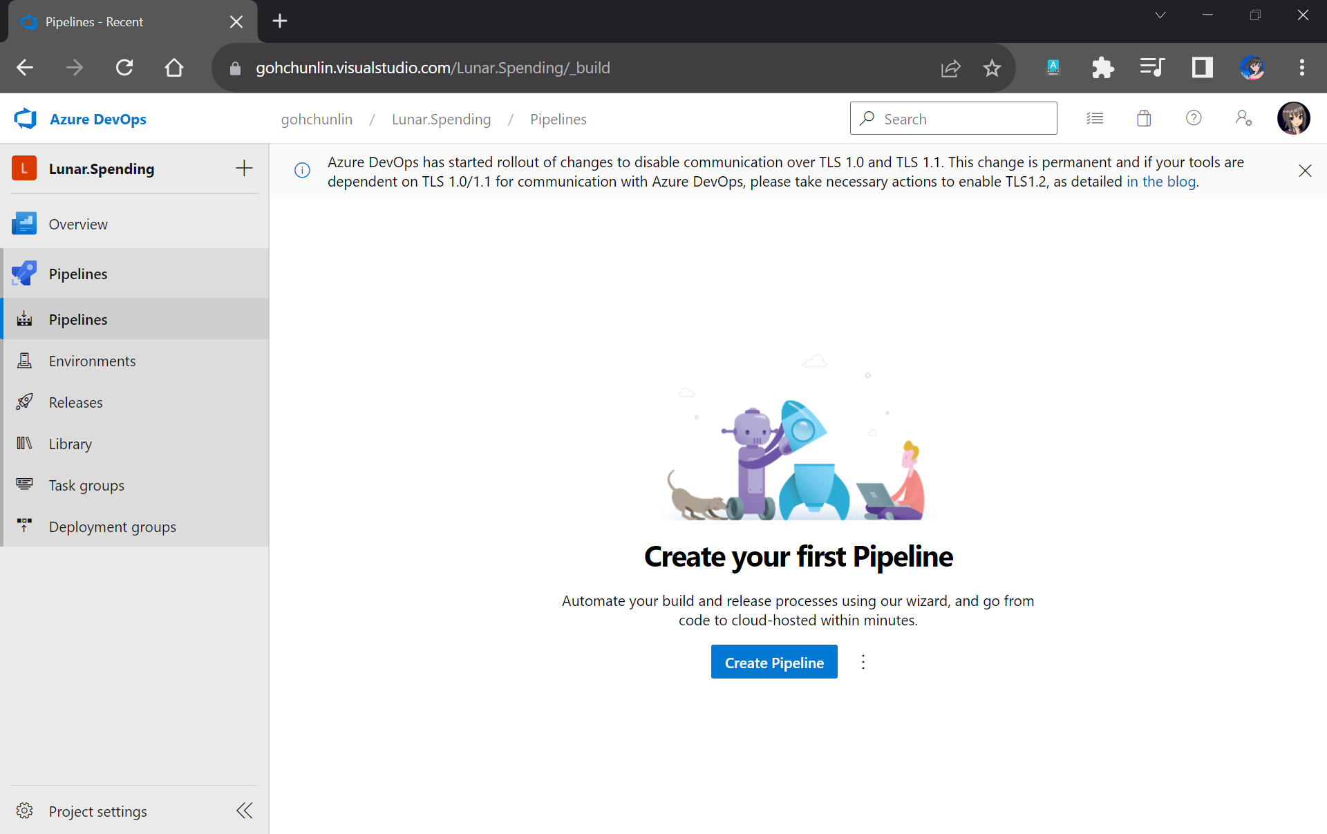
Finally, let’s create a project on Azure DevOps which will host the build and release pipelines for our automatic database deployment.
We will configure our project to have only the Pipelines service on Azure DevOps.
Setup Build Pipeline
Once we have created our project on Azure DevOps, we can proceed to create our Build Pipeline.
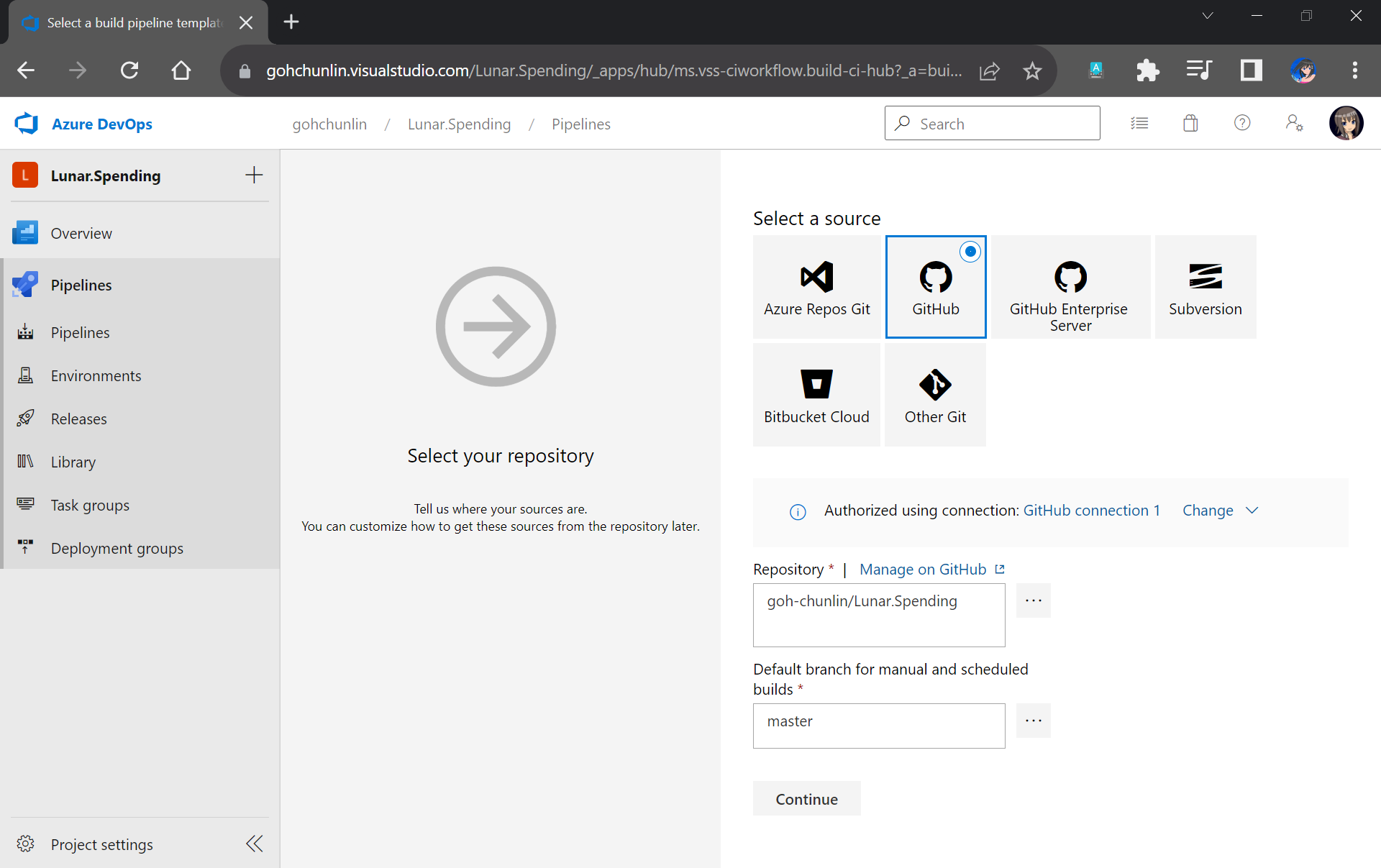
Firstly, we need to specify the code repository we are using. Since our code sists on GitHub, we will connect Azure DevOps with our project on GitHub as shown in the screenshot below.
Please remember to select the correct branch too.
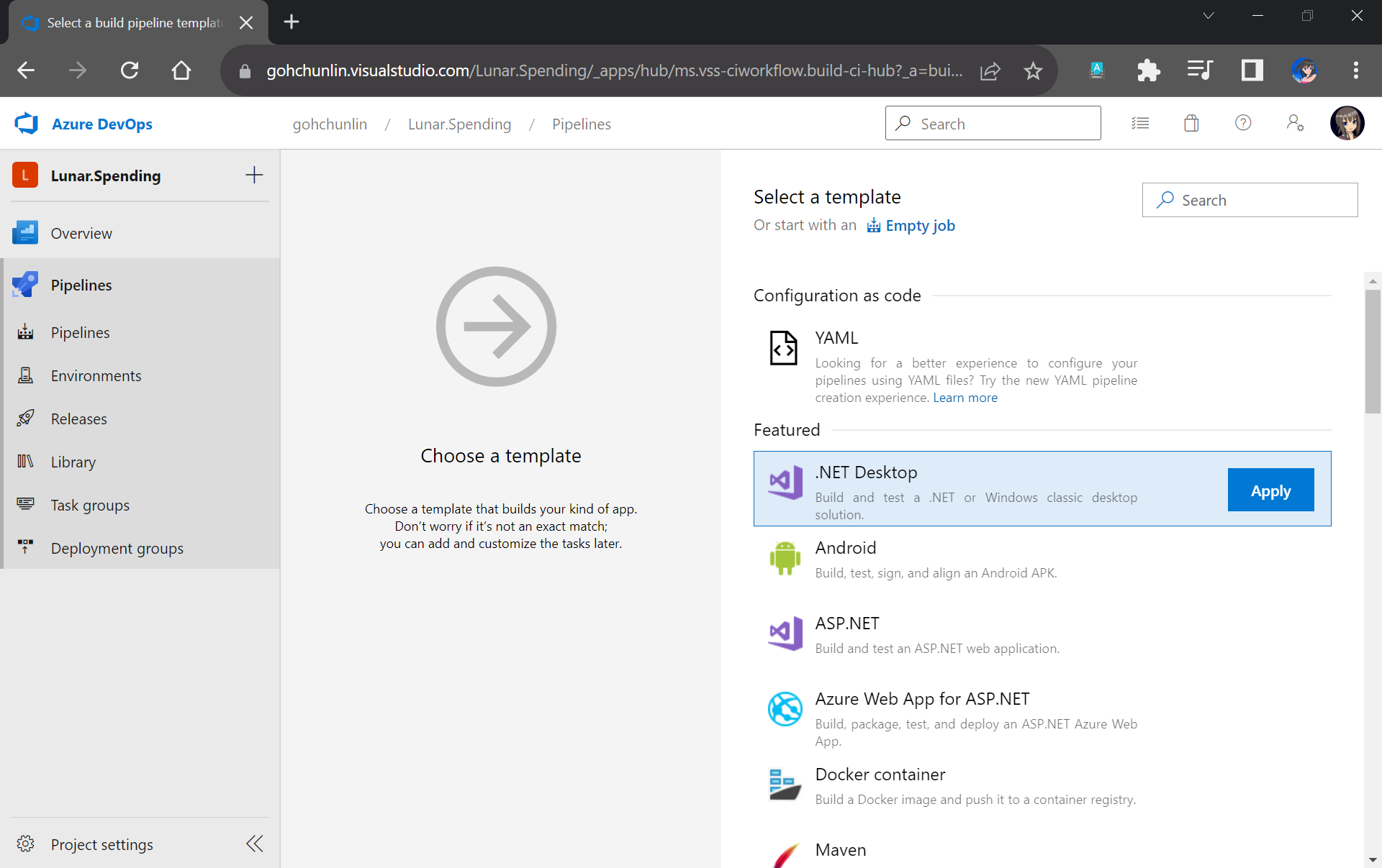
Next, we will start off from the .NET Desktop template. The reason why we choose this template is because it contains many tasks that we can use in our database build pipeline.
We will make use of the .NET Desktop template for our database build pipeline.
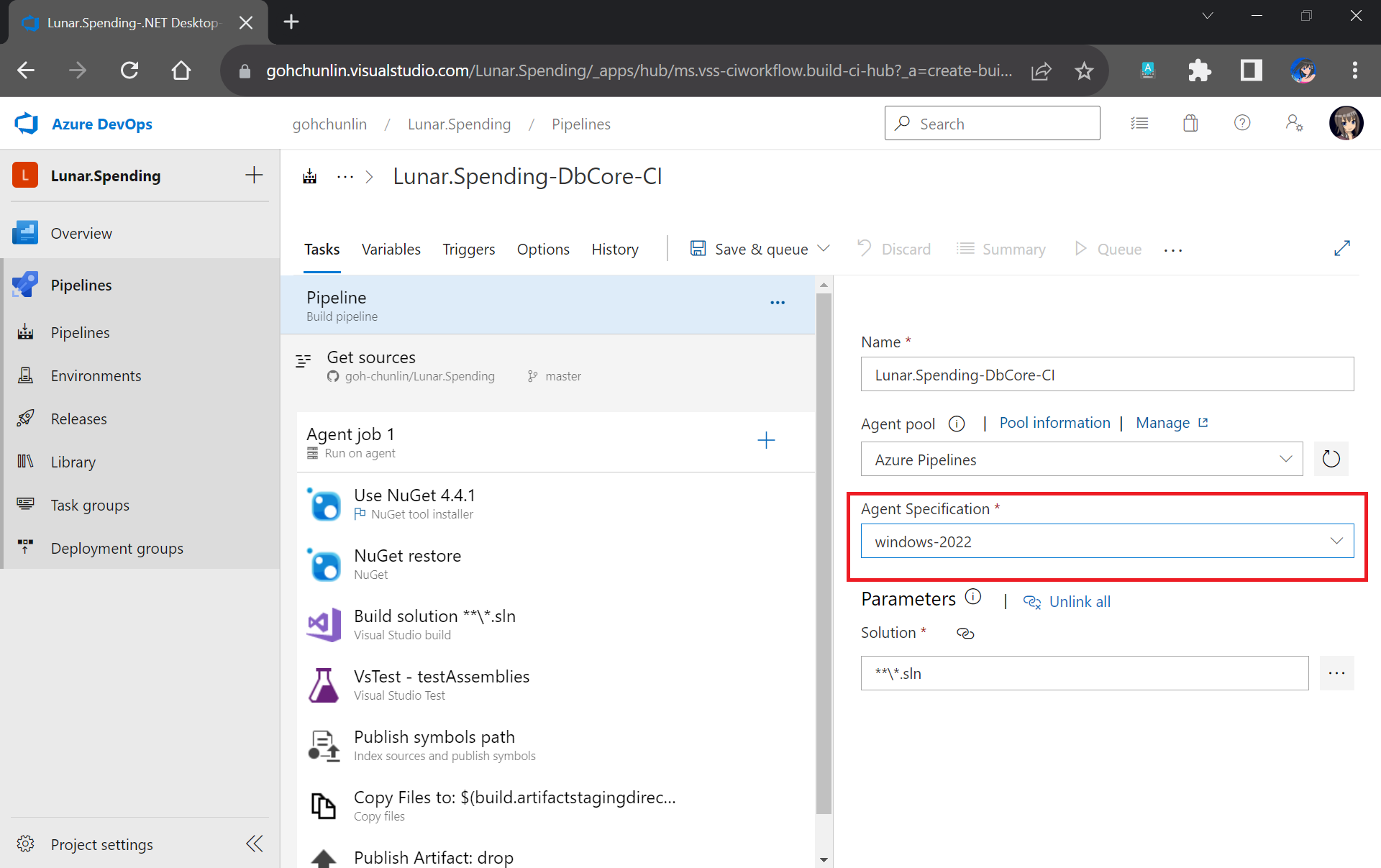
We need to make sure that “windows-2022” (Windows Sever 2022 with VS2022 installed), which is the latest version as of now, is chosen in the Agent Specification field. I have tried with the default “windows-2019” option before and there would be an error message “Error CS0234: The type or namespace name ‘Schema’ does not exist in the namespace ‘Microsoft.Data.Tools’ (are you missing an assembly reference?)”.
Please update to use windows-2022 as our build agent or else there would be issues later.
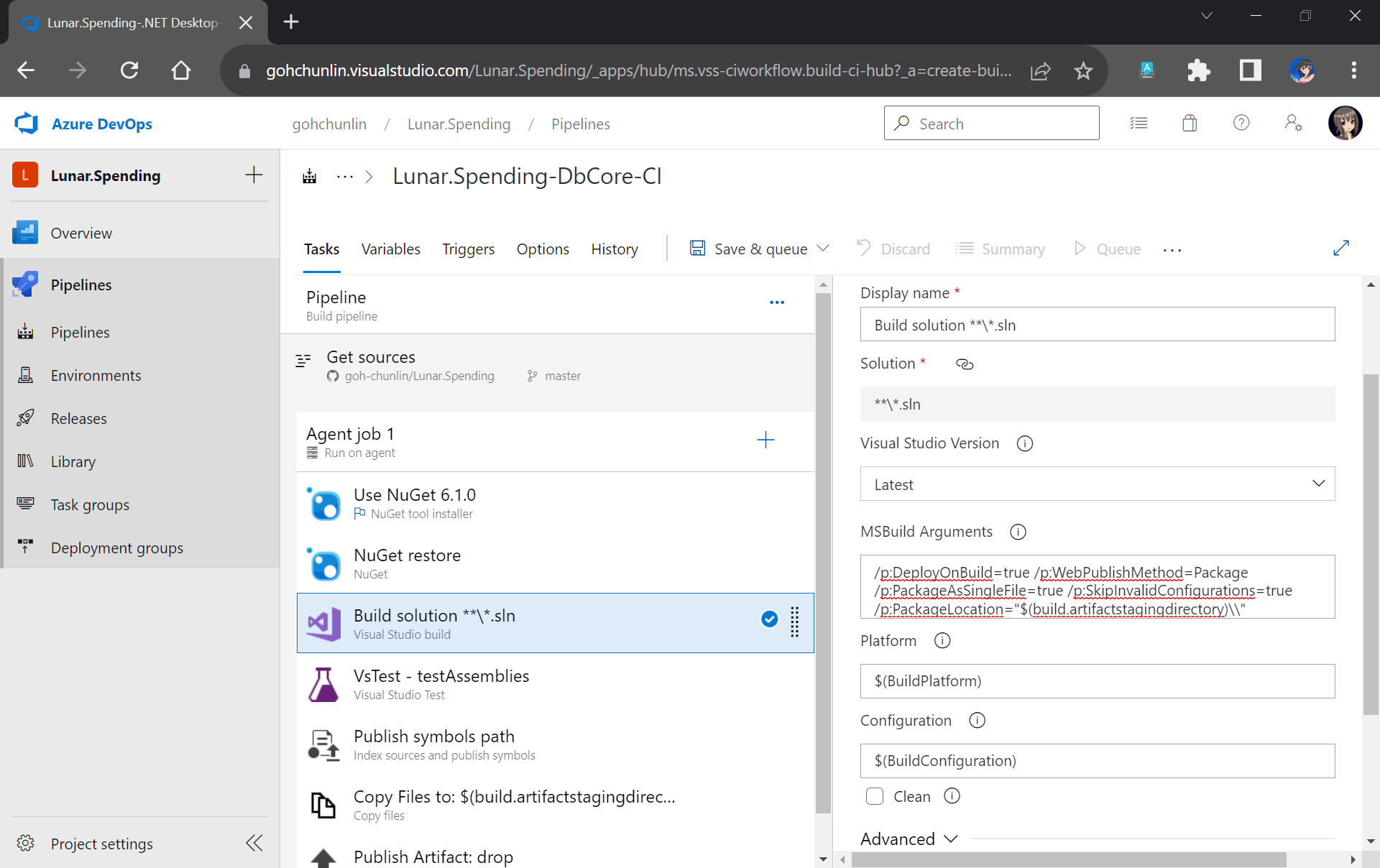
Next, we need to update the version of NuGet to be the latest, which is now 6.1.0.
After that, we move on to the third task in the pipeline which is building our Solution in Release mode with the following MSBuild Arguments on Any CPU.
We will remove the VsTest from the Build Pipeline because it will be proper to run the unit tests after changes have been deployed to the database. Otherwise, we will still be testing against the old schema and old stored procedures. Hence, we will add the testing task in the Release pipeline instead.
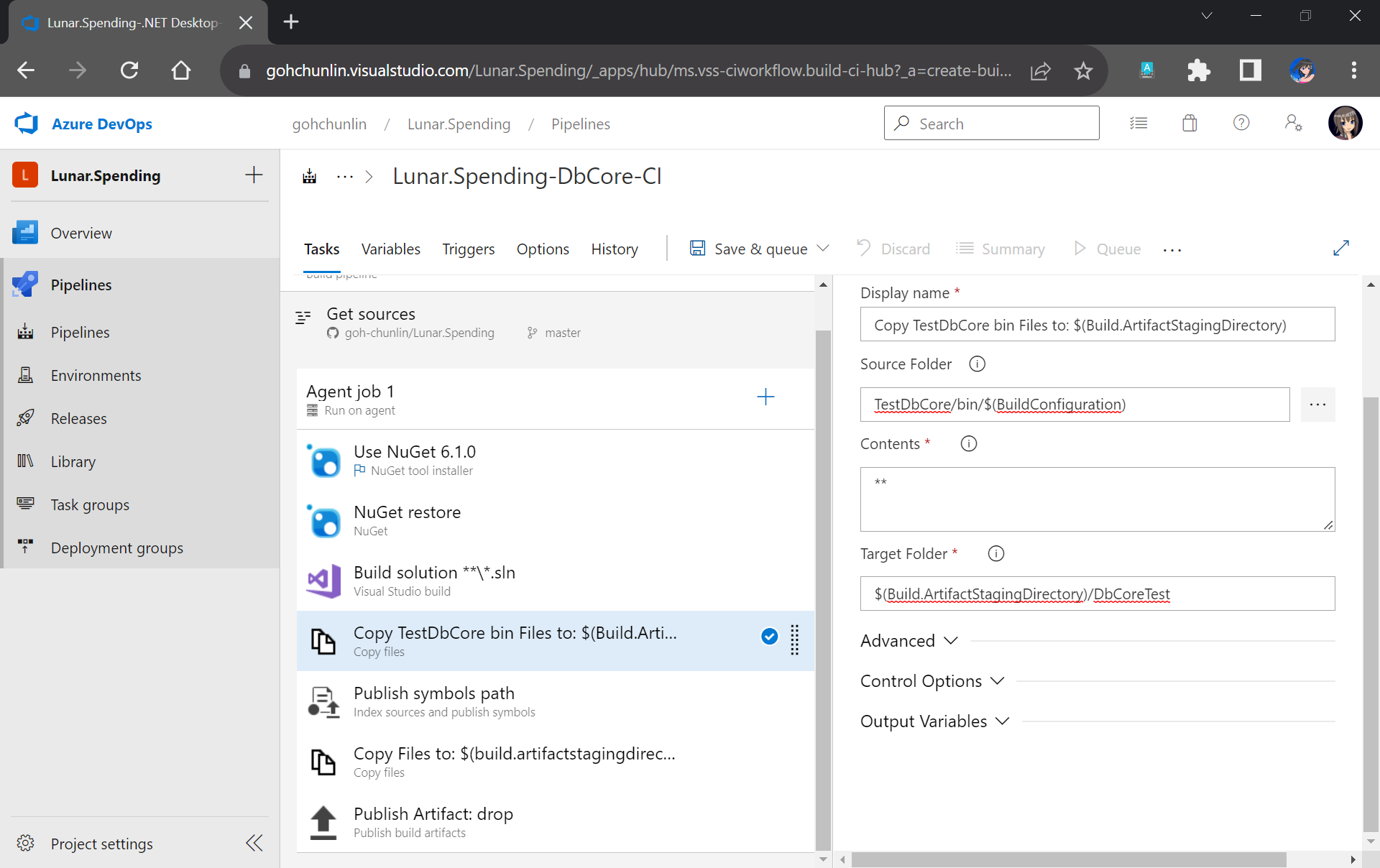
Now, since the testing will be done in the Release Pipeline instead, we shall create a task to copy the assemblies of TestDbCore project to the Build Artifact so that the assemblies can be used in the Release Pipeline later. Thus, we will add a new task “Copy Files” as shown in the screenshot below.
TestDbCore assemblies and other relevant files will be copied to DbCoreTest folder in the Build Artifact.
We will also remove the next task, which is publishing symbols because it is not necessary.
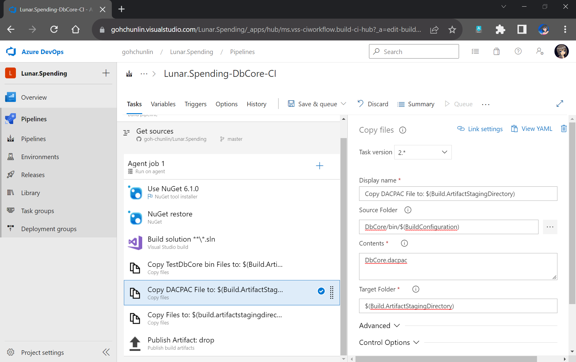
After that, we will add a new task to copy DACPAC file, which is generated during Build, to the Build Artifact, as shown in the following screenshot.
DACPAC file is needed to deploy our database to an existing instance of Azure SQL database.
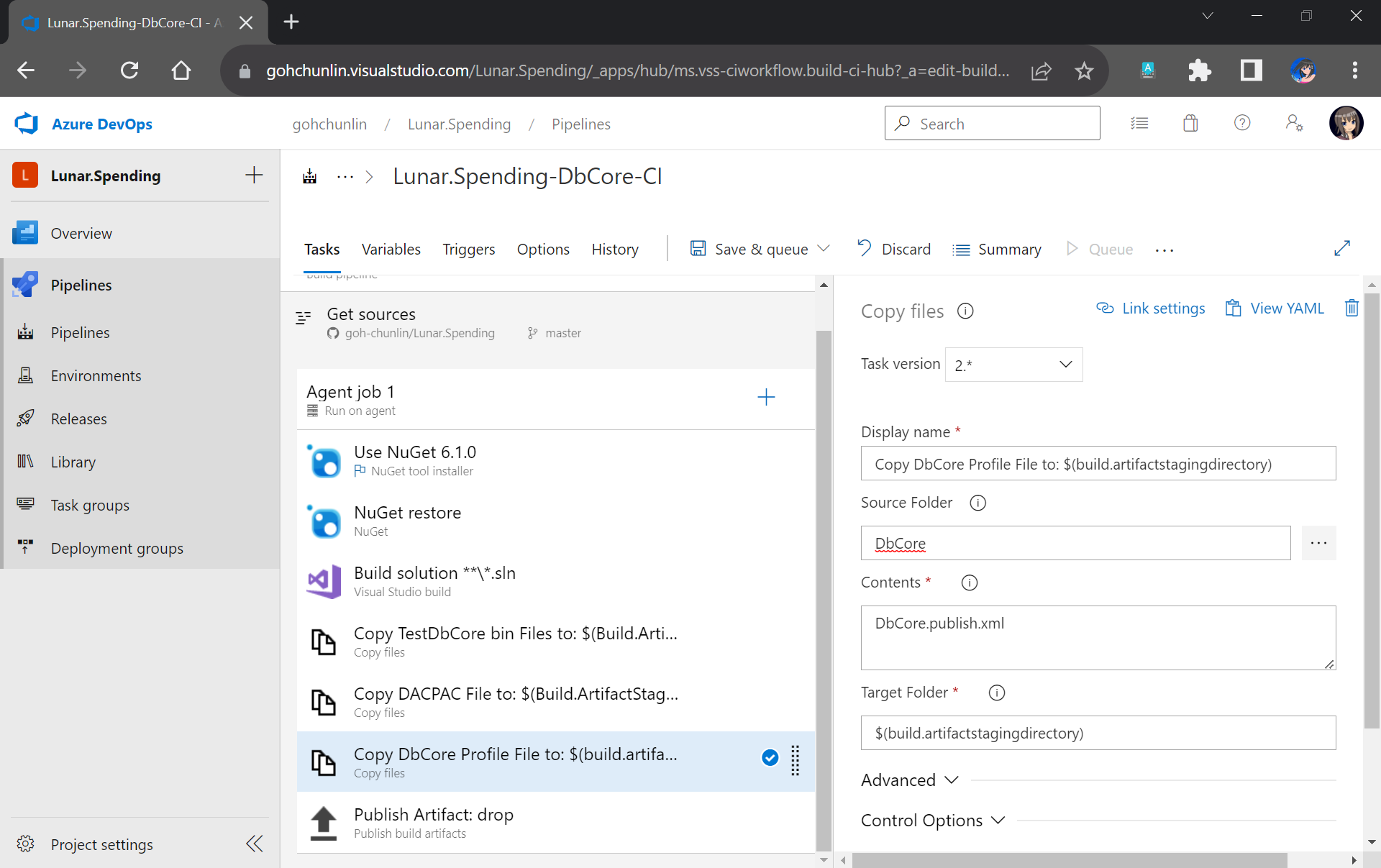
Another file we need to copy is our Database Profile. This is the reason why earlier we have to make sure the profile file needs to be in the source control.
The database publish profile needs to be copied to the Build Artifact directory as well.
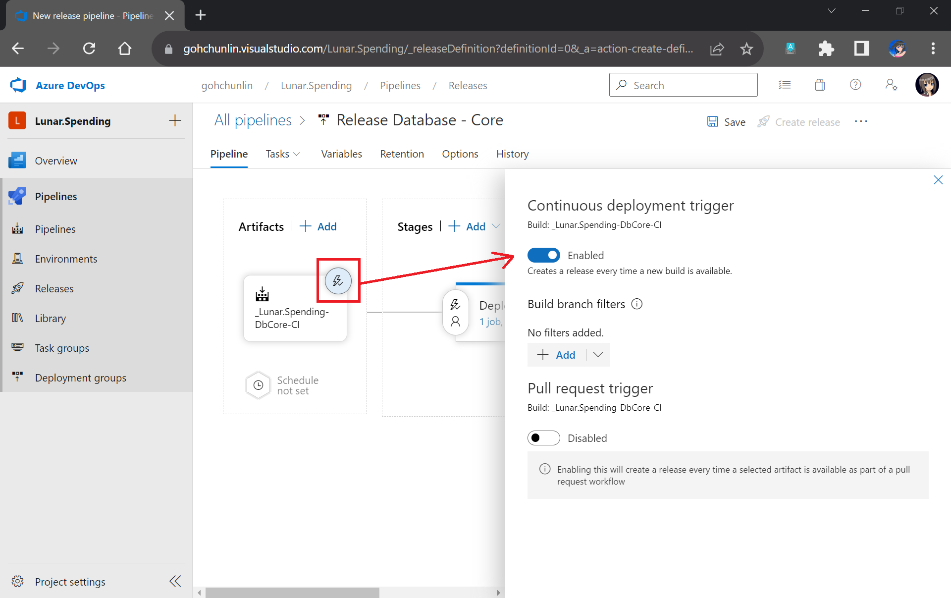
There is nothing to change for the Publish Artifact task. So, we can now move on to enable the Continuous Integration for the Build Pipeline, as shown in the screenshot below.
We can enable the continuous CI under the Triggers section of our Build Pipeline.
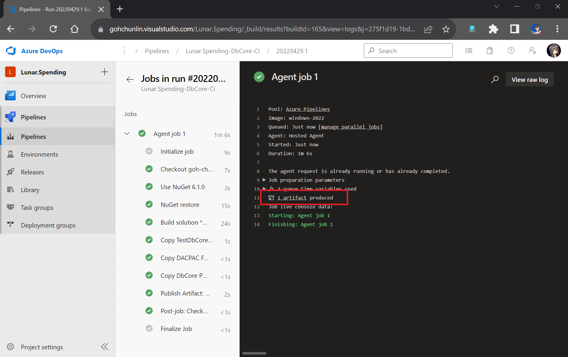
Finally, we can save and queue our Build Pipeline. If the build is successful, we will be able to see a Build Artifact produced, as shown in the screenshot below.
Build is successfully executed!
Setup Release Pipeline
In order to automatically deploy our database changes after the database project and unit test project are built successfully, we need to configure the Release Pipeline.
First of all, we need to integrate our Build Pipeline with this new Release Pipeline, as demonstrated in the following screenshot.
Adding the Build Artifact generated earlier in the Build Pipeline.
Next, we can enable the Continuous Deployment, as shown in the screenshot below. This is to make sure that we can deploy the database changes and test them automatically right after the build is completed successfully.
Enabling CD in our Release Pipeline.
Now, we can move on to configure the tasks in the stage. Here, I have renamed the stage as “Deploy DbCore”. To be consistent with the Build Pipeline, here we will be using “windows-2022” as the agent in our Release Pipeline too.
Please update to use windows-2022 as our agent or else there would be issues later.
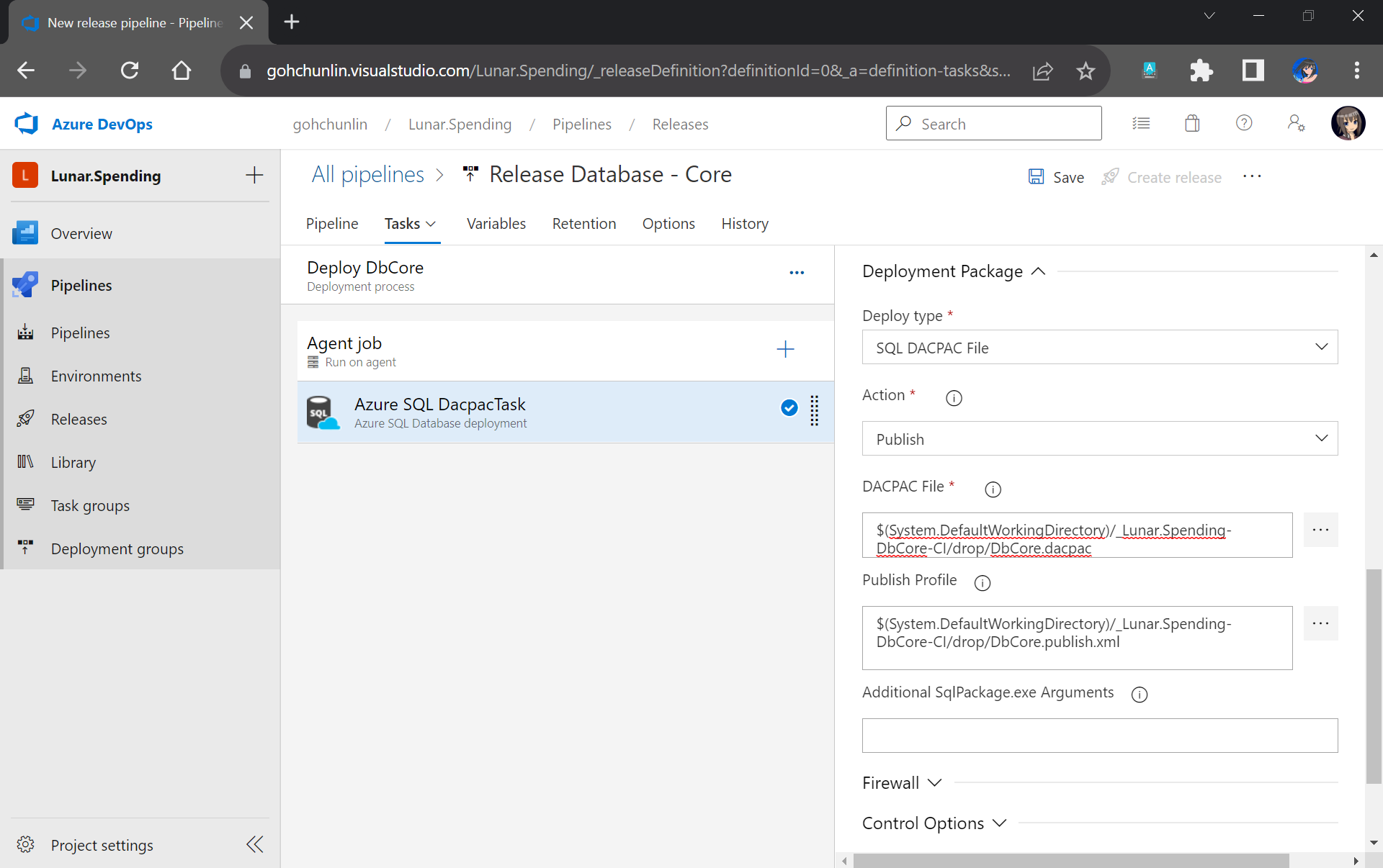
The first task will be deploying database changes to Azure SQL with the task “Azure SQL Database deployment”. In the task, we need to select our Azure subscription and provide our Azure SQL database admin login credential so that the database changes can be deployed to Azure SQL on our behalf.
In the same task, under the Deployment Package section, we need to state that we will be deploy with a DACPAC file. This is also where we will use the DACPAC file and publish profile file in the Build Artifact.
Setting up the deployment package.
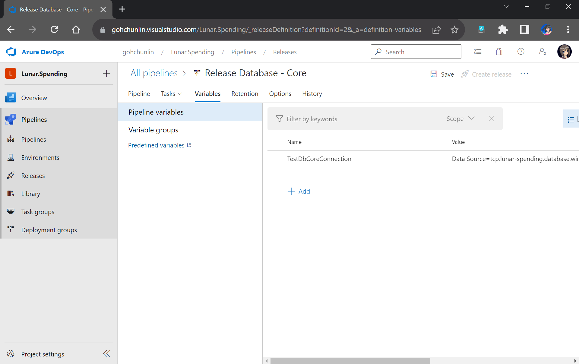
Next, we will run into a problem. We are supposed to add the testing task next. However, connection strings to the database are needed. So how could we securely store the connection strings in our pipeline?
After committing this change to our GitHub repo, we will specify the actual connection string in the Pipeline Variables section under the same name as the token. Since we use TestDbCoreConnection as our token label, the variable is thus called TestDbCoreConnection as well, as shown in the screenshot below.
Storing the actual database connection string in the Pipeline Variables of our Release Pipeline.
Previously we have moved the TestDbCore bin/Release folder to the Build Artifact. In fact, app.config, which is renamed to TestDbCore.dll.config, is in the folder as well. Hence, we can locate the config file easily by pointing the task to the Build Artifact accordingly, as demonstrated in the screenshot below.
We will only need to specify the Root Directory of where our TestDbCore.dll.config is located.
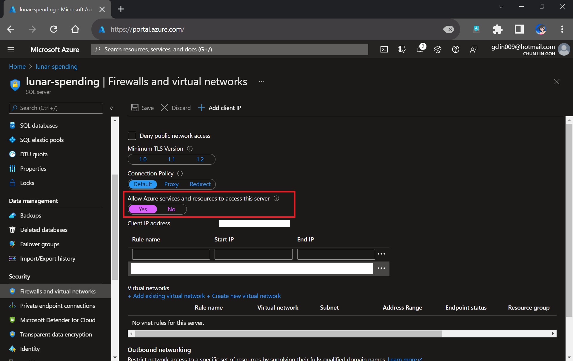
Please take note that since our unit tests need to test the Azure SQL database specified in the connection string, we need to allow Azure services and resources to access our Azure SQL server by configuring its firewall, as shown in the following screenshot. Otherwise, all our unit tests will fail because the Azure SQL server cannot be reached.
Interestingly, the Azure AQL Database deployment task will still be executed successfully even though we do not allow the access mentioned above.
We need to allow Azure services and resources to access the relevant Azure SQL server.
With the actual connection string in place, we can now add our Visual Studio Test (2.*) task back to execute our unit test.
We have our test files in the folder DbCoreTest in the Build Artifact as we designed earlier in the Build Pipeline. Hence, we simply need to point the Search Folder of the Visual Studio Test task to the folder accordingly.
Setting up Visual Studio Test to run our unit test for our stored procedures.
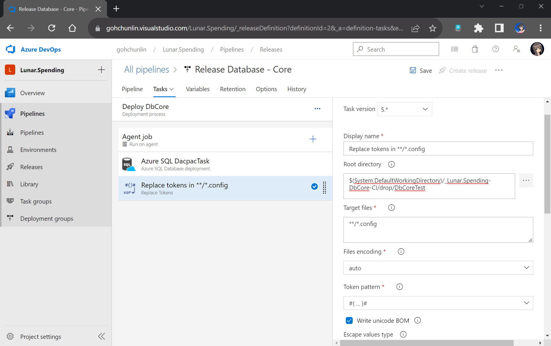
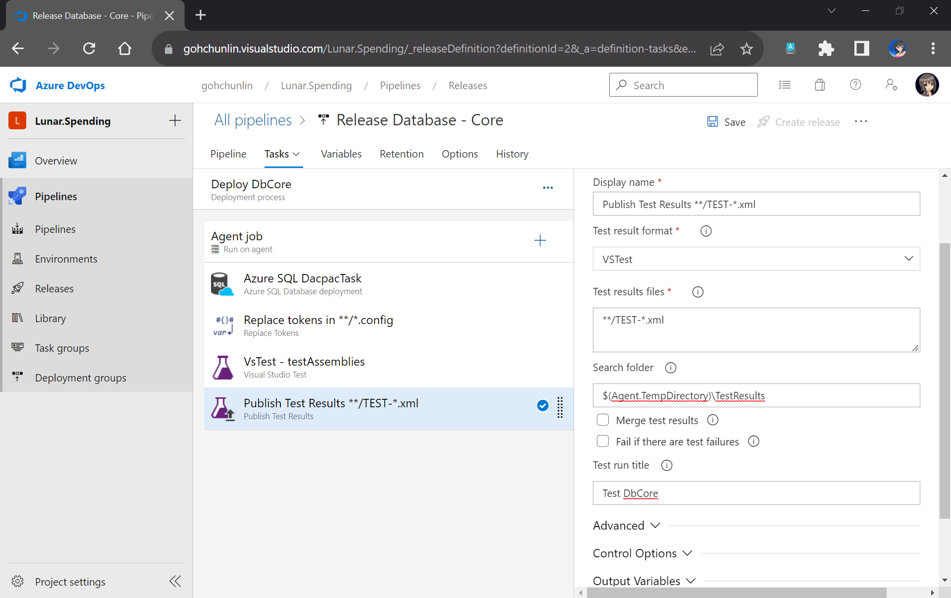
You may have noticed that the test results will be stored in a folder called $(Agent.TempDirectory)\TestResults. So, let’s add our last task of the stage which is to publish the test results.
We will need to specify that our test results are generated by VSTest. Aftervthat, we point the task to look for test results in the $(Agent.TempDirectory)\TestResults folder. Finally, we name our test run.
We can publish our test results to the Release Pipeline.
That’s all! Please remember to save the Release Pipeline changes.
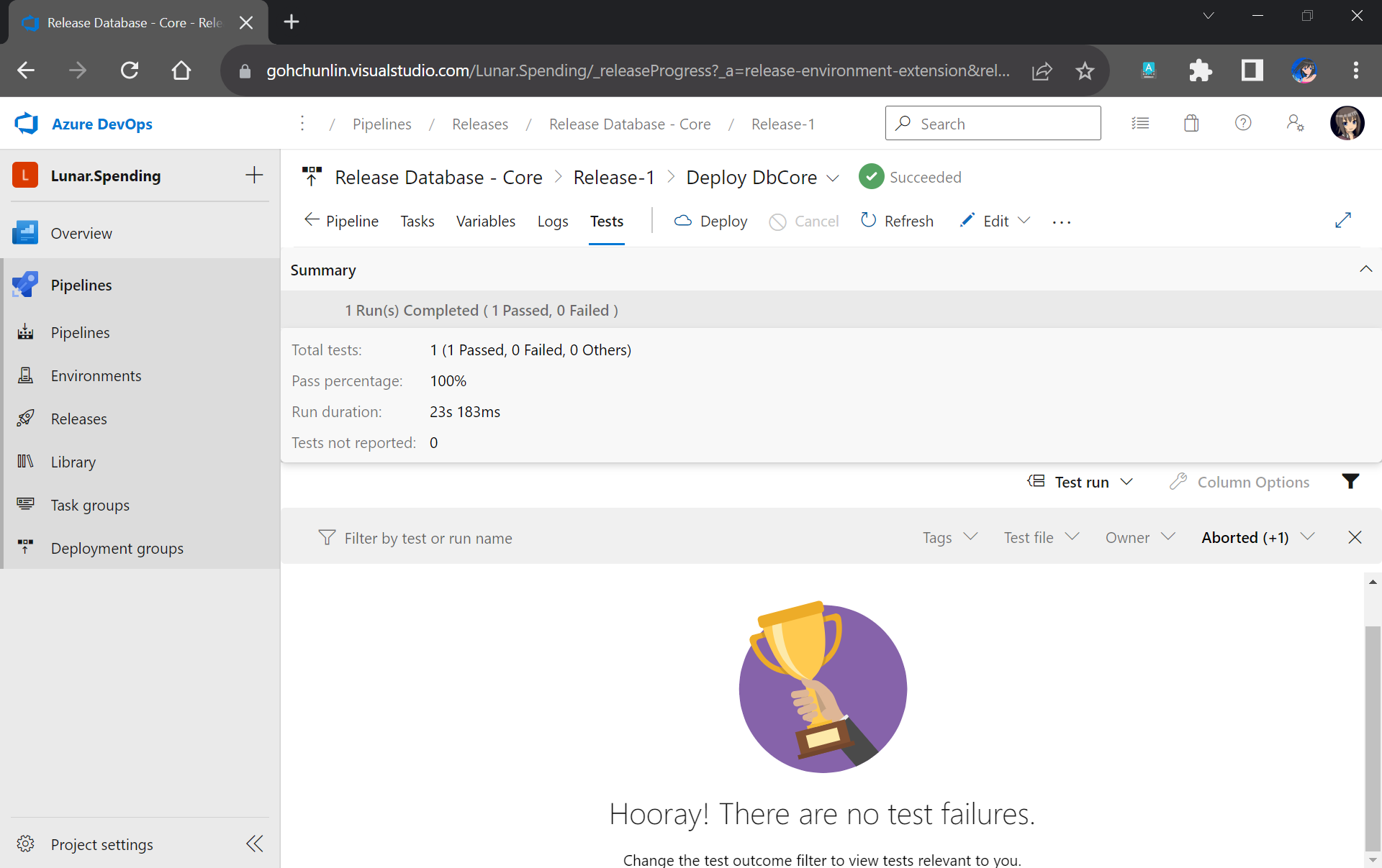
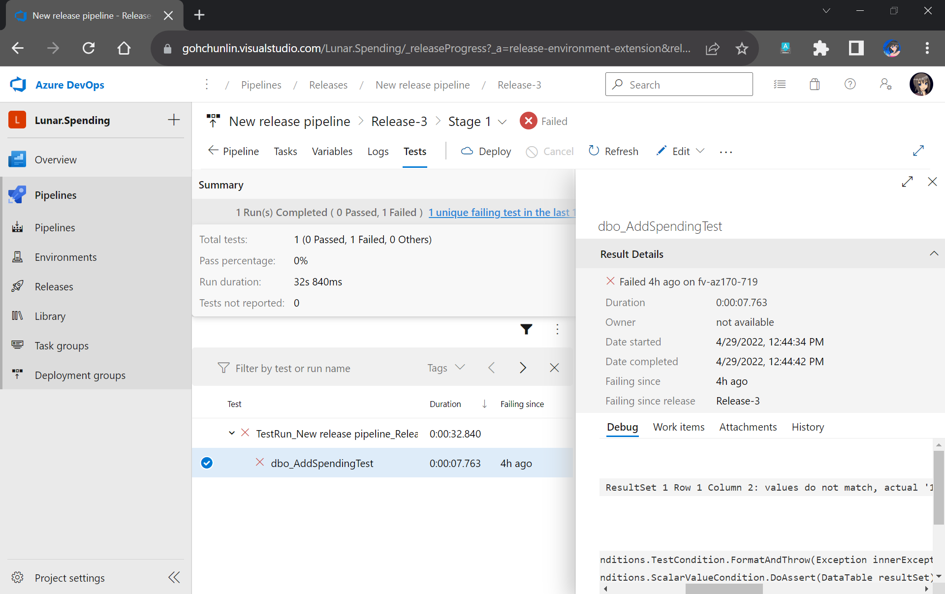
Now when there is a new build completed, the Release Pipeline will be automatically triggered. Once it is completed, not only our database on Azure SQL will be updated accordingly, but also we will have a detailed test result. For example, when all of our unit tests have passed, we will get a test result as shown below.
If all tests have passed, we will receive a trophy. 🙂
However, if there is one or many tests fail, we can easily locate the failed tests easily in the report.
This shows that our stored procedure dbo_AddSpendingTest has issues which need our attention.
That’s all for a simple walkthrough from writing unit tests for stored procedures to automatically deploying and testing them with Azure DevOps CI/CD pipelines.
Previously, we have seen how we could containerise our ASP .NET Core 6.0 web app and manage it with docker commands. However, docker commands are mainly for only one image/container. If our solution has multiple containers, we need to use docker-compose to manage them instead.
docker-compose makes things easier because it encompasses all our parameters and workflow into a configuration file in YAML. In this article, I will share my first experience with docker-compose to build mutli-container environments as well as to manage them with simple docker-compose commands.
To help my learning, I will create a simple online message board where people can login with their GitHub account and post a message on the app.
We will start with a solution in Visual Studio with two projects:
WebFrontEnd: A public-facing web application with Razor pages;
MessageWebAPI: A web API project.
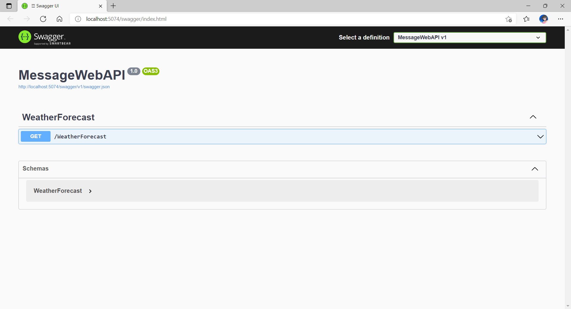
By default, the web API project will have a simple GET method available, as shown in the Swagger UI below.
Default web API project created in Visual Studio will have this WeatherForecast API method available by default.
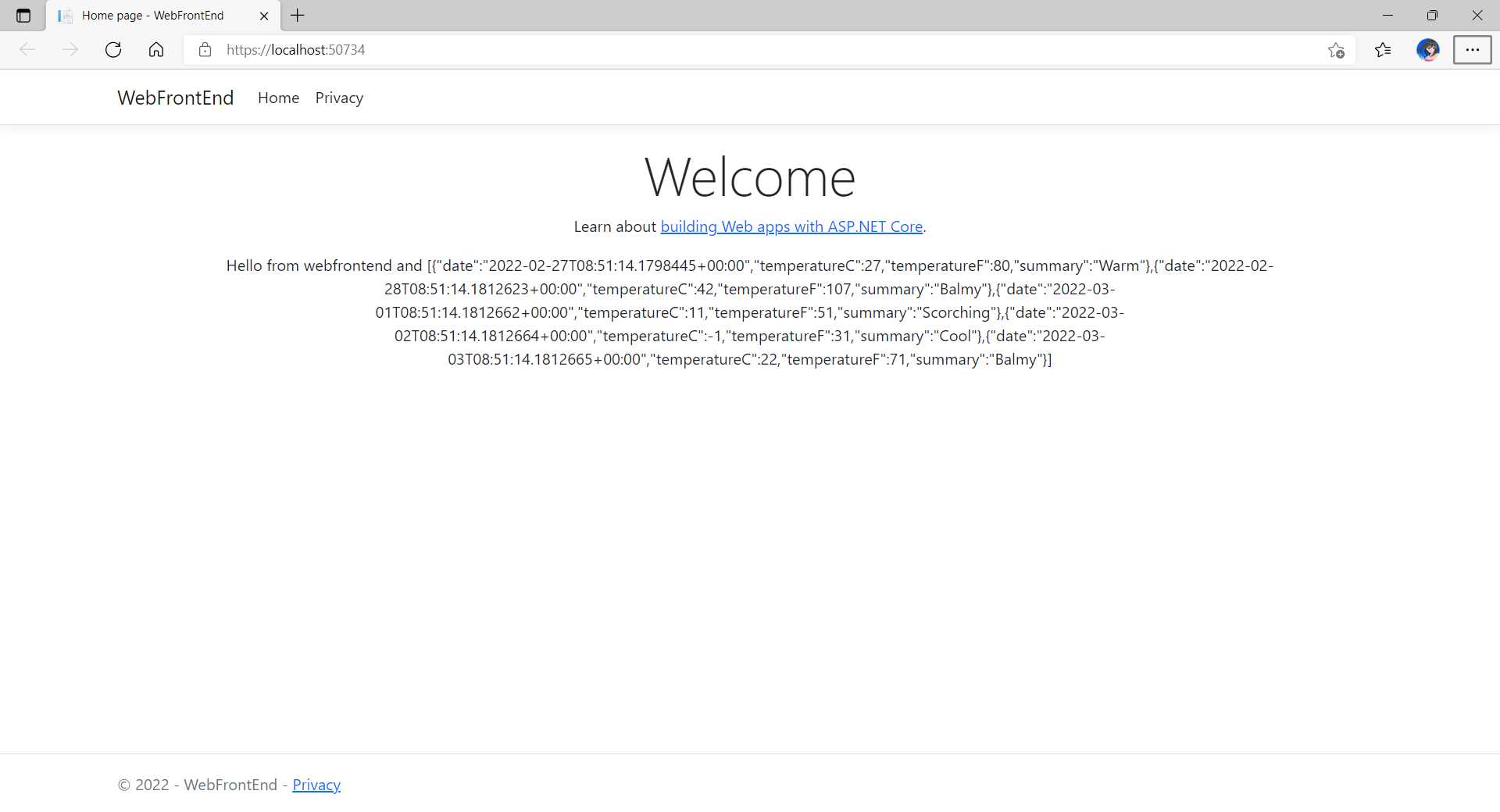
Now, we can make use of this method as a starting point. Let’s have the our client, WebFrontEnd, to call the API and output the result returned by the API to the web page.
var request = new System.Net.Http.HttpRequestMessage();
request.RequestUri = new Uri("http://messagewebapi/WeatherForecast");

var response = await client.SendAsync(request);

string output = await response.Content.ReadAsStringAsync();
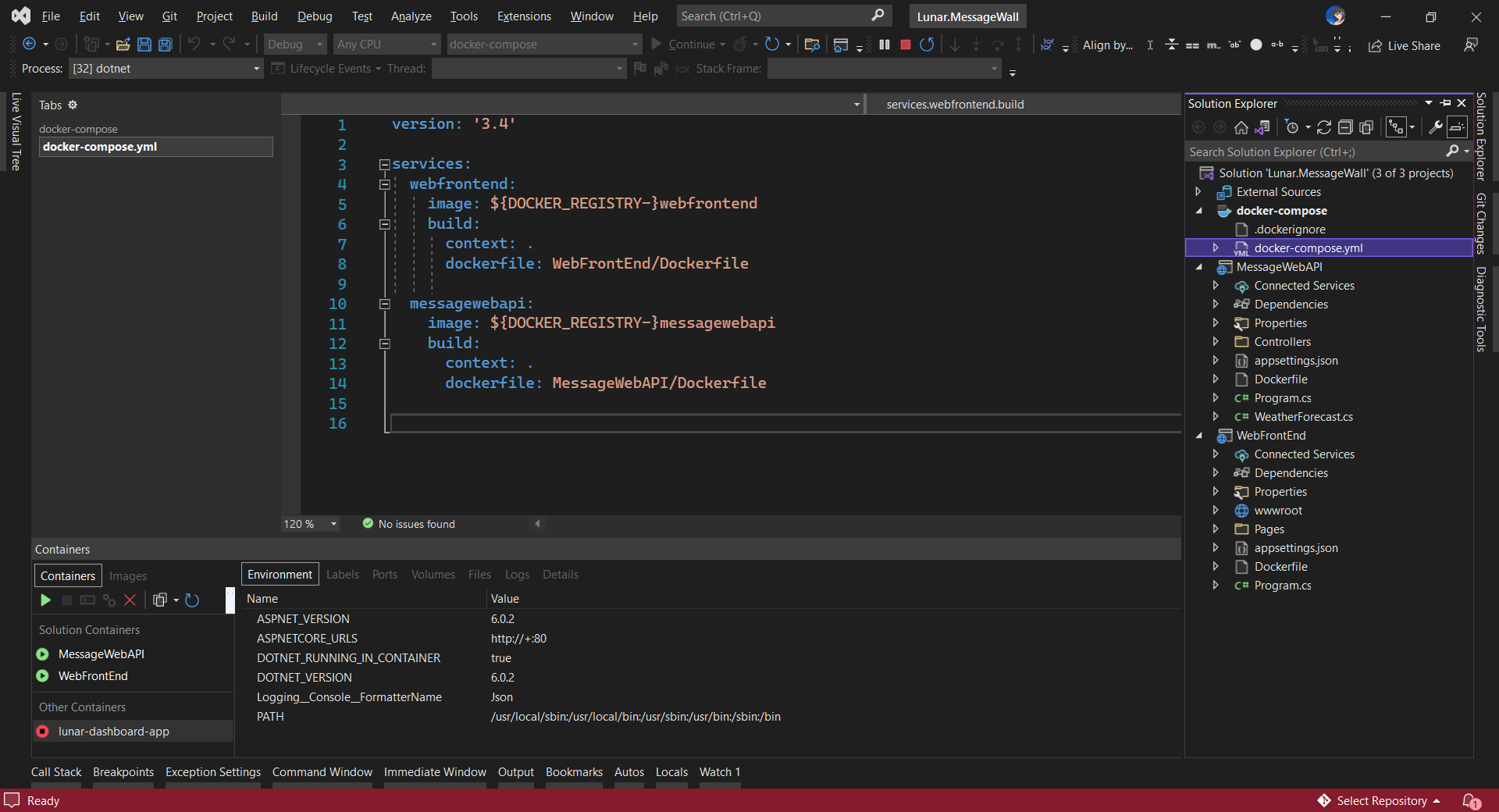
In both projects, we will add Container Orchestrator Support with Linux as the target OS. Once we have the docker-compose YAML file ready, we can directly run our docker compose application by simply pressing F5 in Visual Studio.
The docker-compose YAML file for our solution.
Now, we shall be able to see the website output some random weather data returned by the web API.
Congratulations, we’re running a docker compose application.
Configure Authentication in Web App
Our next step is to allow users to login to our web app first before they can post a message on the app.
It’s usually a good idea not to build our own identity management module because we need to deal with a lot more than just building a form to allow users to create an account and type their credentials. One example will be managing and protecting our user’s personal data and passwords. Instead, we should rely on Identity-as-a-Service solutions such as Azure Active Directory B2C.
Firstly, we will register our web app in our Azure AD B2C tenant.
Normally for first-timers, we will need to create a Azure AD B2C tenant first. However, there may be an error message saying that our subscription is not registered to use namespace ‘Microsoft.AzureActiveDirectory’. If you encounter this issue, you can refer to Adam Storr’s article on how to solve this with Azure CLI.
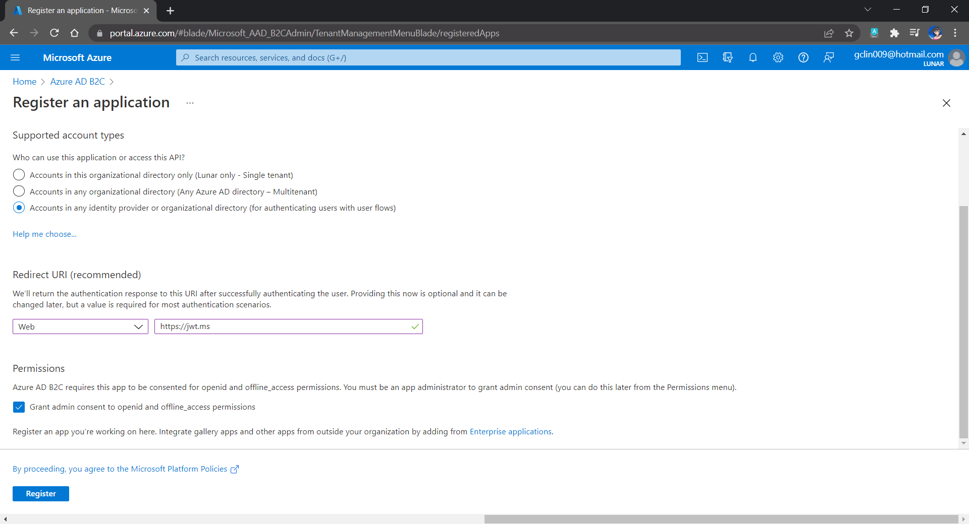
Once we have our Azure AD B2C tenant ready (which is Lunar in my example here), we can proceed to register our web app, as shown below. For testing purposes, we set the Redirect URI to https://jwt.ms, a Microsoft-owned web application that displays the decoded contents of a token. We will update this Redirect URL in the next section below when we link our web app with Azure AD B2C.
Registering a new app “Lunar Message Wall” under the Lunar Tenant.
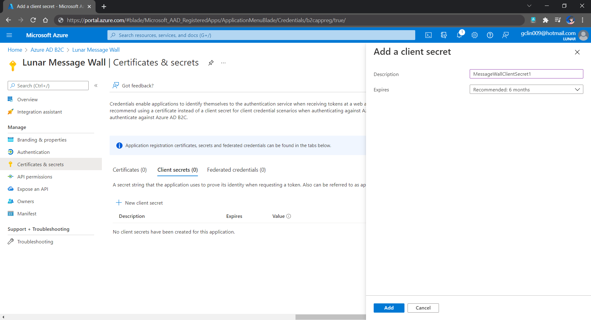
Secondly, once our web app is registered, we need to create a client secret, as shown below, for later use.
Secrets enable our web app to identify itself to the authentication service when receiving tokens. In addition, please take note that although certificate is recommended over client secret, currently certificates cannot be used to authenticate against Azure AD B2C.
Adding a new client secret which will expire after 6 months.
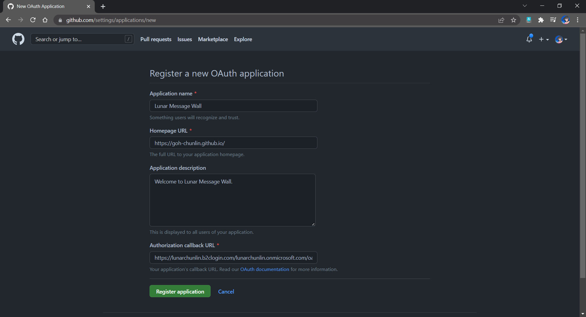
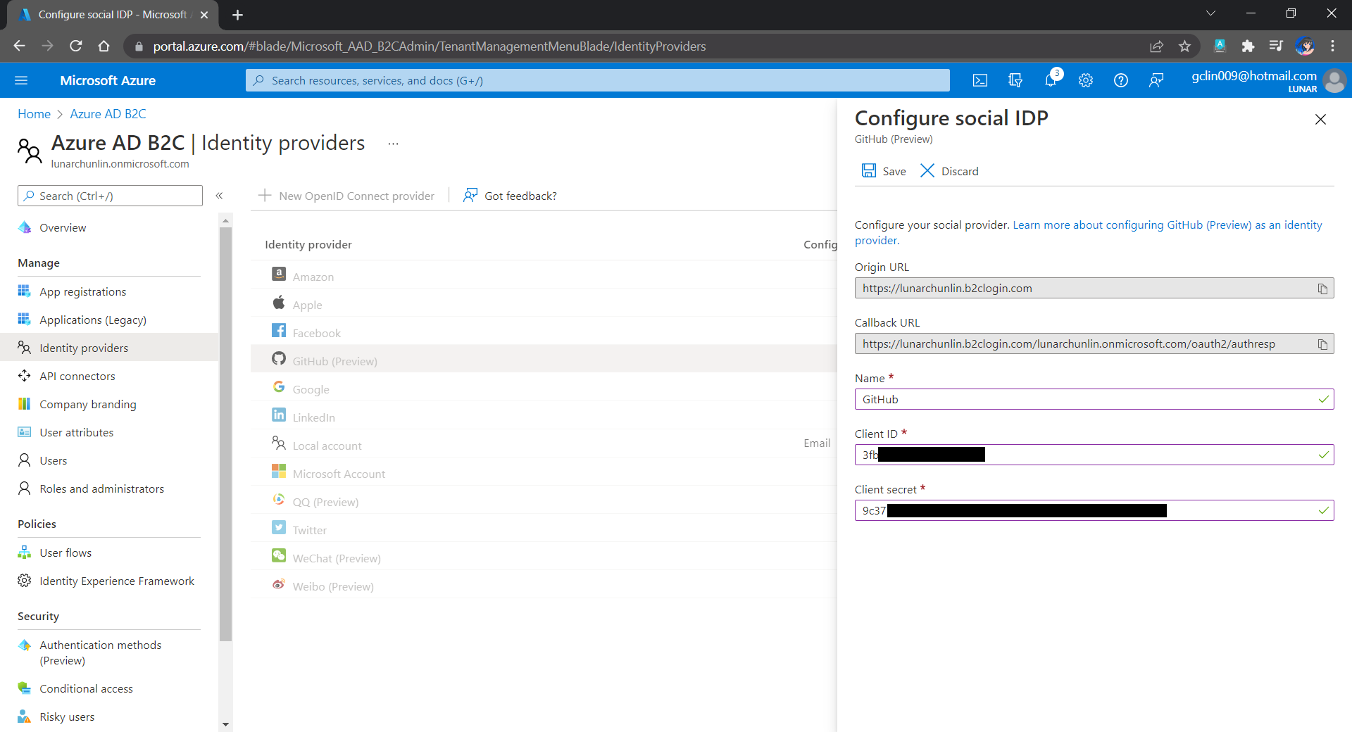
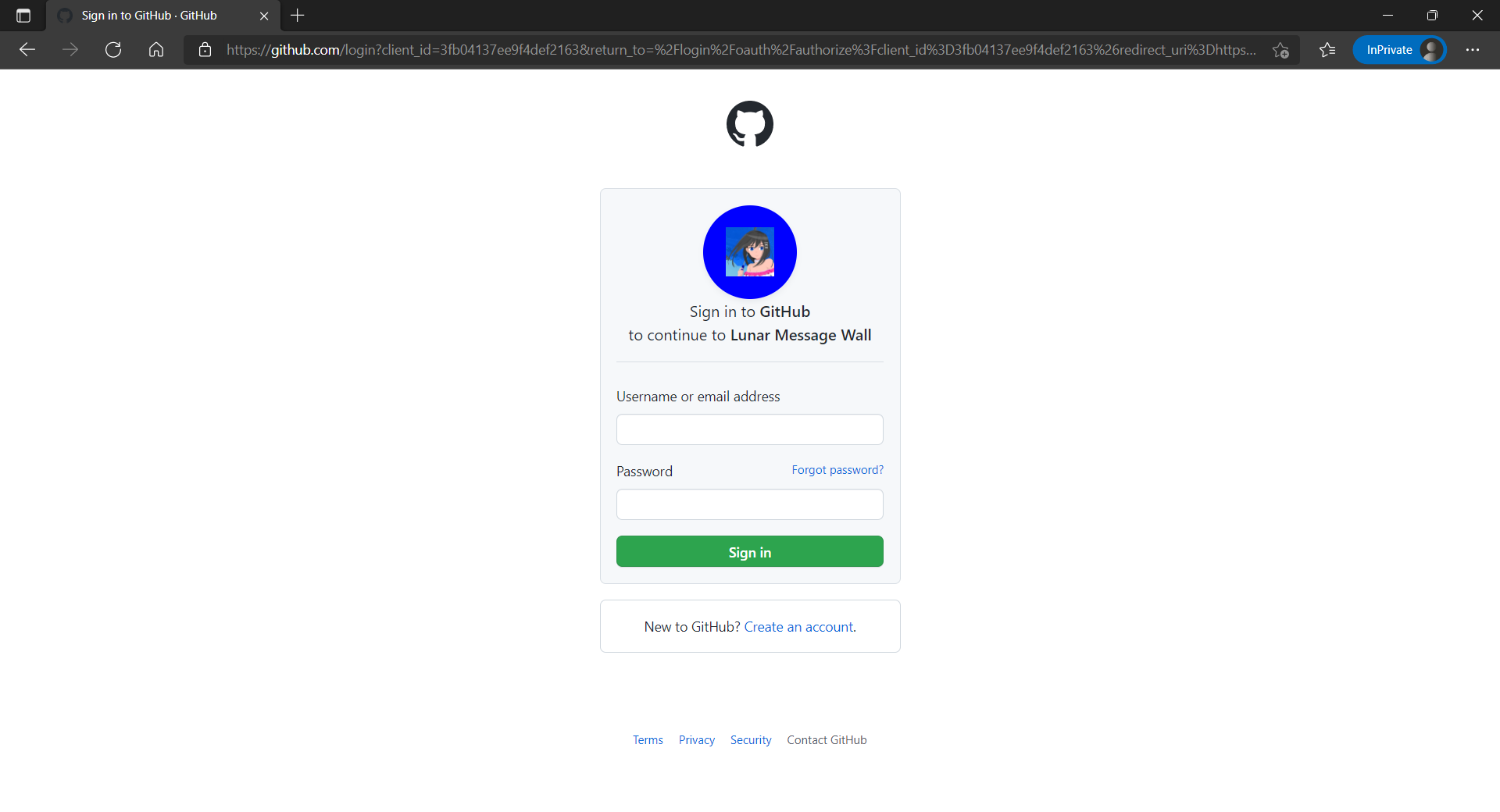
Thirdly, since we want to allow user authentication with GitHub, we need to create a GitHub OAuth app first.
The Homepage URL here is a temporary dummy data.
After we have registered the OAuth app on GitHub, we will be provided a client ID and client secret. These two information are needed when we configure GitHub as the social identity provider (IDP) on our Azure AD B2C, as shown below.
Configuring GitHub as an identity provider on Azure AD B2C.
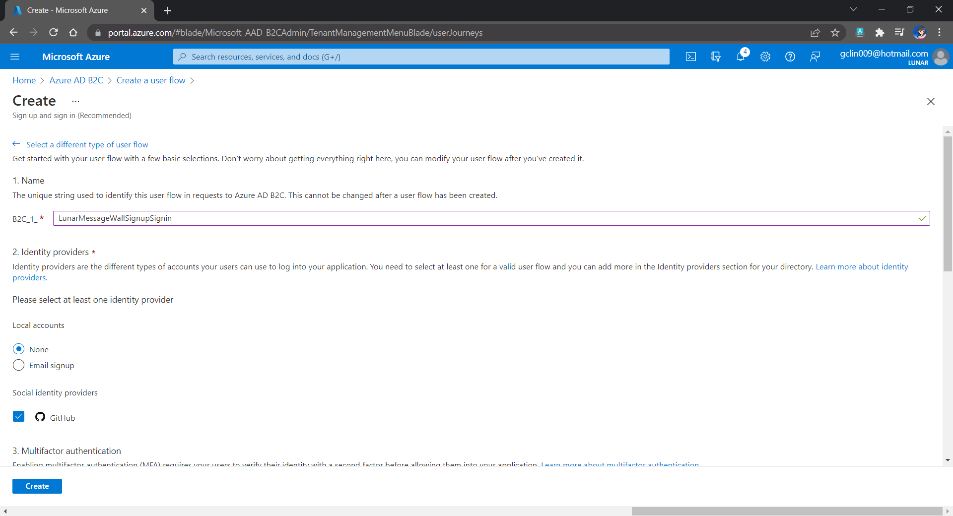
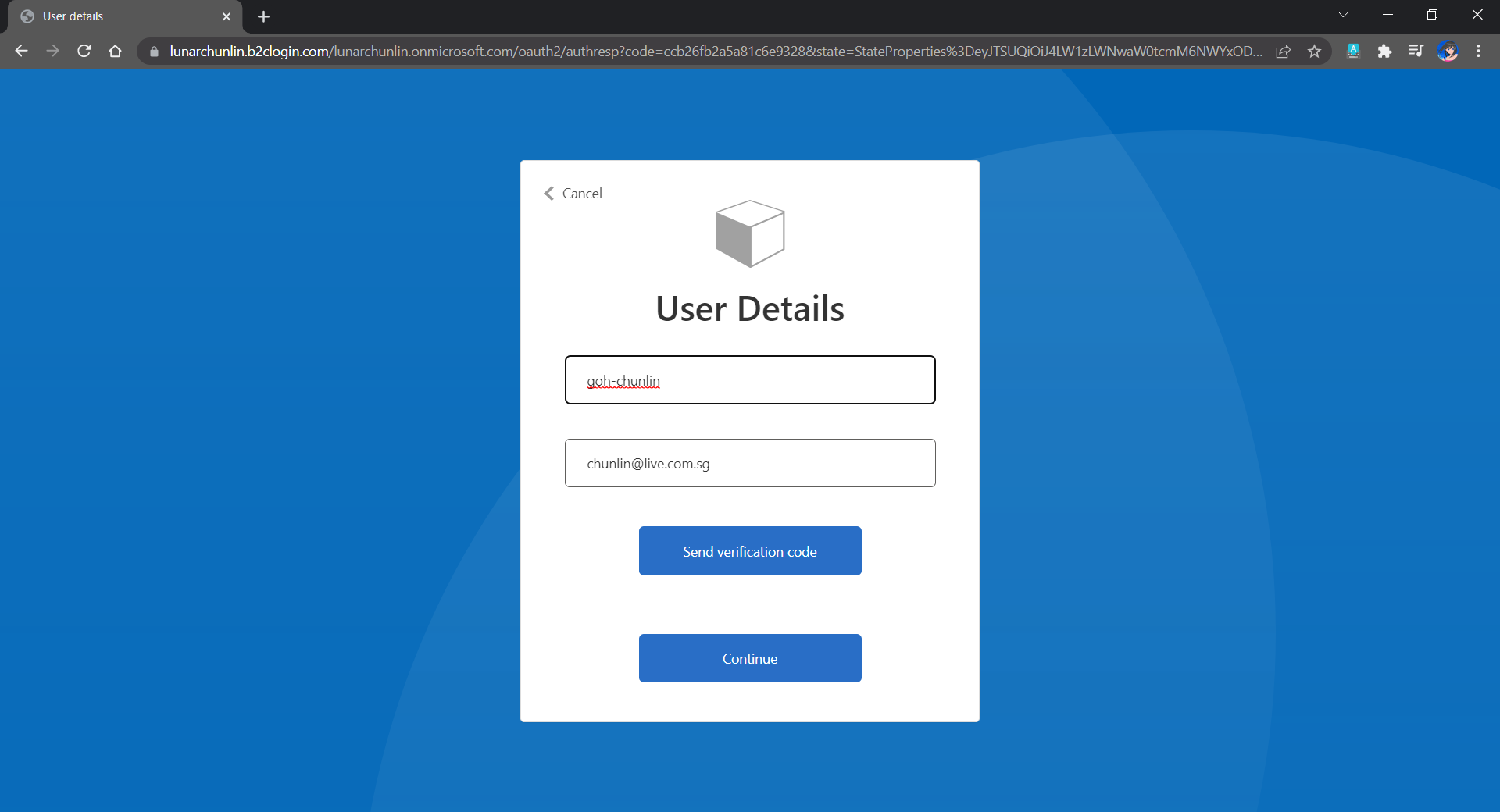
Fourthly, we need to define how users interact with our web app for processes such as sign-up, sign-in, password reset, profile editing, etc. To keep thing simple, here we will be using the predefined user flows.
For simplicity, we allow only GitHub sign-in in our user flow.
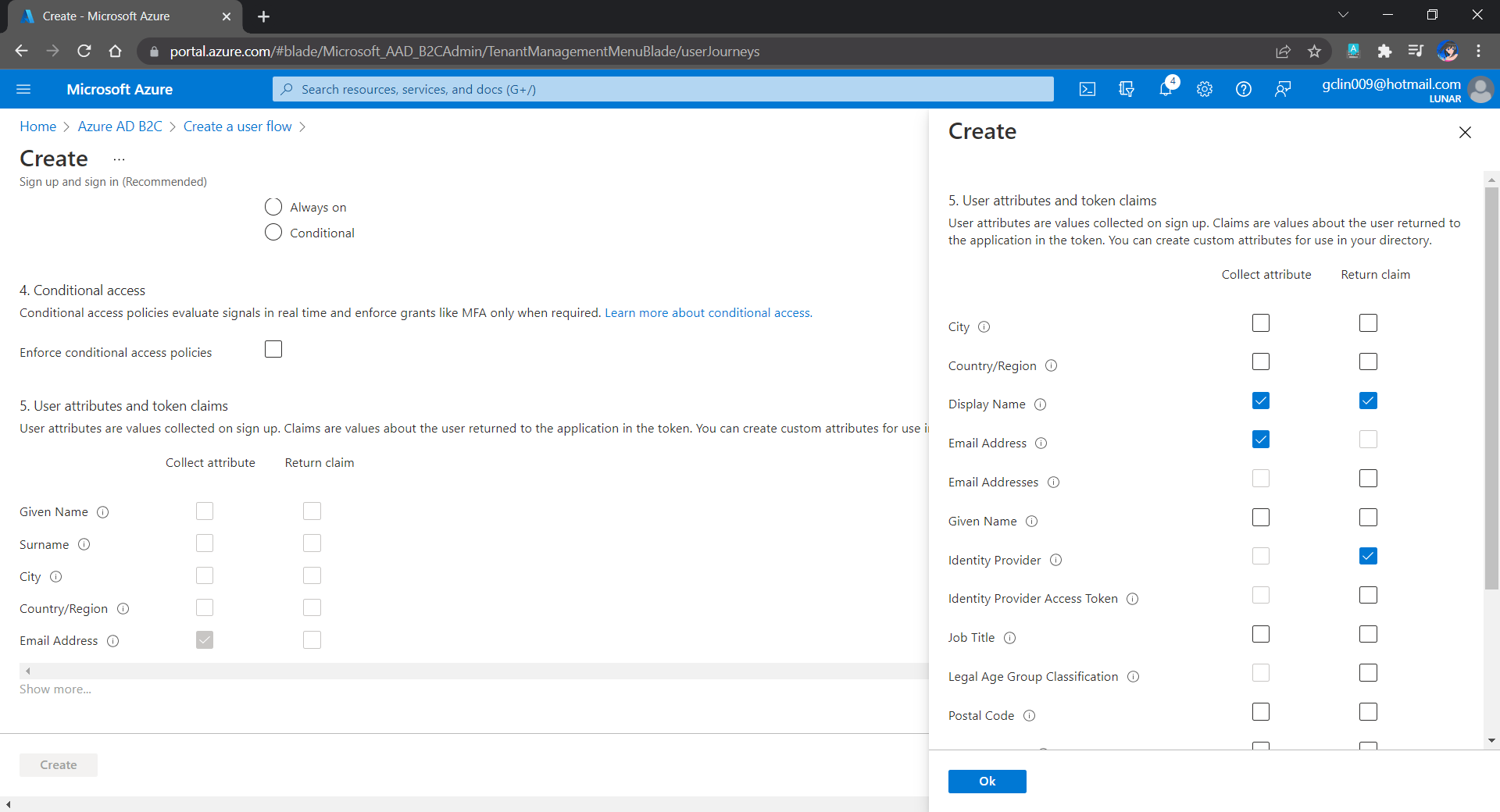
We can also choose the attributes we want to collect from the user during sign-up and the claims we want returned in the token.
User attributes and token claims.
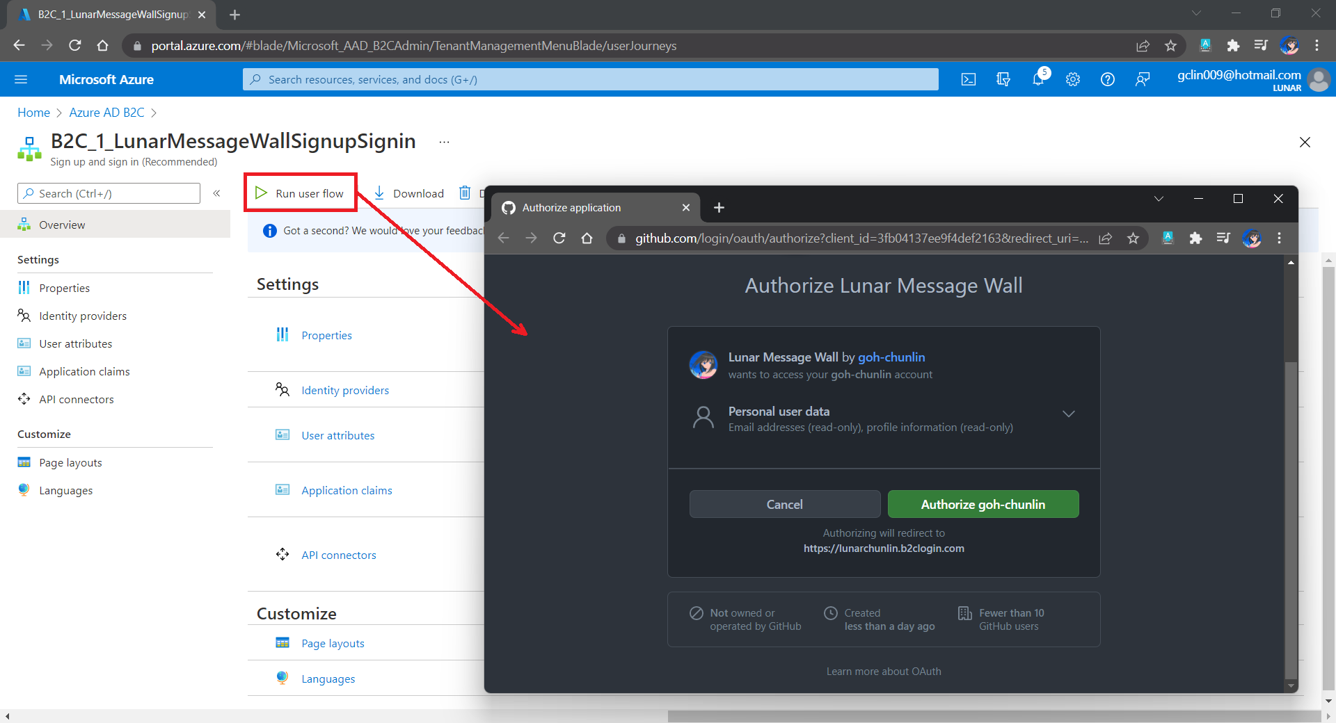
After we have created the user flow, we can proceed to test it.
In our example here, GitHub OAuth app will be displayed.
Since we specify in our user flow that we need to collect the user’s GitHub display name, there is a field here for the user to enter the display name.
The testing login page from running the user flow.
Setup the Authentication in Frontend and Web API Projects
Now, we can proceed to add Azure AD B2C authentication to our two ASP.NET Core projects.
We will be using the Microsoft Identity Web library, a set of ASP.NET Core libraries that simplify adding Azure AD B2C authentication and authorization support to our web apps.
dotnet add package Microsoft.Identity.Web
The library configures the authentication pipeline with cookie-based authentication. It takes care of sending and receiving HTTP authentication messages, token validation, claims extraction, etc.
For the frontend project, we will be using the following package to add GUI for the sign-in and an associated controller for web app.
dotnet add package Microsoft.Identity.Web.UI
After this, we need to add the configuration to sign in user with Azure AD B2C in our appsettings.json in both projects (The ClientSecret is not needed for the Web API project).
With the help of the Microsoft.Identity.Web.UI library, we can also easily build a sign-in button with the following code. Full code of it can be seen at _LoginPartial.cshtml.
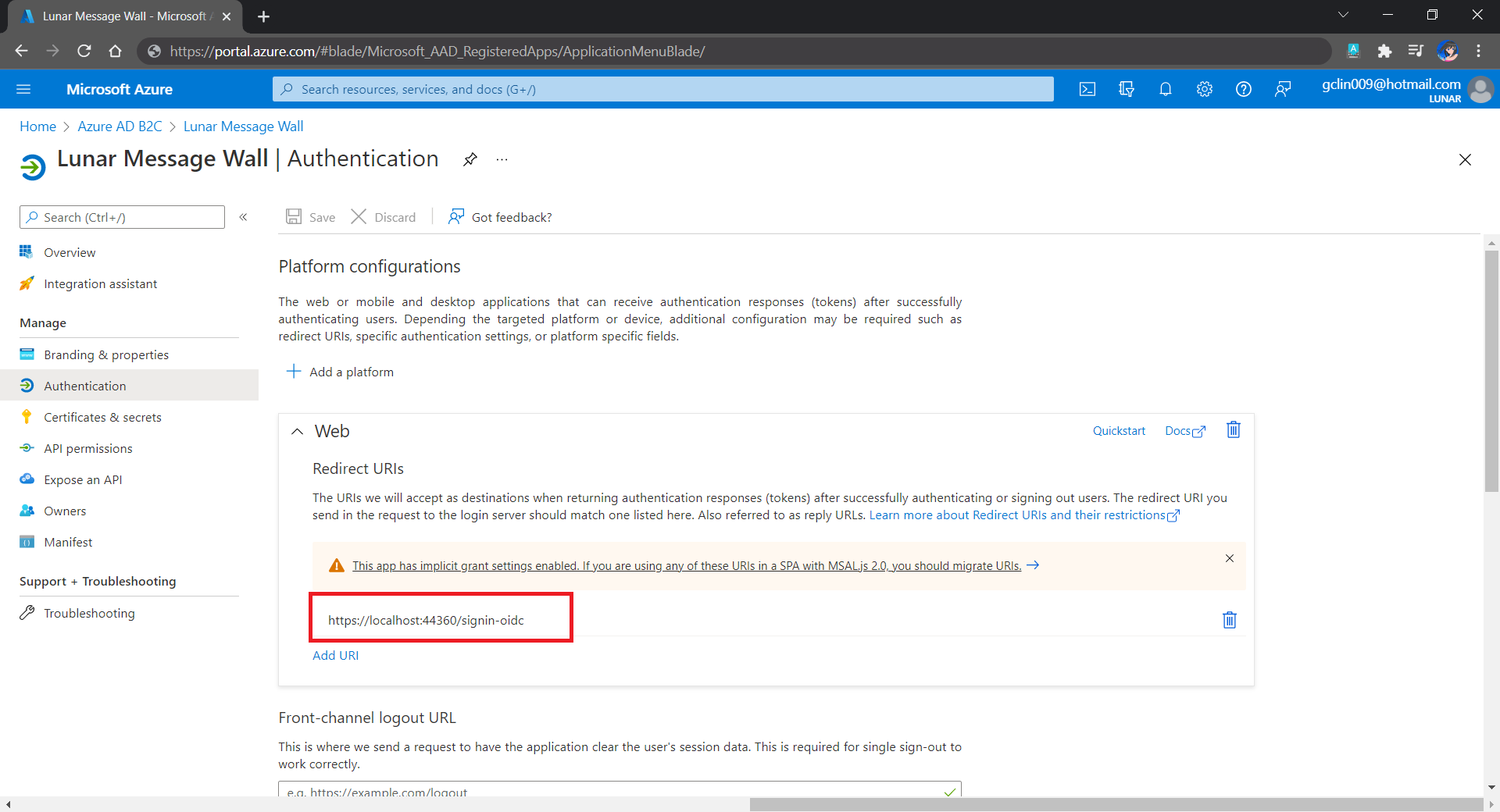
Now, it is time to update the Redirect URI to the localhost. Thus, we need to make sure our WebFrontEnd container has a permanent host port. To do so, we first specify the ports we want to use in the launchsettings.json of the WebFrontEnd project.
Since we need to store the messages submitted by the users, we will need a database. Here, we use PostgresSQL, an open-source, standards-compliant, and object-relational database.
To run the PostgresSQL with docker-compose we will update our docker-compose.yml file with the following contents.
In our case, only the Web API will interact with the database. Hence, we need to make sure that the db service is started before the messagewebapi. In order to specify this relationship, we will use the depends_on option.
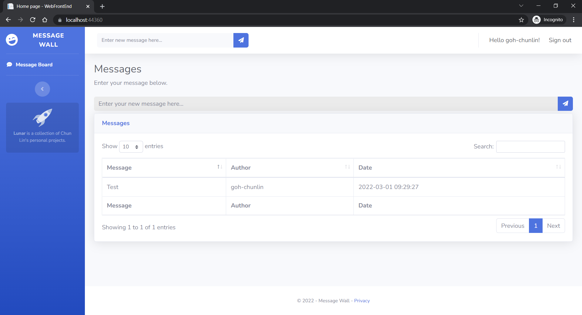
User’s messages can now be stored and listed on the web page.
Next Step
This is just the very beginning of my learning journey of dockerising ASP .NET Core solution. In the future, I shall learn more in this area.
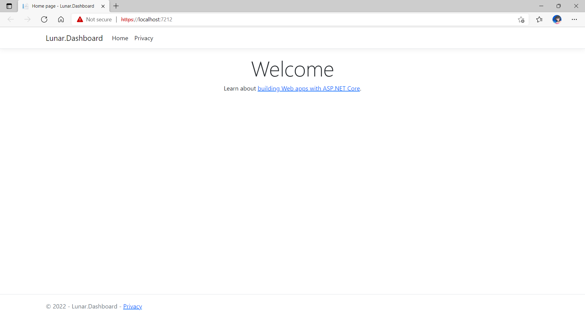
Let’s assume now we want to dockerise a new ASP .NET Core 6.0 web app project that we have locally.
Now, when we build and run the project, we should be able to view it on localhost as shown below.
The default homepage of a new ASP .NET Core web app.
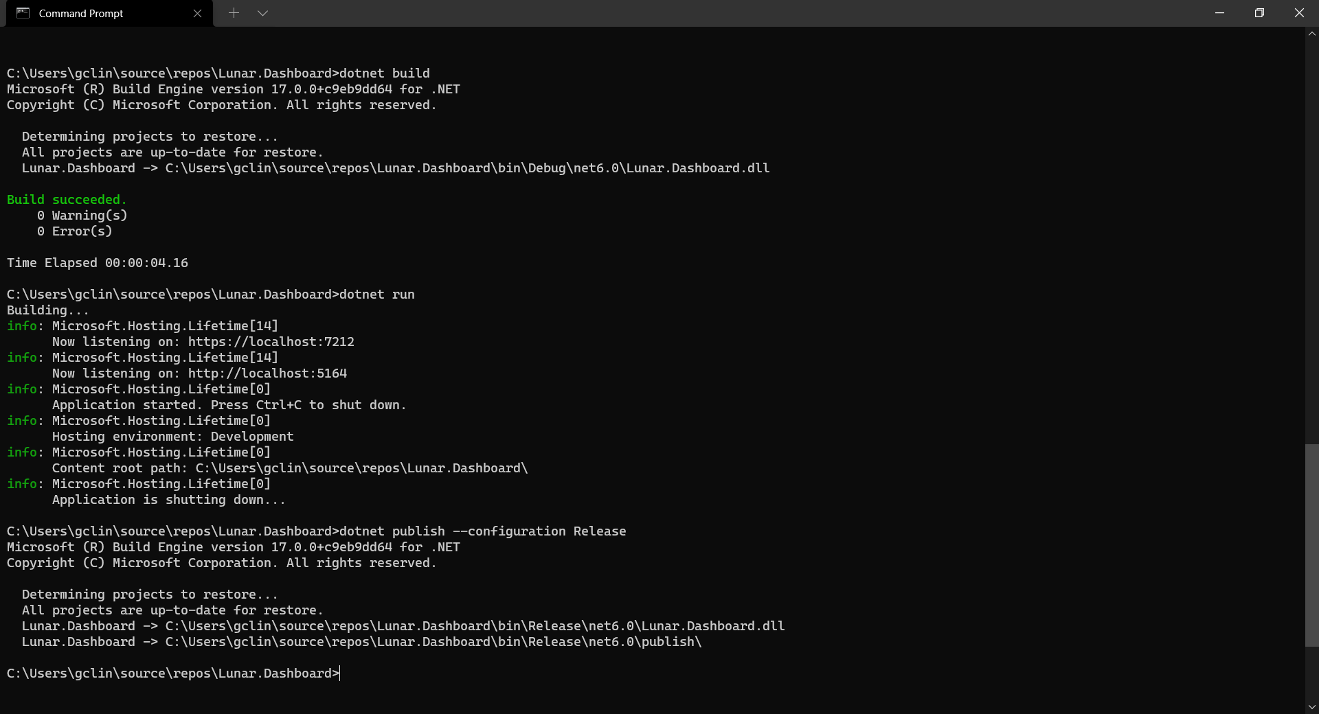
Before adding the .NET app to the Docker image, first it must be published with the following command.
dotnet publish --configuration Release
Build, run, and publish our ASP .NET Core web app.
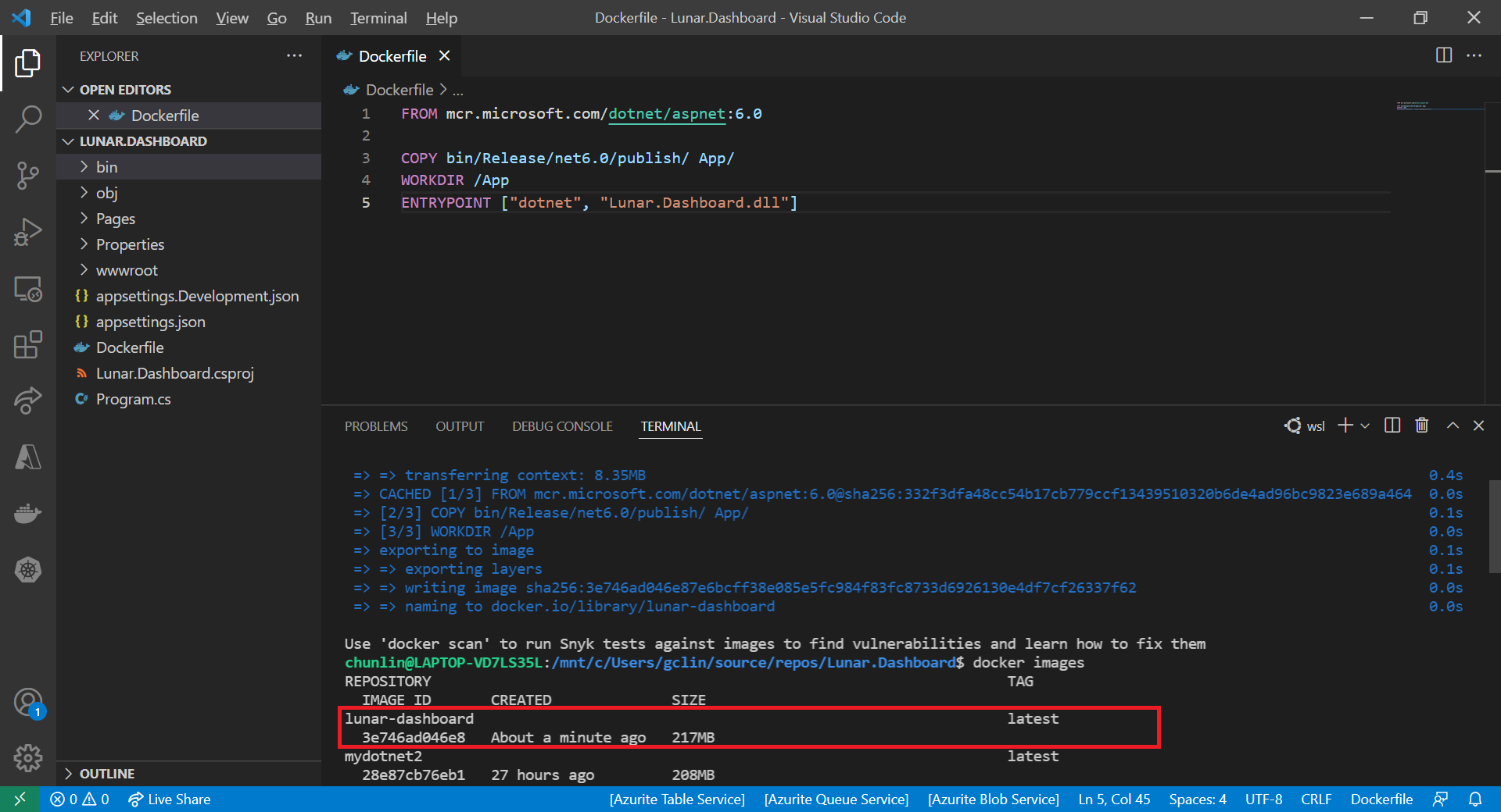
Create the Dockerfile
Now, we will create a file named Dockerfile in directory containing the .csproj and open it in VS Code. The content of the Dockerfile is as follows.
FROM mcr.microsoft.com/dotnet/aspnet:6.0

COPY bin/Release/net6.0/publish/ App/
WORKDIR /App
ENTRYPOINT ["dotnet", "Lunar.Dashboard.dll"]
A Dockerfile must begin with a FROM instruction. It specifies the parent image from which we are building. Here, we are using mcr.microsoft.com/dotnet/aspnet:6.0, an image contains the ASP.NET Core 6.0 and .NET 6.0 runtimes for running ASP.NET Core web apps.
The COPY command tells Docker to copy the publish folder from our computer to the App folder in the container. Then the current directory inside of the container is changed to App with the WORKDIR command.
Finally, the ENTRYPOINT command tells Docker to configure the container to run as an executable.
Docker Build
Now that we have the Dockerfile, we can build an image from it.
In order to perform docker build, we first need to navigate the our project root folder and issue the docker build command, as shown below.
docker build -t lunar-dashboard -f Dockerfile .
We assign a tag lunar-dashboard to the image name using -t. We then specify the name of the Dockerfile using -f. The . in the command tells Docker to use the current folder, i.e. our project root folder, as the context.
Once the build is successful, we can locate the newly created image with the docker images command, as highlighted in the screenshot below.
The default docker images command will show all top level images.
Create a Container
Now that we have an image lunar-dashboard that contains our ASP .NET Core web app, we can create a container with the docker run command.
docker run -d -p 8080:80 --name lunar-dashboard-app lunar-dashboard
When we start a container, we must decide if it should be run in a detached mode, i.e. background mode, or in a foreground mode. By default the container will be running in foreground.
In the foreground mode, the console that we are using to execute docker run will be attached to standard input, output and error. This is not what we want. What we want is after we start up the container, we can still use the console for other commands. Hence, the container needs to be in detached mode. To do so, we use the -d option which will start the container in detached mode.
We then publish a port of the container to the host with -p 8080:80, where 8080 is the host port and 80 is the container port.
Finally, we name our container lunar-dashboard-app with the --name option. If we do not assign a container name with the --name option, then the daemon will generate a random string name for us. Most of the time, the auto-generated name is quite hard to remember, so it’s better for us to give a meaningful name to the container so we can easily refer the container later.
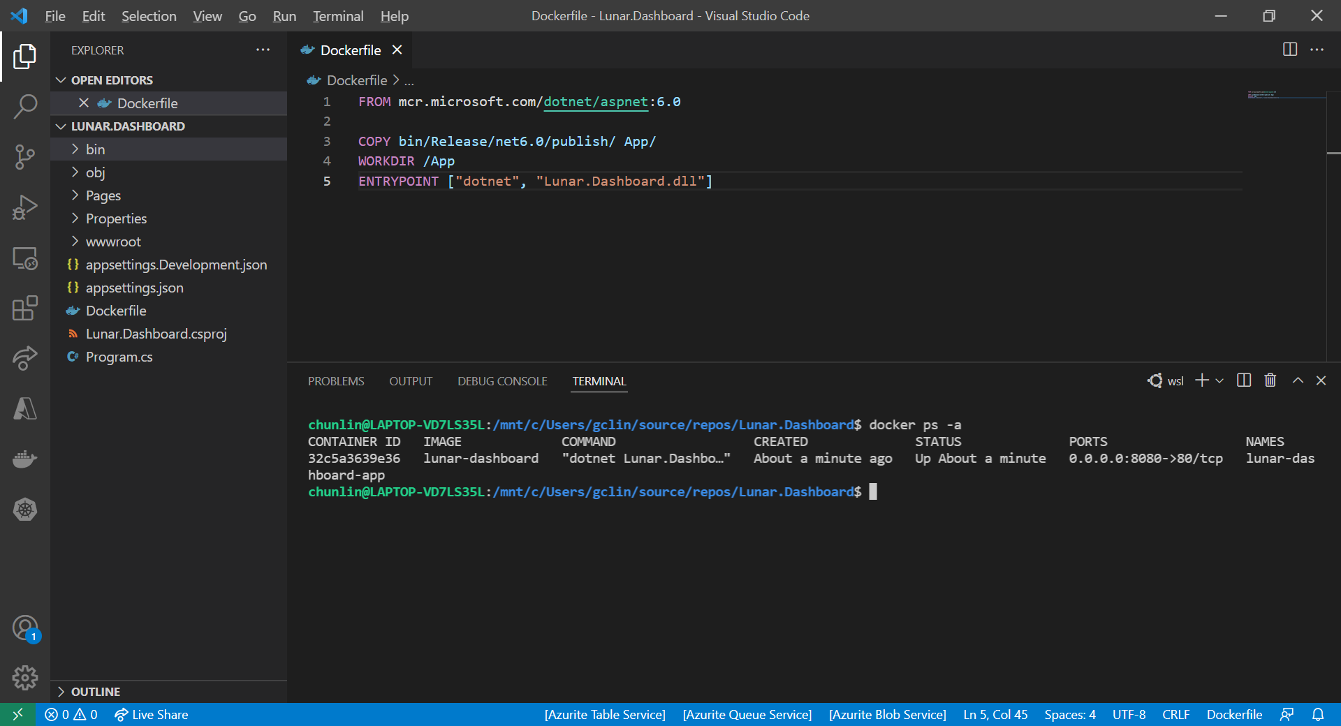
After we run the docker run command, we should be able to find our newly created container lunar-dashboard with the docker ps command, as shown in the following screenshot. The option -a is to show all containers because by default docker ps will show only containers which are running.
Our container lunar-dashboard is now running.
Now, if we visit the localhost at port 8080, we shall be able to see our web app running smoothly.
Hence, I have no choice but to use WSL, which runs a Linux kernel inside of a lightweight utility VM. WSL provides a mechanism for running Docker (with Linux containers) on the Windows machine.
KOSD, or Kopi-O Siew Dai, is a type of Singapore coffee that I enjoy. It is basically a cup of coffee with a little bit of sugar. This series is meant to blog about technical knowledge that I gained while having a small cup of Kopi-O Siew Dai.


 cuteprogramming