Modern Data Warehouse with Azure

This month marks my third year in port and logistics industry.

In April, I attended a talk organised by NUS Business School on the future-ready supply chain. The talk is delivered by Dr Robert Yap, the YCH Group Executive Chairman. During the talk, Dr Yap mentioned that they innovated to survive because innovation was always at the heart of their development and growth. To him and his team, technology is not only an enabler for the growth of their business, but also a competitive advantage of the YCH Group.

In YCH Group, they have a vision of integrating the data flows in the supply chain with their unique analytics capabilities so that they can provide a total end-to-end supply chain enablement and transformation. Hence, today I’d like to share about how, with Microsoft Azure, we can build a data pipeline and modern data warehouse which helps to enable logistics companies to gear towards a future-ready supply chain.

Dr Yap shared about the The 7PLâ„¢ Strategy in YCH Group.

Two months ago, I also had the opportunity to join an online workshop to learn from Michelle Xie, Microsoft Azure Technical Trainer, about Azure Data Fundamentals. The workshop consists of four modules. In the workshop, we learnt core data concepts, relational and non-relational data offerings in Azure, modern data warehouses, and Power BI. Hence, I will share with you what I have learned in the workshop in this article as well.

About Data

Data is a collection of facts, figures, descriptions, and objects. Hence, data can be texts written on papers, or it can be in digital form and stored inside the electronic devices, or it could be facts that are in our mind. Data can be classified as follows.

Unstructured data like image is frequently used in combination with Machine Learning or Azure Cognitive Services capabilities to extract data.

ETL Data Pipeline

To build an data analytical system, we normally will have the following steps in a data pipeline to perform ETL procedure. ETL stands for Extract, Transform and Load. ETL loads data first into the staging storage server and then into the target storage system, as shown below.

ETL procedure in a data processing pipeline.
  • Data Ingestion: Data is moved from one or many data sources to a destination where it can be stored and further analysed;
  • Data Processing: Sometimes the raw data may not in the format suitable for querying. Hence, we need to transform and clean up the data;
  • Data Storage: Once the raw data has been processed, all the cleaned and transformed data will be stored to different storage systems which serve different purposes;
  • Data Exploration: A way of analysing performance through graphs and charts with business intelligence tools. This is helpful in making informed business decisions.
A map in the Power BI report showing the location of a prime mover within a time period.

In the world of big data, raw data often comes from different endpoints and the data is stored in different storage systems. Hence, there is a need of a service which can orchestrate the processes to refine these enormous stores of raw data into actionable business insights. This is where the Azure Data Factory, a cloud ETL service for scale-out serverless data integration and data transformation, comes into picture.

There are two ways of capturing the data in the Data Ingestion stage.

The first method is called the Batch Processing where a set of data is first collected over time and then fed into an analytics system to process them in group. For example, the daily sales data collected is scheduled to be processed every midnight. This is not just because midnight is the end of the day but also because the business normally ends at night and thus midnight is also the time when the servers are most likely to have more computing capacity.

Another method will be Streaming model where data is fed into analytics tools as it arrives and the data is processed in real time. This is suitable for use cases like collecting GPS data sent from the trucks because every piece of new data is generated in continuous manner and needs to be sent in real time.

Modern Data Warehouse

A modern data warehouse allows us to gather all our data at any scale easily, and to get insights through analytics, dashboard, and reports. The following image shows the data warehouse components on Azure.

Architecture diagram
Azure modern data warehouse architecture. (Image Source: Azure Docs)

For a big data pipeline, the data is ingested into Azure through Azure Data Factory in batches, or streamed near real-time using Apache Kafka, Event Hub, or IoT Hub. This data will then land in Azure Data Lake Storage long term persisted storage.

The Azure Data Lake Storage is an enterprise-wide hyper-scale repository for large volume of raw data. It is a suitable staging storage for our ingested data before the data is converted into a format suitable for data analysis. Thus, it can store any data in its native format, without requiring any prior transformations. Data Lake Storage can be accessed from Hadoop with the WebHDFS-compatible REST APIs.

As part of our data analytics workflow, we can use Azure Databricks as a platform to run SQL queries on the data lake and provide results for the dashboards in, for example, PowerBI. In addition, Azure Databricks also integrates with the MLflow machine learning platform API to support the end-to-end machine learning lifecycle from data preparation to deployment.

In the logistics industry, the need to store spatial data is greater than ever.

Let’s say a container trucking company collects data about each container delivery through an IoT device installed on the vehicle. Information such as the location and the speed of the prime mover is constantly sent from the IoT device to Azure Event Hub. We then can use Azure Databricks to correlate of the trip data, and also to enrich the correlated data with neighborhood data stored in the Databricks file system.

In addition, to process large amount of data efficiently, we can also rely on the Azure Synapse Analytics, which is basically an analytics service and a cloud data warehouse that lets us scale, compute, and store elastically and independently, with a massively parallel processing architecture.

Finally, we have Azure Analysis Services, which is an enterprise-grade analytics engine as a service. It is used to combine the data, define metrics, and secure the data in a single, trusted tabular semantic data model with enterprise-grade data models. As mentioned by Christian Wade, the Power BI Principal Program Manager in Microsoft, in March 2021, they have brought Azure Analysis Services capabilities to Power BI.

Pricing tiers available for Azure Analysis Services.

Relational Database Deployment Options on Azure and HOSTING COST

On Azure, there are two database deployment options available, i.e. IaaS and PaaS. IaaS option means that we have to host our SQL server on their virtual machines. For PaaS approach, we are able to either use Azure SQL Database, which is considered as DBaaS, or Azure SQL Managed Instance. Unless there is a need for the team to have OS-level access and control to the SQL servers, PaaS approach is normally the best choice.

Both PaaS and IaaS options include base price that covers underlying infrastructure and licensing. In IaaS, we can reduce the cost by shutting down the resources. However, in PaaS, the resources are always running unless we drop and re-create our resources when they are needed.

Cloud SQL Server options: SQL Server on IaaS, or SaaS SQL Database in the cloud.
The level of administration we have over the infrastructure and by the degree of cost efficiency. (Image Source: Azure Docs)

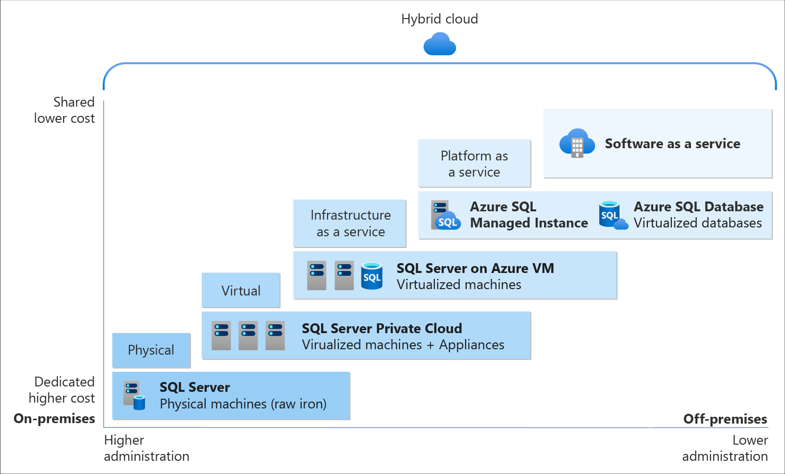
SQL Managed Instance is the latest deployment option which enables easy migration of most of the on-premises databases to Azure. It’s a fully-fledged SQL instance with nearly complete compatible with on-premise version of SQL server. Also, since SQL Managed Instance is built on the same PaaS service infrastructure, it comes with all PaaS features. Hence, if you would like to migrate from on-premise to Azure without management overhead but at the same time you require instance-scoped features, such as SQL Server Agent, you can try the SQL Managed Instance.

Andreas Wolter, one of the only 7 Microsoft Certified Solutions Masters (MCSM) for the Data Platform worldwide, once came to Singapore .NET Developers Community to talk about the SQL Database Managed Instance. If you’re new to SQL Managed Instance, check out the video below.

Spatial Data Types

Visibility plays a crucial role in the logistics industry because it relates to the ability of supply chain partners to be able to access and share operation information with other parties. Tracking the asset locations with GPS is one of the examples. However, how should we handle the geography data in our database?

Spatial data, also known as geospatial data, is data represented by numerical values in a geographic coordinate system. There are two types of spatial data, i.e. the Geometry Data Type, which supports Euclidean flat-earth data, and the Geography Data Type, which stores round-earth data, such as GPS latitude and longitude coordinates.

In Microsoft SQL Server, native spatial data types are used to represent spatial objects. In addition, it is able to index spatial data, provide cost-based optimizations, and support operations such as the intersection of two spatial objects. This functionality is also available in Azure SQL Database and Azure Managed Instances.

geom_hierarchy
The geometry hierarchy upon which the geometry and geography data types are based. (Image Source: SQL Docs)

Let’s say now we want to find the closest containers to a prime mover as shown in the following map.

The locations of 5 containers (marked as red) and location of the prime mover (marked as blue).

In addition, we have a table of container positions defined with the schema below.

CREATE TABLE ContainerPositions
(
    Id int IDENTITY (1,1),
    ContainerNumber varchar(13) UNIQUE,
    Position GEOGRAPHY
);

We can then simply use spatial function as shown below like STDistance, which will return the shortest distance between the two geography locations, in our query to sort the containers having the shortest to the longest distance from the prime mover.

The container “HKXU 200841-9” is the nearest container to the prime mover.

In addition, starting from version 2.2, Entity Framework Core also supports mapping to spatial data types using the NetTopologySuite spatial library. So, if you are using EF Core in your ASP .NET Core project, for example, you can easily get the mapping to spatial data types.

In the .NET Conference Singapore 2018, we announced the launch of Spatial Extension in EF Core 2.2.

Non-Relational DatabaseS on Azure

Azure Table Storage is one of the Azure services storing non-relational structured data. It provides a key/attribute store with a schema-less design. Since it’s a NoSQL datastore, it is suitable for datasets which do not require complex joins and can be denormalised for fast access.

Each of the Azure Table Storage consists of relevant entities, similar to a database row in RDBMS. Then each entity can have up to 252 properties to store the data together with a partition key. Entities with the same partition key will be stored in the same partition and the same partition server. Thus, entities with the same partition key can be queried more quickly. This also means that batch processing, the mechanism for performing atomic updates across multiple entities, can only operate on entities stored in the same partition.

In Azure Table Storage, using more partitions increases the scalability of our application. However, at the same time, using more partitions might limit the ability of the application to perform atomic transactions and maintain strong consistency for the data. We can then make use of this design to store, for example, data from each of the IoT devices in a warehouse, into different partition in the Azure Table Storage.

For a larger scale of the system, we can also design a data solution architecture that captures real-time data via Azure IoT Hub and store them into Cosmos DB which is a fast and flexible distributed database that scales seamlessly with guaranteed latency and throughput. If there is existing data in other data sources, we can also import data from data sources such as JSON files, CSV files, SQL database, and Azure Table storage to the Cosmos DB with the Azure Cosmos DB Migration Tool.

Azure Cosmos DB Migration Tool can be downloaded as a pre-compiled binary.

Globally, supply chain with Industry 4.0 is transformed into a smart and effective procedure to produce new outlines of income. Hence, the key impression motivating Industry 4.0 is to guide companies by transforming current manual processes with digital technologies.

Hard-copy of container proof of delivery (POD), for example, is still necessary in today’s container trucking industry. Hence, storing images and files for document generation and printing later is still a key feature in the digitalised supply chain workflow.

Proof of Delivery is now still mostly recorded on paper and sent via email or instant messaging services like Whatsapp. There is also no acceptable standard for what a proof of delivery form should specify. Each company more or less makes up their own rules.

On Azure, we can make use of Blob Storage to store large, discrete, binary objects that change infrequently, such as the documents like Proof of Delivery mentioned earlier.

In addition, there is another service called Azure Files available to provide serverless enterprise-grade cloud file shares. Azure Files can thus completely replace or supplement traditional on-premises file servers or NAS devices.

Hence, as shown in the screenshot below, we can upload files from a computer to the Azure File Share directly. Then the files will be accessible in another computer which is also connected to the Azure File Share, as shown below.

We can mount Azure File Share on macOS, Windows, and even Linux.

The Data Team

Setting up a new data team, especially in a startup, is a challenging problem. We need to explore roles and responsibilities in the world of data.

There are basically three roles that we need to have in a data team.

  • Database Administrator: In charge of operations such as managing the databases, creating database backups, restoring backups, monitoring database server performance, and implementing data security and access rights policy.
    • Tools: SQL Server Management Studio, Azure Portal, Azure Data Studio, etc.
  • Data Engineer: Works with the data to build up data pipeline and processes as well as apply data cleaning routine and transformations. This role is important to turn the raw data into useful information for the data analysis.
    • Tools: SQL Server Management Studio, Azure Portal, Azure Synapse Studio.
  • Data Analysis: Explores and analyses data by creating data visualisation and reporting which transforms data into insights to help in business decision making.
    • Tools: Excel, Power BI, Power BI Report Builder

In 2016, Gartner, a global research and advisory firm, shared a Venn Diagram on how data science is multi-disciplinary as shown below. Hence, there are some crucial technical skills needed, such as statistics, querying, modelling, R, Python, SQL, and data visualisation. Besides the technical skill, the team also needs to be equipped with business domain knowledge and soft skills.

The data science Venn Diagram. (Image source: Gartner)

In addition, the data team can also be organised in two manners, according to Lisa Cohen, Microsoft Principal Data Science Manager.

  • Embedded: The data science teams are spread throughout the company and each of the teams serves specific functional team in the company;
  • Centralised: There will be a core data team providing services to all functional teams across the company.

References

Building COVID-19 Dashboard in Golang with Google BigQuery

It has been almost half a year since the first case relating to the COVID-19 pandemic in Singapore, the country I am now working at, was confirmed. Two days after the first case was confirmed in Singapore, eight travellers entering Malaysia, my home country, from Singapore were confirmed to be infected as well.

Since then, we were asked to work from home as travel restriction is applied in both countries. While the situation is not getting better, it’s quite disappointing to know that there are still people believing that COVID-19 is a hoax.

Fortunately, there are still a lot more people working hard in this tough period. Earlier on, my friend who is doing research in Colorado told me that she’s working hard with a group of scientists to educate the public about the virus.

🎨  People endured hours-long queues to enter Singapore from Malaysia before the travel restrictions to curb the spread of COVID-19 came into force. 🎨 

In addition, to aid the researchers and data scientists in an effort to combat the pandemic disease, Google BigQuery also decided to host a repository of public datasets from JHU CSSE (Johns Hopkins Center for Systems Science and Engineering). With the public datasets, we can now query up to 1TB for free each month on COVID-19 datasets and the queries over COVID-19 data are free (until 15th of September 2020).

In my previous article, I talked about how Google BigQuery could work together with Google Data Studio to render beautiful reports without any coding. Thus, in this article, I will show how we can write a simple web client in Golang to fetch data from the BigQuery via its API.

BigQuery Public Datasets Programme

There are a huge number of datasets hosted by Google where we can access and integrate them into our applications but Google pays for the storage. Using the public datasets, we only need to pay for the queries we perform on the data.

🎨  There are a lot of public datasets available in the GCP Marketplace. 🎨 

In order to access the public datasets, we first need to enable them through the Google BigQuery documentation (I find this to be quite funny because Google makes the enabling link to be so hidden). In the “Using the Web UI” page, as shown in the screenshot below, we can then find an URL which will let us open the public datasets project manually through browser (Remember to update the &page=project to your project in GCP).

There are also detailed steps written in the documentation of Data Analytics Products (Yes, the same info is spread all over different places).

🎨  The link to enable the public datasets in the web UI. 🎨 

The COVID-19 Dataset

Once we have done the steps above, we shall see the public datasets, including the COVID-19 datasets, available in our Google BigQuery. The dataset that I will be using in this article is the covid19_jhu_csse, a daily updated data repository for COVID-19 from JHU CSSE.

🎨  The covid19_jhu_csse dataset. 🎨 

There are four tables under the dataset where the first three recording the number of confirmed cases, the number of reported deaths, and the number of recovered cases, respectively, in each of the country or region.

The interesting about the first three tables is that they recorded the numbers of each day in a separated column. Hence, every day, there will be one new column added to three of the tables. I’m not sure why they do so but this actually requires us to write our own client in order to get the data. Google Data Studio cannot work well with dynamic column names.

🎨  A column for each of the day. 🎨 

Luckily, there is a fourth table called summary which actually has just one date column and every record for each day is one row instead of one column. This is a more SQL-friendly table and can be integrated with Google Data Studio easily.

🎨  The summary table is more SQL-friendly because the date is stored in just one column. 🎨 

In this article, I will demonstrate using 1st, 2nd, and 4th table in order to show how we can programmatically get the data through the BigQuery API.

BigQuery Client Library for Golang

There are many client libraries of Google BigQuery for different types of programming languages, including C#. In this article, we choose to use Golang.

Before we proceed, we need to make sure that we have already enabled the BigQuery API for our project in the GCP. From the GCP Cloud Console, we will get the credential which will allow us to connect to the Google BigQuery and thus we must keep this credential file in a safe and secret place.

Now we can proceed to build our Golang client.

Firstly, we need to install the client library using go get command.

go get -u cloud.google.com/go/bigquery

Secondly, we need to initialise a Google BigQuery client.

ctx := context.Background()
client, err := bigquery.NewClient(ctx, projectID)

if err != nil {
    log.Fatalf("bigquery.NewClient: %v", err)
}

defer client.Close()

Querying the Tables

Next, we can start to query the data in the BigQuery.

rows, err := queryData1(ctx, client)
if err != nil {
    log.Fatal(err) 
}

queryResult := processQueryResult1(rows)

If we have other different queries for different tables or even datasets, we can continue to query in the same way as above.

So what does queryData1 look like? It is basically as simple as follows.

func queryData1(ctx context.Context, client *bigquery.Client) (*bigquery.RowIterator, error) { 
    query := client.Query("<SQL here>")
    
    return query.Read(ctx)
}

For example, if we are fetching the date as well as numbers of confirmed cases and deaths, we will be using the the following SQL.

`SELECT 
    CAST(date as STRING) as date, 
    IFNULL(confirmed, 0) as confirmed_cases, 
    IFNULL(deaths, 0) as deaths 
FROM ` + "`bigquery-public-data.covid19_jhu_csse.summary`" + ` ORDER BY date;

There are a few things to take note here is the use of CAST.

It casts the date field to string otherwise we may encounter problems such as having error of “schema field date of type DATE is not assignable to struct field date of type time.Time” when we unmarshal the returned JSON from the BigQuery in Golang later. The reason why I choose CAST is because casting from a date type to a string is independent of time zone and is of the form YYYY-MM-DD.

In addition, we also use IFNULL to make sure that the value in the confirmed_cases and deaths are always non-negative integers. In the original tables, the numbers can be null.

Now, we just need to have a struct where we can apply RowIterator.Next() to load each row into it. The struct that corresponding to the SQL above is as follows.

type QueryResultDataRow struct { 
    Date           string `bigquery:"date"` 
    ConfirmedCases int64  `bigquery:"confirmed_cases"` 
    Deaths         int64  `bigquery:"deaths"`
}

To iterate, we can use the code below.

func processQueryResult1(iter *bigquery.RowIterator) []QueryResultDataRow { 
    var result []QueryResultDataRow

    for { 
        var row QueryResultDataRow

        err := iter.Next(&row)

        if err == iterator.Done { 
            break 
        }

        if err != nil { 
            log.Print(err) 
            continue 
        }

        result = append(result, row) 
    }
    
    return result
}

Here, I’d like to share that there was a mistake I made when I wrote the code above. I forgot that I should end the for loop when the iterator is done, i.e. when err == iterator.Done. So the return statement will never reach. Please take note of this when you are writing this type of iteration.

Challenge: The Tables Having Dates as Columns

If you would like to challenge yourself to retrieve the data from the tables having dates as their columns, it is possible too, just with a few challenges.

First challenge is that we are not sure when the dataset will be updated. So, we can never be sure for the value of the last column. Since the dataset will be updated daily, to be safe, we can let the date of two days ago to be the last column in our query.

Second challenge is the format of the date. We cannot use the Golang magical reference date (Mon, Jan 2 15:04:05 MST 2006) to format the date because of the underscores found in the column name. There is a very interesting discussion about the origin of the magical reference date on Stack Overflow, in case you are interested, but it’s not important here. Hence, we will use the following code to format the date instead.

latestDateInQuery := fmt.Sprintf("_%v_%v_%v", int(d.Month()), d.Day(), d.Year() - 2000)

So the following code will help us to get the count from the second latest, if not the latest, column.

latestDate := time.Now().AddDate(0, 0, -2)
latestDateInQuery := fmt.Sprintf("_%v_%v_%v", int(latestDate.Month()), latestDate.Day(), latestDate.Year()-2000)

Once we get the column name, we can then use it in the following query.

`SELECT 
    IFNULL(province_state, "") AS place, 
    country_region, 
    latitude, 
    longitude, 
    (` + latestDateInQuery + `) AS count 
FROM ` + "`bigquery-public-data.covid19_jhu_csse.confirmed_cases`;"

Visualising the Data

With the queries above, we can then easily generate results with Google Charts. Here, I use the Line Chart and the GeoChart.

🎨  The COVID-19 dashboard powered by Golang and Google BigQuery. 🎨 

There is an interesting feature in GeoChart is that, by default, when we are using latitude and longitude instead of the address to identify the places, the text shown on the map tooltip will be the latitude and longitude, which is not user friendly. However, we can actually change the text by putting a description column right after the longitude column, as discussed over here on Google Groups. It’s interesting because this is said to be an undocumented support for such a column. So we’re not sure where this will stop working.

Next, I am using web page done with Material Design to display the charts. Please enjoy the following screenshots.

🎨  Charts showing the situation in both of my beloved countries. 🎨 
🎨  Top 10 countries having the most confirmed cases. 🎨 
🎨  The global situation where we locate the places with latitudes and longitudes. 🎨 

That’s all for the COVID-19 dashboard done using Golang and Google BigQuery. Also, thanks to JHU CSSE and Google, we are able to access to such an important data for free.

Finally, I’d like to wish all of you and your loved ones to stay safe and healthy.

🎨  A nurse checks the temperature of a visitor as part of the COVID-19 screening procedure. (Photo Credit: The Straits Times) 🎨 

Analytical Processing on Transaction Data with Google BigQuery and Data Studio

Data analysing is not about reporting. While reporting gives data, data analytics gives answers to the whys. Data analytics is the practice of using data and information to make informed decisions.

When I was in a startup, I was assigned a task by the CEO to work on analytical processing on transaction data. In the early days of the startup, the number of transactions was low, so simple data processing using stored procedures on MS SQL databases was sufficient. However, based on my past experience in SMEs, without investing in data workflow early, it will be challenging for the team to use the data to make informed decisions later. Imagine five years down the road, the team requires to do analysis on the huge amount of data collected in the past five years with just Excel.

🎨  Simple solution to do big data processing with Google BigQuery. 🎨 

Hence, in this article, we will be focusing on how we can do analytical data processing with Google BigQuery and then visualise the data using Google Data Studio.

Analytical Data Processing

There are two main categories when we talk about data processing, i.e. Transactional Processing and Analytical Processing.

For example, in my previous startup team, we had an Order Management Support (OMS) team that focused on tracking and processing the orders on time. What the OMS team does is transactional processing. Then we also had another Data Analyse (DA) team to analyse sales data to find out about monthly revenue, for example. So the DA team is basically performing analytical data processing.

Hence, the DA team needs to analyse large batch of data. As the business grows, the data the team needs to access will be going back months, or even years. Also, when there are more sales channels introduced in the business, the DA team may need to access multiple data sources as well. So, let’s see how we can use data warehouse to help dealing with the big data the DA team has.

Why Google BigQuery?

There are many data warehouse solutions out there.

The reason why we choose Google BigQuery is because it is a data warehouse that is very similar to the RDBMS which we have been very familiar with. Another good news is that Google BigQuery now supports the standard SQL which is ANSI:2011 compliant. Hence, the DA team can move to Google BigQuery seamlessly.

In addition, Google BigQuery can handle complex analytical queries which will be essential to the businesses and the data stored in it can easily scale to petabytes as the businesses grow.

The fast real-time access to our data is also another advantage of Google BigQuery. So within a few seconds, the DA team can retrieve the results from processing the huge amount of data.

Finally, Google BigQuery is serverless. So we don’t have to instantiate compute nodes like we do in AWS Redshift.

🎨  First 1TB per month is free for on-demand querying on Google BigQuery. 🎨 

Importing Data to Google BigQuery

The transaction data of the previous month will normally be double checked and verified by the relevant teams monthly. Once it is done, we can then download the transaction report of the month into a CSV file.

The reason why we choose CSV file is because it’s one of the three file types accepted by Google BigQuery. The other two are JSON and AVRO. Yes, AVRO! We talked about it in our previous article about Azure Event Hub.

Here, we will use Google Cloud Storage to store the CSV files because it is one of the accepted data source for Google BigQuery.

🎨  Monthly transaction data is kept in the bucket on Google Cloud Storage. 🎨 

So after the monthly transaction data has been uploaded to the storage, we can then proceed to create a new dataset (a concept which can be treated as database in RDBMS). Then in the dataset, we can start to create new table based on the monthly transaction data.

There are a few ways on how to create the table in the dataset. It seems like merging data from all months into one table is easier for maintenance. However, I decide to go for the way where we have one table for every month. This way actually allows me to delete and upload monthly data whenever I need to.

🎨  Creating a new table based on data stored in the Google Cloud Storage. Take note that Google BigQuery is powerful enough to generate schema for us. 🎨 

After that, we need to make sure to remove the header row(s) in our CSV file, if any, as shown in the following screenshot. If we don’t do this, the header row may be wrongly included into the dataset. The reason why we don’t need header here is also because the schema has been auto-detected by the Google BigQuery (or defined differently by the person who is uploading the data) in the previous step.

🎨  Remember to remove header in CSV during import stage. 🎨 

Sometimes, there might be some data corruption in the CSV file. For example, a column which is expected to contain only number suddenly has a non-numerical value. Then Google BigQuery will complain to us, as shown in the screenshot below..

🎨  The dialog will indicate the row number (29928) and its position of the error. 🎨 

Once the data is imported successfully to the table, we can then preview the data in the table.

This preview function is a very user-friendly feature. Do you still remember about the query price we mentioned earlier? If we explore the data in the table with the “SELECT *” statement, we will be charged and our usage quota may be affected. However, the preview function allows us to get a rough idea about the data in the table for free (and quota not affected)!

🎨  Previewing the data in the table. 🎨 

Views and Queries

Now we have seen both dataset and table, we need to introduce third concept in Google BigQuery called View. The view is actually a virtual table defined by a SQL query. Unlike the table which actually holds the records, the view will display the data in the related tables by executing its view-query.

Just now, I split the monthly transaction data into different tables. Actually I sort of regretting it after doing so because I can’t have an overview of the yearly report. Fortunately, with view, I can come up with a virtual table that holds essential data for the months in a year from all the tables using UNION in the query.

🎨  Combining transaction data of each month in 2018 into one single view. 🎨 

The query is easy to write as long as we are familiar with the standard SQL. For example, we can have a view which will show the driver who has the highest cost of jobs in each month with the query which uses LIMIT and UNION ALL shown in the following screenshot.

🎨  Who is the top driver? =) 🎨 

Visualisation using Data Studio

Dashboard building and reporting are very important in almost all the businesses because they make it easy to translate messages, retain information, and gather insights from the data. In short, that’s a way of data storytelling.

Similar as Power BI, Google Data Studio comes with interactive dashboards and beautiful reports that inspire smarter business decisions. The Data Studio has connectors to Google Cloud Platform (GCP) services, including Google BigQuery, and data stores. So, we will see how we can make use of it to visualise our data.

In the Data Studio, we first need to search for the BigQuery connector first.

🎨  Google BigQuery <> Google Data Studio 🎨 

After that, we need to locate the table or view which will provide the necessary data for the data visualisation, as shown in the following screenshot.

🎨  We can use both table and view as the data source in Data Studio. 🎨 

We then can draw a table with bars to show the driver with highest cost in their jobs for each month, as shown in the image below.

🎨  Table with bars. 🎨 
🎨  ABC 🎨 

However, we notice that the month is actually not ordered properly and it makes us hard to analyse the data. Why is it so? It turns out that the data type of the Month field is actually now recognised as “Text” which is indicated as “ABC” in the right menu.

To correct it, we need to click on the “ABC” beside the “Month” field and change its type to “Date”. The format we will use YYYYMM because that is how the year and month are formatted in the data source.

🎨  Changing the type of the “Month” field to be Date & Time. 🎨 

We will then see the “Month” column in the table will be shown in date format. The funny thing is even though the format we choose is YYYYMM, when the Data Studio displays the months, they will be displayed as, for example, April 2018 instead of 201804.

What we’re now left to do is just sort the table according to the month in ascending order.

🎨  Sorting the table according to month. 🎨 

So, congratulation to Mr Heng Swee Ren for being the only driver having the highest cost for two months!

In the Data Studio, we can also further customise the style of our report, such as changing the colours, to make the report to be more engaging to the readers.

🎨  A simple report for a huge amount of data is done easily without any coding. 🎨 

Conclusion

This is not the end of the journey. It’s actually just the beginning. For example, the line chart shown above actually has a limitation of showing only 10 series, as discussed over here. If there are more than 10 series, some of them will be grouped as “Others” in the chart and the visualisation will no longer make sense.

Anyway, this is my proposal of how we should do analytical data processing with data warehouse tool, such as Google BigQuery. Through this article, I also hope that businesses, especially startups and SMEs, can start to look into building common business reports using Power BI or Google Data Studio which will avoid wasting programmers’ time on coming up in-house dashboard and reports which are not highly customisable.

[KOSD Series] Running MS SQL Server 2019 on macOS

Few days ago, my teammate would like to learn how to use MS SQL Server. However, he only has a Macbook and MS SQL Server doesn’t run on macOS. Hence, I decided to write him a quick setup guide on how to do that with the help of container.

Starting from March 2016, besides Windows, SQL Sever 2019 also runs on Linux. So, we can easily spin up a Linux container and host SQL Server on it.

🎨 Microsoft introduced SQL Server on Linux in 2016. 🎨

Docker

We need to run Docker on our Mac machine. Since my teammate is new to Docker, he can simply choose a rather straight-forward path for this, which is to use Docker Desktop on Mac. Kindly take note of the system requirement before proceed to install it.

Once the Docker is up and running, we can proceed to pull the image of SQL Server 2019 from the Docker Hub.

SQL Server 2019 Developer Edition

In 2019, continuing with the approach to delivering a consistent and trustworthy acquisition experience for Microsoft container images, Microsoft Container Registry (MCR) is announced.

We can run the following command in Terminal window to start the database server. Here we are using 1501 as the port. Take note that, we need to replace the password with our password which meets the following guideline:

  • at least 8 characters;
  • including uppercase, lowercase letters, base-10 digits and/or non-alphanumeric symbols.
$ docker run -e 'ACCEPT_EULA=Y' -e 'SA_PASSWORD=yourStrong(!)Password' -p 1501:1433 -d mcr.microsoft.com/mssql/server:2019-latest

In the command above, there are two environment variables.

Firstly, it is the environment variable “ACCEPT_EULA”. Setting it to Y means that we accept the End-User Licensing Agreement of the product. So far I still couldn’t find the EULA of the Microsoft SQL Server 2019. If you know, please drop me a message in the comment section. Thanks!

Secondly, it is the “SA_PASSWORD” which is used to set the password that we will later use to connect to the SQL server later as the database admin (userid = “sa”).

Actually, there is another environment variable which is not set here. It is the MSSQL_PID, i.e. the product ID of the SQL Server. By default, it is the Developer edition. If we would like to use Express or Enterprise edition, we can specify it here.

The reason we chose the Developer edition is because it is the edition that it is licensed for use as a development and test system, not as a production server. In addition, despite being Developer edition, it includes all the functionality of Enterprise edition. Hence, SQL Server Developer is an ideal choice for developers like us to build and test applications.

🎨 Docker Hub page of Microsoft SQL Server. 🎨

There are more information about the MS SQL Server image on the Docker Hub page. Hence I will not repeat them here.

Azure Data Studio

To visualise and manage our data in the databases, we need to use tools such as SQL Server Management Studio (SSMS). However, SSMS is only for Windows (AMD or Intel). So, on macOS, we have to choose another cross-platform alternative, which is Azure Data Studio. Azure Data Studio is usable on Windows and Linux too.

Interestingly, Azure Data Studio was previously called SQL Operations Studio. Hence, please only use the latest one, which is the Azure Data Studio.

Now we can connect to the SQL Server from Azure Data Studio as shown below. Take note that the Server is “localhost,1501” and it is using comma, not dot, between the word localhost and the port number.

🎨 Connecting to the Microsoft SQL Server from Azure Data Studio. 🎨

If the connection is successful, we shall be able to see the Server Dashboard as shown below.

🎨 Server Dashboard in Azure Data Studio. 🎨

That’s all. Now we can have MS SQL Server running on our Mac machine for local testing and development.

References

KOSD, or Kopi-O Siew Dai, is a type of Singapore coffee that I enjoy. It is basically a cup of coffee with a little bit of sugar. This series is meant to blog about technical knowledge that I gained while having a small cup of Kopi-O Siew Dai.