Introducing Viewport to Mobile Website

Yesterday I downloaded Windows Phone Emulator from Microsoft Download Center (http://www.microsoft.com/download/en/details.aspx?id=13890). It came along with Visual Studio 2010 Express, Expression and XNA Game Studio 4. I basically just wanted to see how my mobile website will look on WP7.

Then I realized the display of the web page had some problems, as shown in the following screenshot.
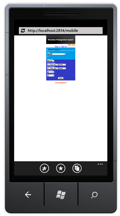
Phone Website - Without Viewport Meta Tag
Ano... Can't see.

It seems like the phone is showing the website as like on desktop.

Viewport

The screen size of mobile is always an important thing to take care of when I’m developing the mobile version of my website. Phone normally has screen width of about 400px. My Motorola Quench XT3 has the screen size of 320px x 480px (Reference: http://www.gsmarena.com/motorola_xt502_greco-3354.php). Hence, I need to find a way to tell the phone browser to show only the part with text.

So, how about setting the width of the body/div of the web pages? It just won’t work. Actually the screenshot shown above was done by setting the width of the div to be 320px and then positioning it at the center of the page. This method won’t work on most of the phones, except maybe my Android phone. In my Android phone browser, the website auto scale to fit the actual screen width. However, it’s not the case in my friend’s Android phone.

There are two types of viewport: Visual Viewport and Layout Viewport. There are a few very good online articles and discussion about these two viewports. For example, interesting and detailed explanation of the two can be found here: Browser compatibility — viewports and A tale of two viewports — part two. There is a thread discussing this on Stack Overflow: http://stackoverflow.com/questions/6333927/difference-between-visual-viewport-and-layout-viewport.

Solution

Soon, I found that by adding the viewport meta tag as shown below, the problem seems to be solved.

<meta name=”viewport” content=”width=device-width, minimum-scale=1.0, maximum-scale=1.0″ />

It allows developers to tell the phone browser how the web page should be shown.

The code above says the width of the viewport to be the width of the device. Setting the maximum-scale to be 1.0 is to prevent users to expand the window size beyond the initial size. Munimum-scale is also playing the similar role. However, these two are currently not supported in the initial release IE Mobile for WP7 (Reference: The IE Mobile Viewport on Windows Phone 7). So, to keep user from scaling the viewport, I have to set user-scalable to be false in the viewport meta tag. Anyway, for details explanation on the viewport tag setting, please refer to The IE Mobile Viewport on Windows Phone 7 (for IE Mobile on WP7) and Configuring the Viewport (for Mobile Safari on iOS). Meanwhile, Firefox also started to support viewport meta tag with the same properties as Mobile Safari two years ago: Using the viewport meta tag to control layout on mobile browsers.

Yup, after adding in the viewport meta tag, the web pages look fine on the emulator.
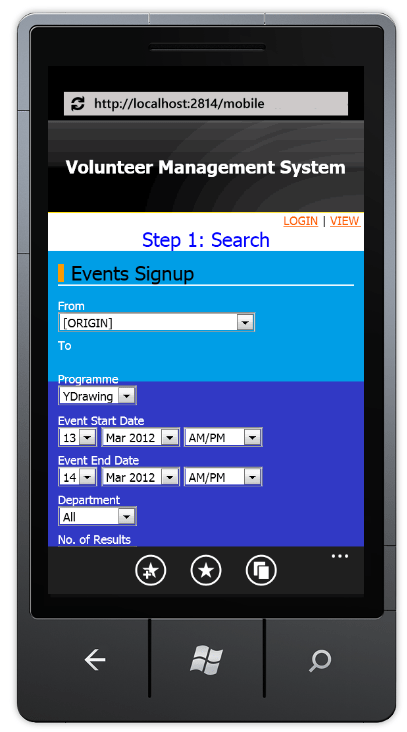
Phone Website - With Viewport Meta Tag
Yup, the mobile website looks good now. =)

Flipping Table: Showing Very Wide Table on Phone

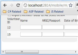
Most of the mobile phones have vertical screen, so building a mobile website where user needs to scroll horizontally frequently is a No. Thus, it is not a good idea to have HTML tables which are very wide, especially those have text-boxes and many other fields for user to fill in as shown below.

Before Flipping Table
Have to scroll horizontally to fill up information in a wide table

After the first version of the mobile website is done, I now focus on making the columns of the wide tables to be shown vertically, like the one shown below.

Columns now become rows

It is done using CSS. I like the solution very much because unlike some other solutions which require changes done to the ASPX, this solution with CSS will not affect the C# code behind.

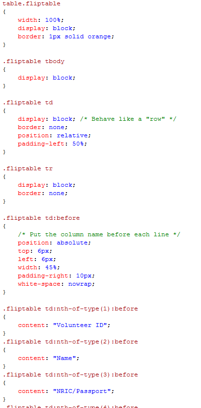
The CSS part is quite straight-forward. The idea is just to make each cell of every row to show line by line in the row. After that, the name of the columns will be placed in front of each line:

Fliptable CSS
The rest of the CSS is just adding header text to each row

There is an advanced solution posted online where the table can actually decide the layout itself based on the screen size: http://css-tricks.com/responsive-data-table-roundup/. That advanced version allows the user to get different look-and-feel on different devices. However, I somehow could not get it to work on my ASP website. Thus, I modified it to a simpler version as shown above.

Oh yeah, the CSS above does not work in Internet Explorer. According to a discussion on Stack Overflow, adding “float: left” to .fliptable td seems to solve the problem (at least in IE9).

Building Mobile Version for My ASP Website

I enjoy watching YouTube on my Android because I don’t sit in front of my PC for a long time. I found that the mobile version of YouTube was quite simple, straight-forward and easy. It is very easy to look for videos in Subscriptions, personal Playlists, History and Favourites. I like how YouTube handles playlists which are very long (having more than 12 videos in it). Instead of showing all the videos in a long playlist, the mobile version of YouTube shows only the first few. The user then has to click on the “Show more videos” button at the bottom of the page to view more of the playlist. This is a bit troublesome for the user but that feature helps in showing the playlist videos page faster. This feature is introduced because of the smaller display we have in mobile phones.

Usability
Recently, I am doing the mobile version for an existing ASP website. Learning from YouTube mobile and some other mobile website online tutorials, I introduce a few changes in the mobile version of the ASP website:

  1. Remove large images, especially not-so-useful advertisement pictures shown on the original site and background images. This helps in reducing the bandwidth;
  2. Make the mobile version of the website to be single column. The original site has a multi-column layout. This makes the user needs to scroll a lot (horizontally and vertically) on the phone just to view the entire web page. The what-the-hash moment comes when the page contains too much unnecessary content, and the user has to spend time on scrolling and finding the important info on the page;
  3. Increase the click-able area. It will never be a good idea to ask user to zoom in to the page just to click on the tiny check-box or radio button. So, I have a large table cells there to replace the radio buttons and check-boxes so that user has a wider area to click on. Drop-down list can also be used to replace radio buttons because it is easier to choose item from the drop-down list in the mobile phone;
  4. No Flash and Silverlight. Removing all the animation thingy is a good choice;
  5. Build a fluid layout. Since different types of the mobile phones have different screen size, so it is good to fix the width of the display area;
  6. Have a “Back” button to go to the previous page. The original site has a section where the user has to go through several steps to get to see their results. So, a “Back” button is important in section like this on mobile version.

Besides, the links should be avoided for any important call to action. YouTube mobile still has this problem. Previously, they even placed the “Sign out” link very close to the “Show more videos” button. So, there are many times I accidentally clicked on the “Sign out” link. In the latest version, YouTube mobile has changed the position of the “Sign out” link. However, it is still placed not far from the frequently used buttons and they still do not ask for conformation when user clicks on the “Sign out” link. Haiz…

YouTube Mobile Not-so-good Design
The "Sign out" link in YouTube mobile is still close to the "Show more videos" button. Argg...

Also, I am thinking of having the functionality of allowing the user to view the address on the map on smartphone. This is to help user find out the actual position of the place easily. Allow users to automatically call the number when they click on the number on the web page is also helpful. I think some users will go crazy if they have to first note down the number on paper and then type the number on the phones just to call the person.

Detect the Mobile Device
Since it is an ASP website, I decided to use ASP to do the device detection.

MSDN shows a very easy tutorial to do that: http://msdn.microsoft.com/en-us/library/fhhycabe.aspx. The tutorial shows how to use Request.Browser[“IsMobileDevice”] to check if it is a mobile device that is accessing the page right now. According the a discussion thread on the StackOverflow (http://stackoverflow.com/questions/1829089/how-does-ismobiledevice-work), by calling Request.Browser[“IsMobileDevice”], the runtime uses regular expression from the *.browser files to match against the incoming User-Agent string. However, this does not work at my side.

The *.browser files shipped with .NET
I then tried another solution found on another thread ASP.NET Forums (http://forums.asp.net/t/1175390.aspx):

An advanced version of code to check the device being used
The method suggested by anantjains uses several stuff to check: IsMobileDevice, HTTP_X_WAP_PROFILE, HTTP_ACCEPT and HTTP_USER_AGENT. The code actually works when I use User Agent Switcher on Firefox to test it. Yup, so I will use the code for now.

Meanwhile, according to a page in ASP.NET (http://www.asp.net/mobile), there is a third-party project on detecting the mobile devices, including those which are just released recently. The project is an open-source project and it is called 51degree.mobi Foundationhttp://51degrees.codeplex.com/. I have not tried it yet though.

Testing Mobile Website on PC
I usually tested my ASP and C# code on localhost first before deploy it on the server. So, for the mobile ASP website, I need a way to test it on my PC also.

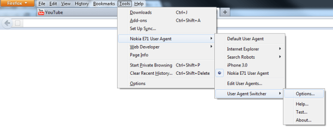
True mobile browsing can be done on Firefox with the help of User Agent Switcher add-on (https://addons.mozilla.org/en-US/firefox/addon/user-agent-switcher/). With just the User Agent and a short description in the User Agent Switcher, a new user agent option can then be added to the list. By switching to the correct mobile user agent, the mobile version of the page can be viewed properly.

User Agent Switcher Add-on for Firefox

There is also an online article about testing mobile website on Firefox using this add-on and Modify Headers add-on: http://mobiforge.com/testing/story/testing-mobile-web-sites-using-firefox.